4.1. Copernicus EMS and crisis maps production
4.1.1. Copernicus EMS on demand mapping
Copernicus Emergency Management Service (EMS) is part of the huge Copernicus programme (https://www.copernicus.eu/), which is dedicated to mapping, early warning and monitoring of emergencies and which has already been introduced in 3.1.4.6. In this chapter, we are going to discuss the different components of the service (Fig. 4.1.1.1), as well as which are the technologies and the methods which allow to obtain maps that can support emergency management.
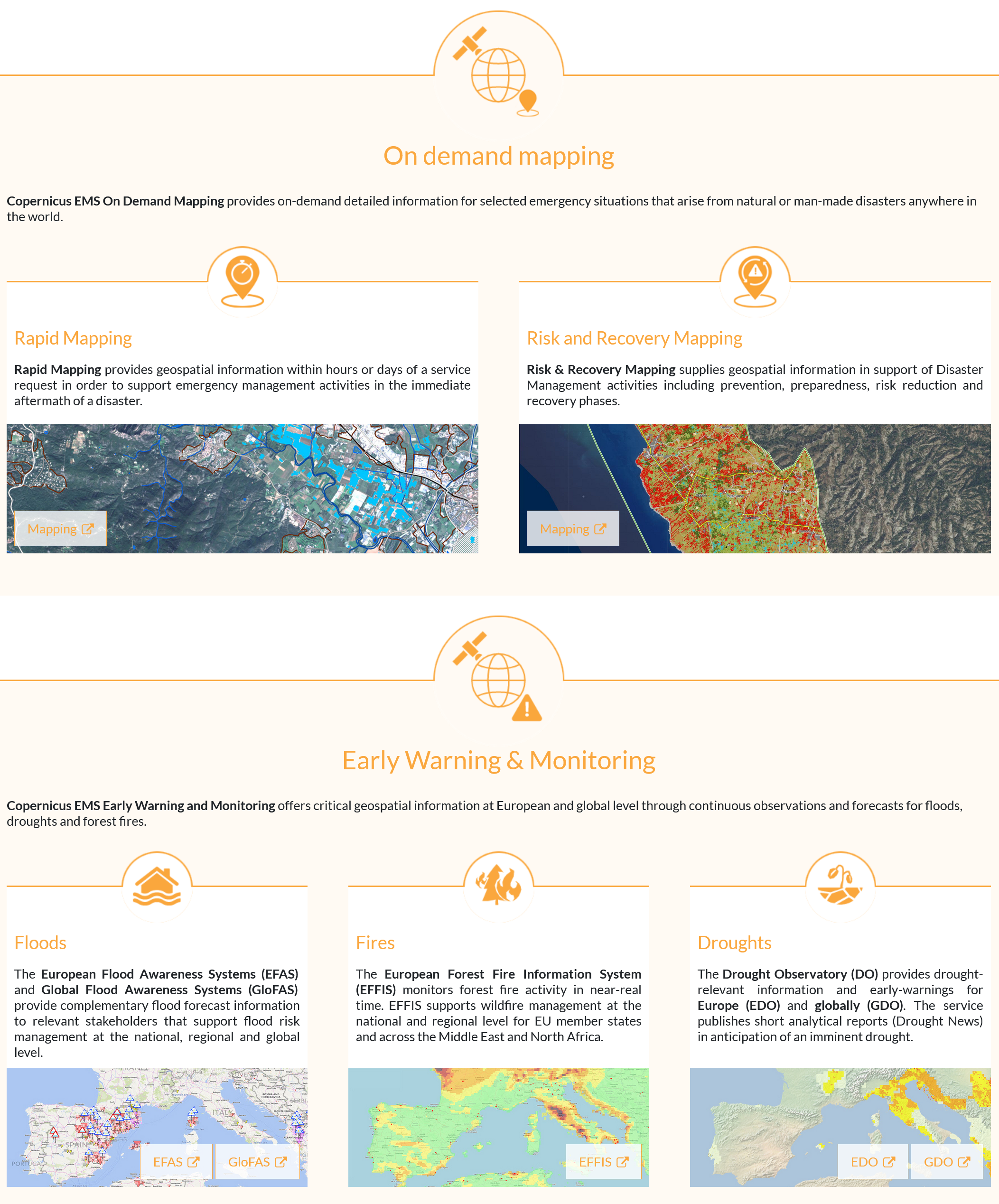
Fig. 4.1.1.1 – The Copernicus EMS components, which include on demand mapping, Early Warning and Monitoring. Source: https://emergency.copernicus.eu/
4.1.2. Copernicus EMS on demand mapping
The Copernicus EMS on demand mapping service is meant to be activated after the occurrence of a crisis event (and in some cases before, to support preparedness) in order to provide the stakeholders, who take care of the operations during and after the emergency, valuable maps which can support the activities planning. The map production can be requested to the Service by Authorised users (e.g. National Civil Protection or international humanitarian organizations). The following two typologies of maps are provided:
- Rapid maps which are meant to be delivered shortly (few hours or days) after the occurrence of a disaster in order to provide information about the impact over the area of interest. Depending on the type of disaster and on the users’ request, rapid maps can show the delineation of the affected area (e.g. the perimeter of the flooded area) or the grading of the damage (if buildings are destroyed, heavily damaged or slightly damaged).
- Risk Recovery Maps can contribute to prevention, preparedness, disaster risk reduction and recovery phases of emergency management and their production does not imply immediate response.
These maps are produced taking advantage of available layers and sources of information and mainly rely on satellite imagery in order to show the impacts of the disaster. The image processing exploits, when possible, semi-automatic procedures (e.g. spectral indices thresholding), however visual interpretation and the experience of the operator play the most important role.
Fig. 4.1.2.1 shows the schema of the activities that are needed to allow the production of the on demand maps. First of all, the Service is activated by authorised users, through the Emergency Response Coordination Centre (ERCC, https://ec.europa.eu/echo/what/civil-protection/emergency-response-coordination-centre-ercc_en) and the Joint Research Centre DG (JRC, https://ec.europa.eu/jrc/en).
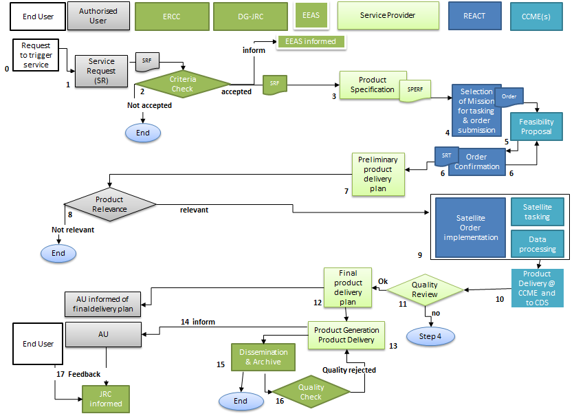
Fig. 4.1.2.1 – The Copernicus on demand mapping activities workflow. Source: https://spacedata.copernicus.eu/copernicus-users/user-categories/copernicus-services/emergency/ems-service-workflow
Then, depending on the typologies of maps to be produced and on the type of disaster, the satellite image acquisition is triggered. At this point, it is necessary to wait for the availability of a suitable satellite image and, in the meantime, it is possible to collect other layers that can be useful for mapping (such as topographic maps, ancillary information, pre-event data). Many satellite constellations, can be considered for imagery acquisition, including the Sentinels (see 3.1.3.2). This is the phase of the process which takes the longest amount of time and it is critical in the case of rapid mapping, requiring from few hours to few days.
The maps produced by Copernicus EMS are openly and freely available through the website (Fig. 4.1.2.2), the most recent ones can be accessed through a map, as well as the full list of activations can be accessed and queried.
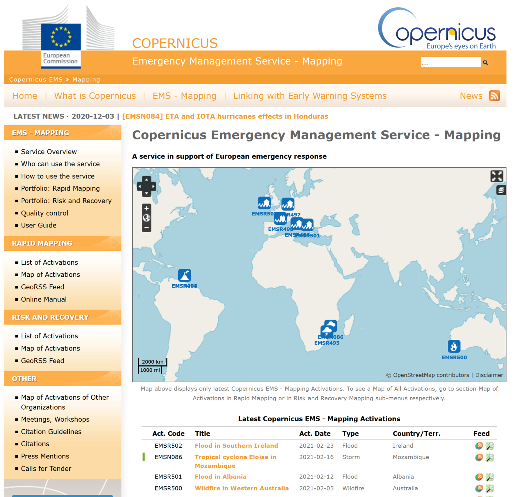
Fig. 4.1.2.2 – The map interface to access the Copernicus EMS activations. Source: https://emergency.copernicus.eu/mapping/#zoom=2&lat=13.54457&lon=27.49718&layers=00B0T
Maps are provided both in printable versions (often with different resolutions in order to be able to be downloaded even when the internet connection conditions are not favourable) and in vector format (Fig. 4.1.2.3).
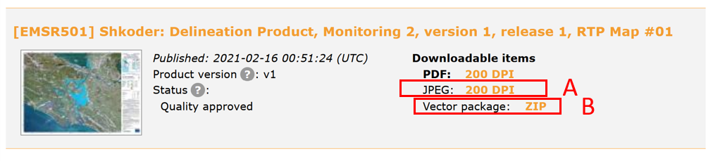
Fig. 4.1.2.3 – Example of rapid map downloadable both in printable (A) and vector (B) formats. Source: https://emergency.copernicus.eu/mapping/list-of-components/EMSR501
Printable maps (Fig. 4.1.2.4) are mainly designed to be used during the emergency by the operators managing the activities in the field, so they can e.g. discuss around a table (or in the field, Fig. 4.1.2.5) watching the map showing the affected area and elements of interest, such as roads, open areas which could be suitable to put tents and vehicles for the logistics, key buildings, like schools or hospitals. The vector files of the damage assessment can be overlayed to other layers in a GIS software in order to be able to make more complex analyses and exploit other layers that the local administrations or organisations could have.
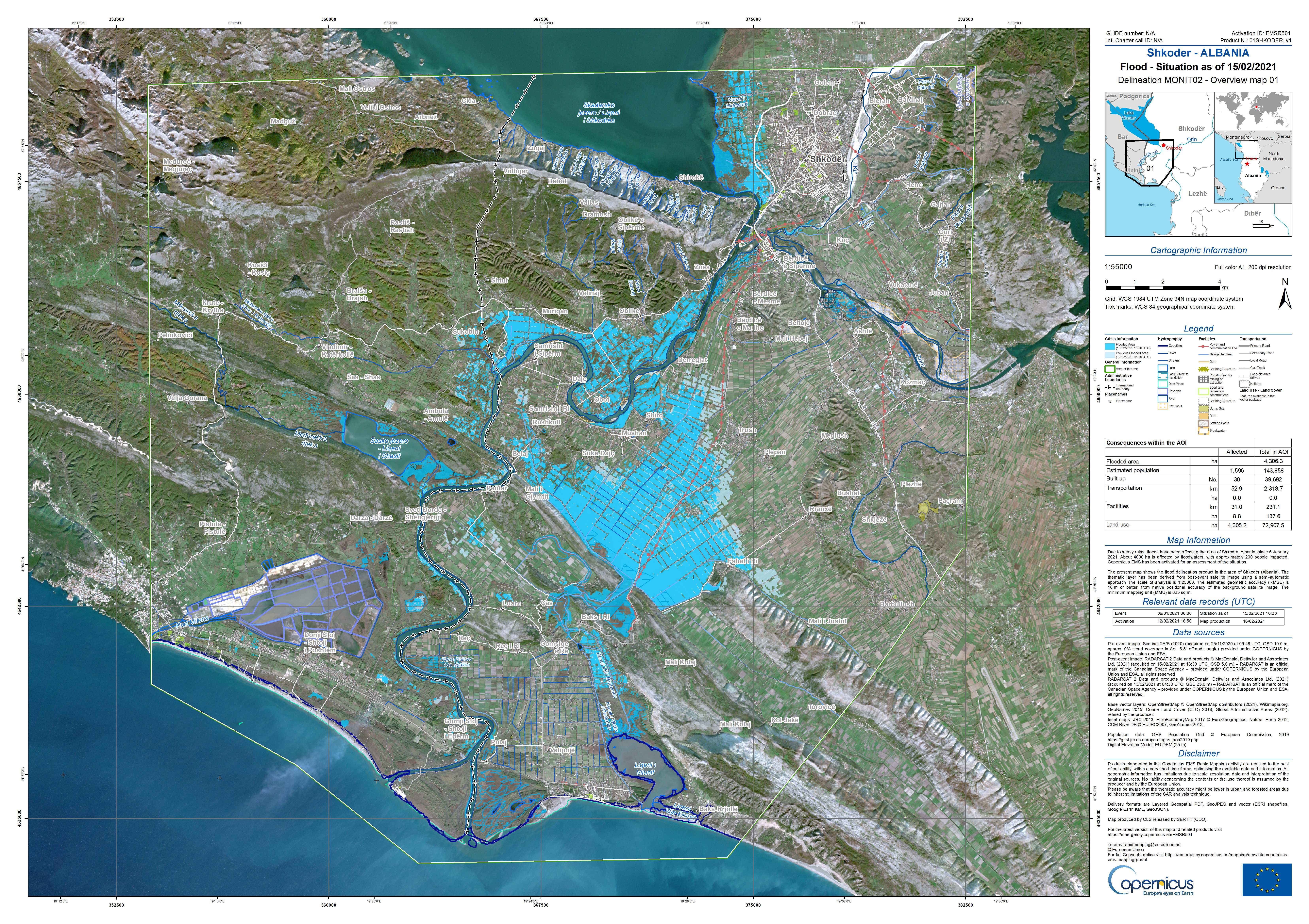
Fig. 4.1.2.4 – Example of rapid map for a flood event in printable format. Source : https://emergency.copernicus.eu/mapping/system/files/components/EMSR501_AOI01_DEL_MONIT02_r1_RTP01_v1.jpg
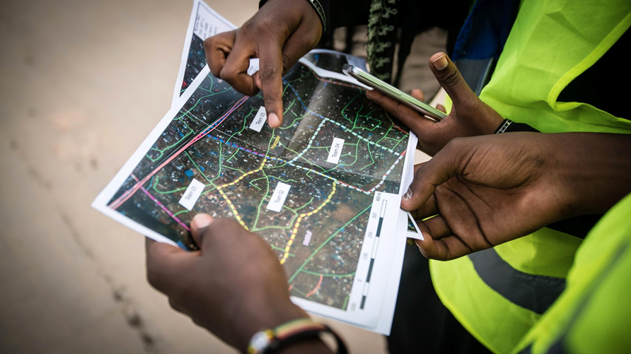
Fig. 4.1.2.5 – Example of use of maps in the field. Source: https://earthobservations.org/geo_blog_obs.php?id=455
In the following, the different typologies of crisis maps provided by Copernicus EMS are listed and discussed.
Reference products (Fig. 4.1.2.6) provide knowledge of the territory prior to the emergency. The contents of the products include topographic features describing the area of interest. It targets the exposed properties and other helpful information that can assist the stakeholders during the management of the emergency.
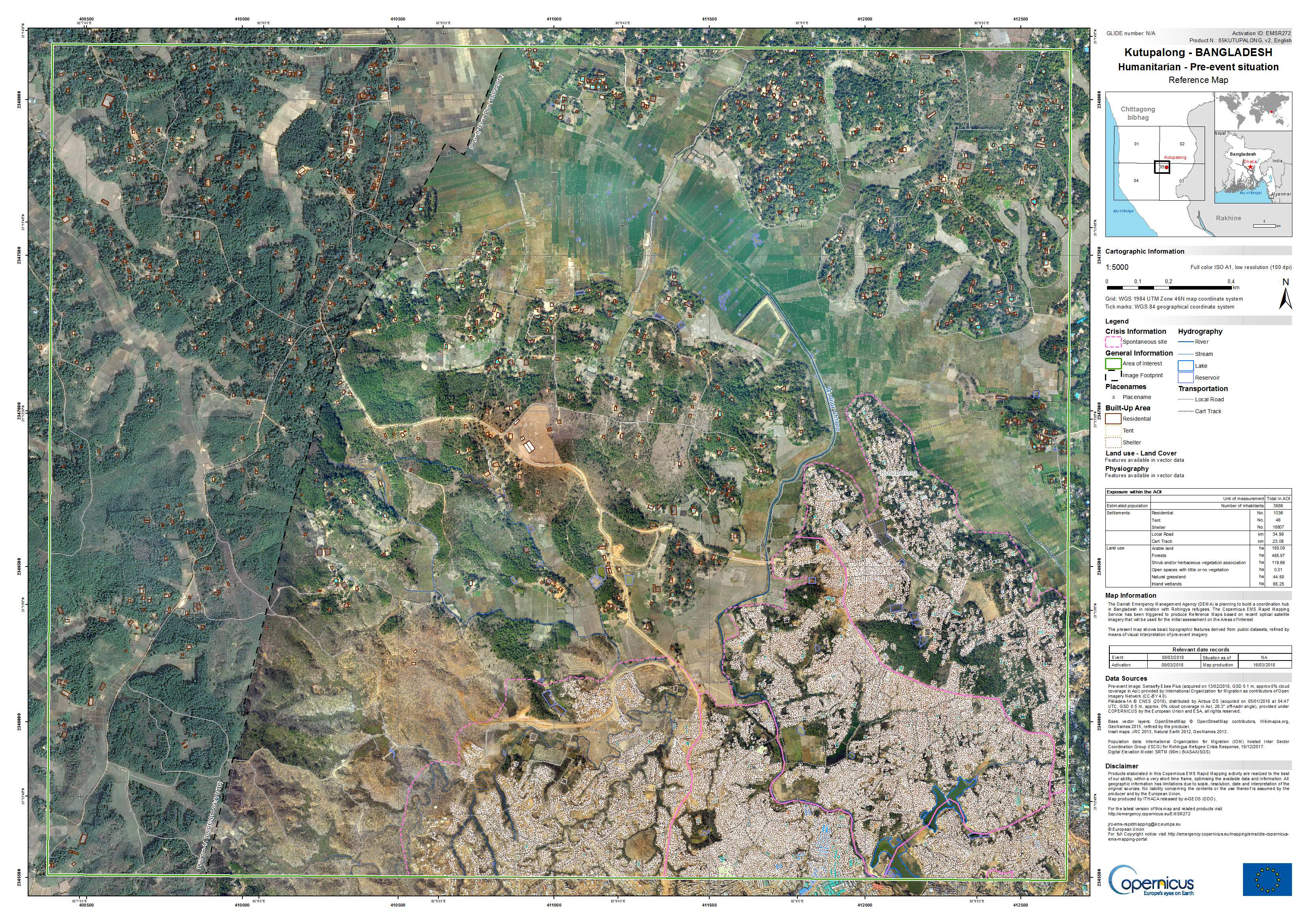
Fig. 4.1.2.6 – Example of reference map. Source: https://emergency.copernicus.eu/mapping/system/files/components/EMSR272_05KUTUPALONG_00REFERENCE_MAP_v2_200dpi.jpg
First Estimate Product (FEP, Fig. 4.1.2.7) provide a very fast, but not very detailed, early assessment of the affected locations within the AOI (Area Of Interest). The assessment is derived from the first available post-event imagery. This product can be used to provide a first estimate of the affected area and to better define the requirements for the following more detailed products.
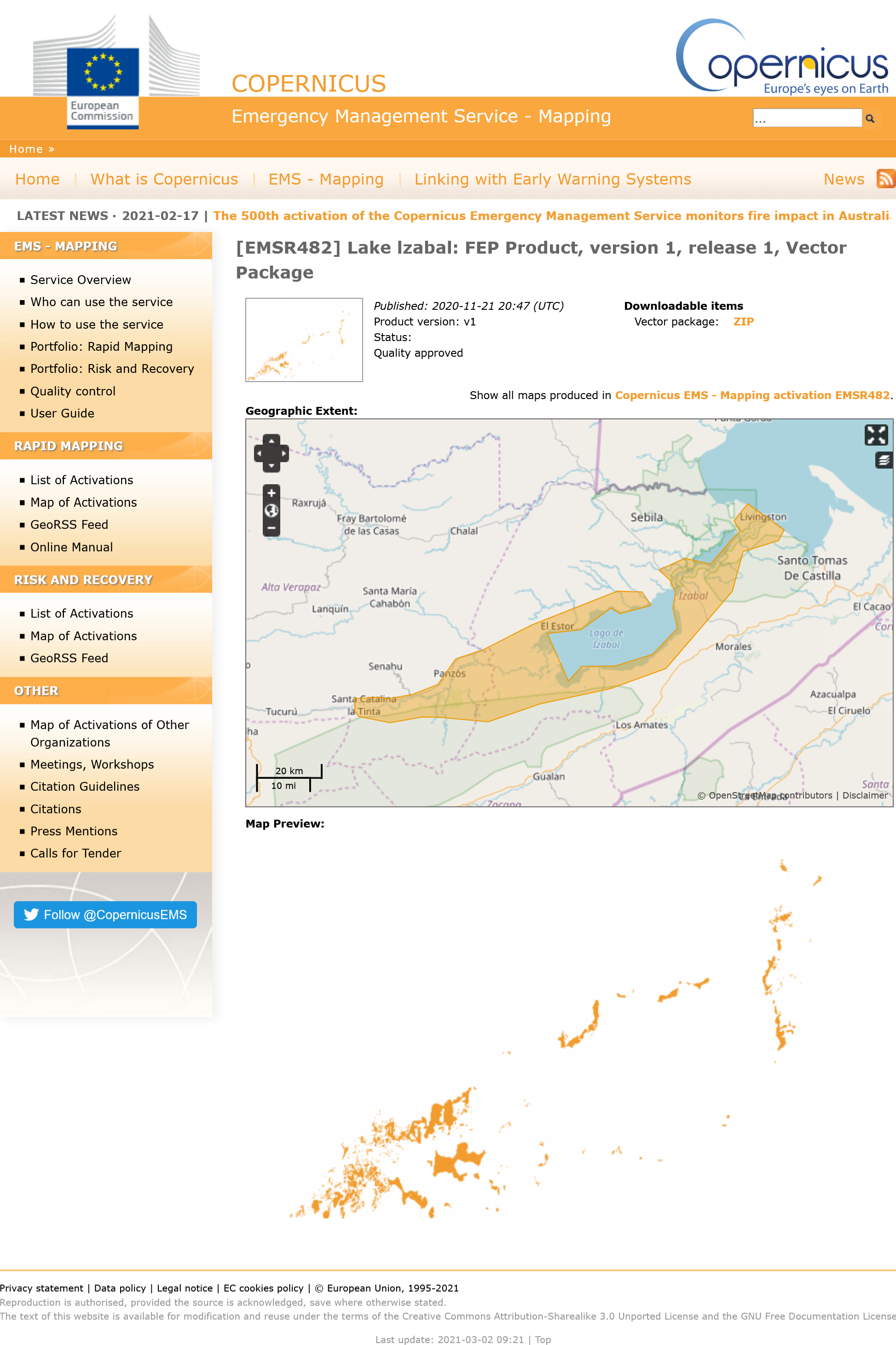
Fig. 4.1.2.7 – Example of first estimate product. Source: https://emergency.copernicus.eu/mapping/ems-product-component/EMSR482_AOI07_FEP_PRODUCT_r1_VECTORS/1
Delineation products (Fig. 4.1.2.8) describe the impact of the event over the area of interest, showing the affected area and the affected assets, without providing a measure of the level of damage.
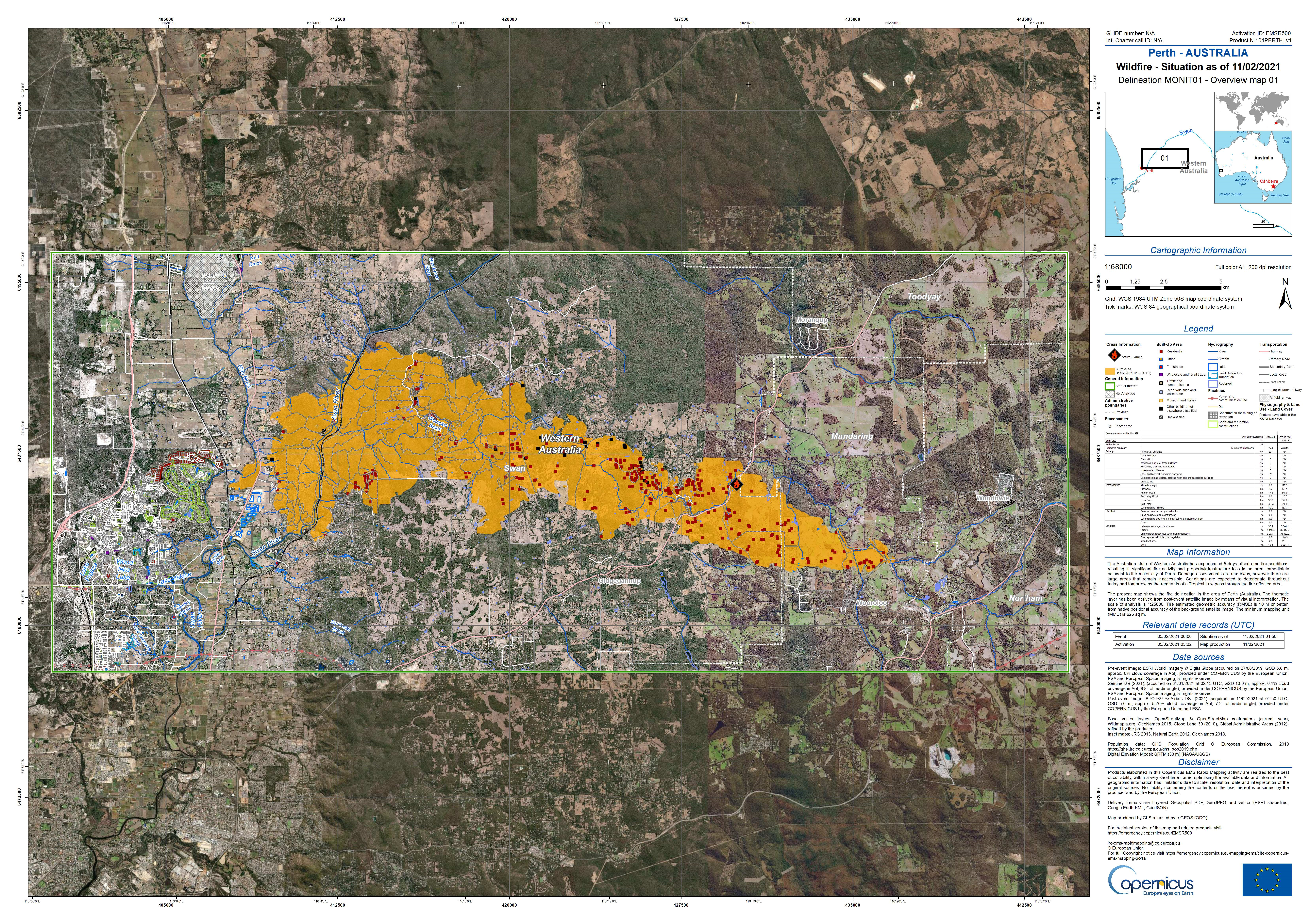
Fig. 4.1.2.8 – Example of delineation product. Source: https://emergency.copernicus.eu/mapping/system/files/components/EMSR500_AOI01_DEL_MONIT01_r1_RTP01_v1.jpg
Grading products (Fig. 4.1.2.9) provide information on the level of severity of the damage, its spatial distribution and extent. These products are derived from post-event satellite imagery and include the level, magnitude or damage grades concerning a specific disaster type. If possible, the products publish relevant and up-to-date information specific to the affected area, such as settlements, transport networks, industries, and others.
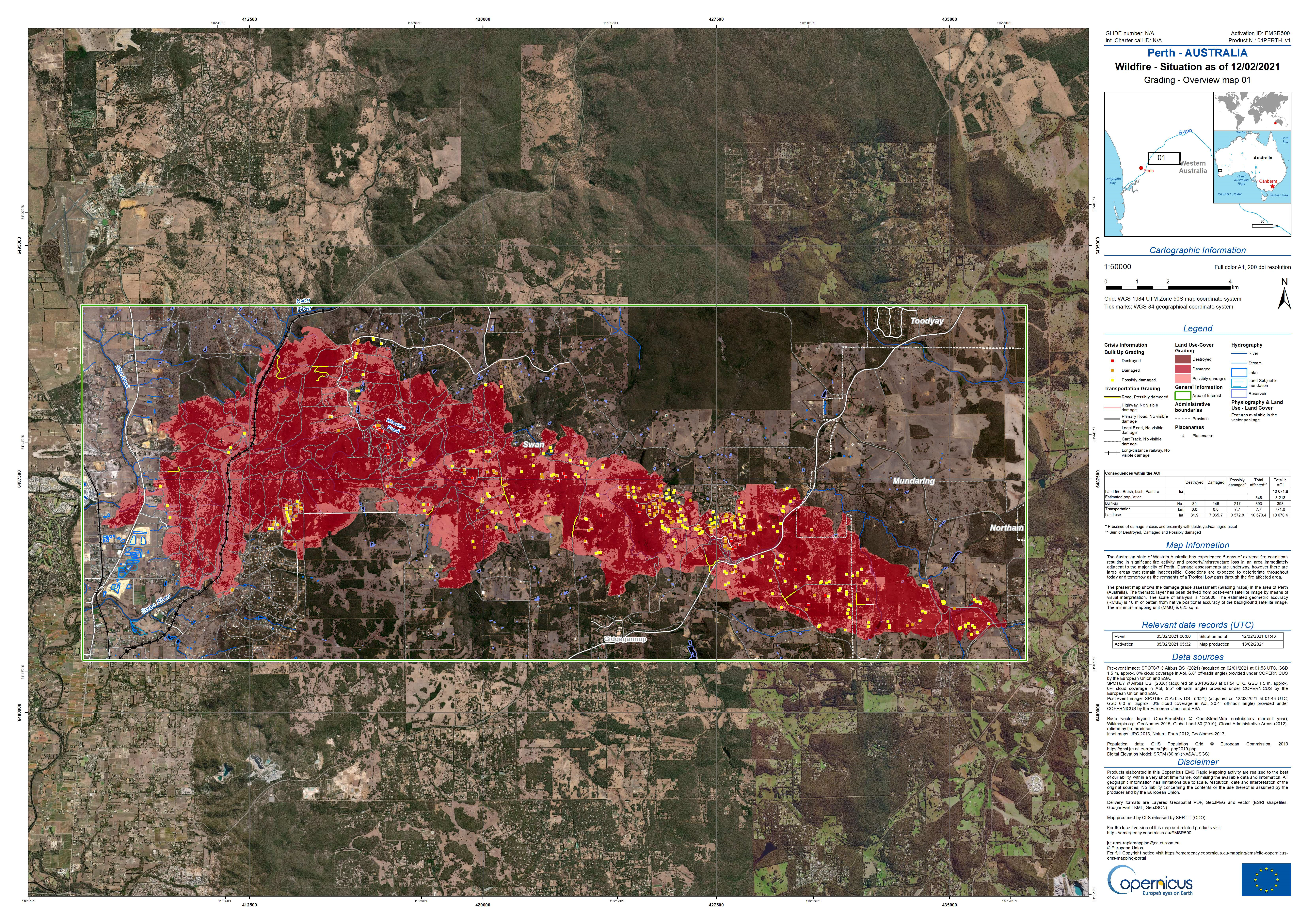
Fig. 4.1.2.9 – Example of grading product. Source: https://emergency.copernicus.eu/mapping/system/files/components/EMSR500_AOI01_GRA_PRODUCT_r1_RTP01_v1.jpg
Supplementary info
For more information about the products, refer to the Products Portfolio https://emergency.copernicus.eu/mapping/ems/rapid-mapping-portfolio or refer to the technical manual for the Copernicus EMS – Rapid Mapping Products
4.1.3. Crisis maps production
Crisis maps are mainly produced from semi-automatic processing of satellite images and visual interpretation. Provided the importance of delivering a reliable map to the operators in the field, the visual interpretation is very important as well as the experience of the map provider in order to contain as much as possible the limitations of the automatic processing. In addition, not all kinds of damages are visible from the satellites, due to the limited spatial resolution and to the typology of the acquisition, which allows to observe from a certain perspective only, e.g. on a satellite it is possible to see only the roof of buildings.
In general, in order to single out the damage, pre and post imagery of the area of interest should be compared (Fig. 4.1.3.1). In this way, the map provider can infer from the differences between pre and post situation the effects of the disaster. In some cases the change detection analysis can be performed with the help of semi-automatic procedures. As already anticipated, in most cases, visual interpretation plays a crucial role. In order to ease the comparison between pre and post situation, the pre and post images should be as much similar as possible, i.e. acquired with the same sensor, possibly in very similar conditions. If possible, pre and post images should be close in time, one acquired immediately before and the other one immediately after the event. This is not always easy to obtain, due to the period when a certain satellite passes over the area of interest or to the possible poor quality of the imagery, e.g. due to the possible presence of clouds. For this reason, the choice of the satellite to be triggered for image acquisition when a disaster must be mapped is a critical point.
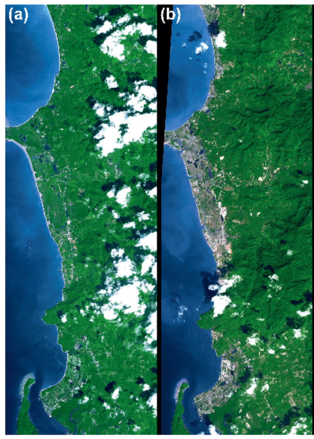
Fig. 4.1.3.1 – Example of pre and post satellite imagery. Images of Khao Lak in Thailand before and after the 26 December 2004 Indian Ocean tsunami. (a) Pre-event Advanced Spaceborne Thermal Emission and Reflection Radiometer (ASTER) image (15 November 2002). (b) Post-event ASTER image (31 December 2004). Source: Koshimura, Shunichi; Moya, Luis; Mas, Erick; Bai, Yanbing. 2020. “Tsunami Damage Detection with Remote Sensing: A Review” Geosciences 10, no. 5: 177. https://doi.org/10.3390/geosciences10050177
In the following section, the different types of disasters are discussed to explain which types of images are suitable and which types of processing can be performed in order to produce the crisis maps.
4.1.4. Crisis maps for Earthquakes
After an earthquake, the effects that can be mapped are: damaged or destroyed buildings, damages occurred to the road network, e.g. damaged roads, roads covered in rubble or debris, landslides, avalanches, etc. The most used method to assess the damages is visual interpretation on VHR (Very High Resolution) satellite images. In particular pre and post event images should be available and the comparison between the two helps the mapper to understand which structures have been affected (Fig. 4.1.4.1). The damage on the crisis map can be displayed in different ways, e.g. with points or polygons defining with different colours the level of damage of the corresponding buildings.
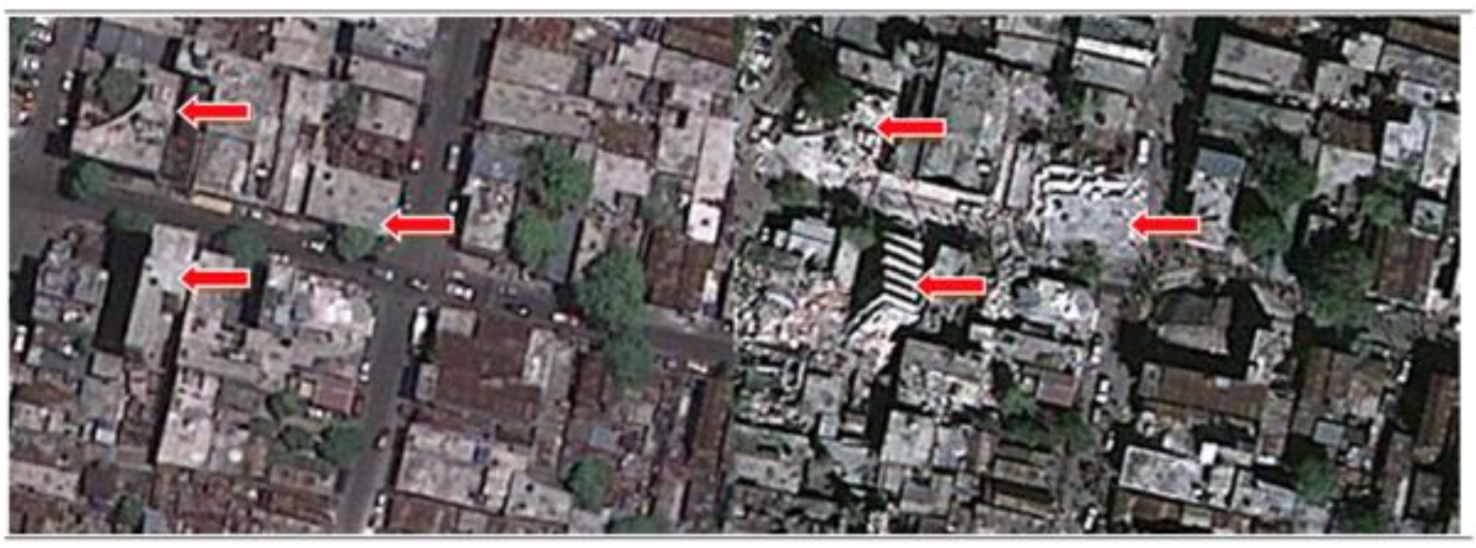
Fig. 4.1.4.1 – Example of pre (left) and post (right) imagery of damages after an Earthquake. Source: Caribbean Handbook on Risk Management, http://www.charim.net/use/94
The highest the resolution of the available imagery, the best it is for the photointerpreter, because in many cases it is difficult to be able to correctly point out the damages and, increasing the resolution, the level of visible details increases as well. When possible, it is preferred to have aerial images, which can have even higher resolution (Fig. 4.1.4.2).
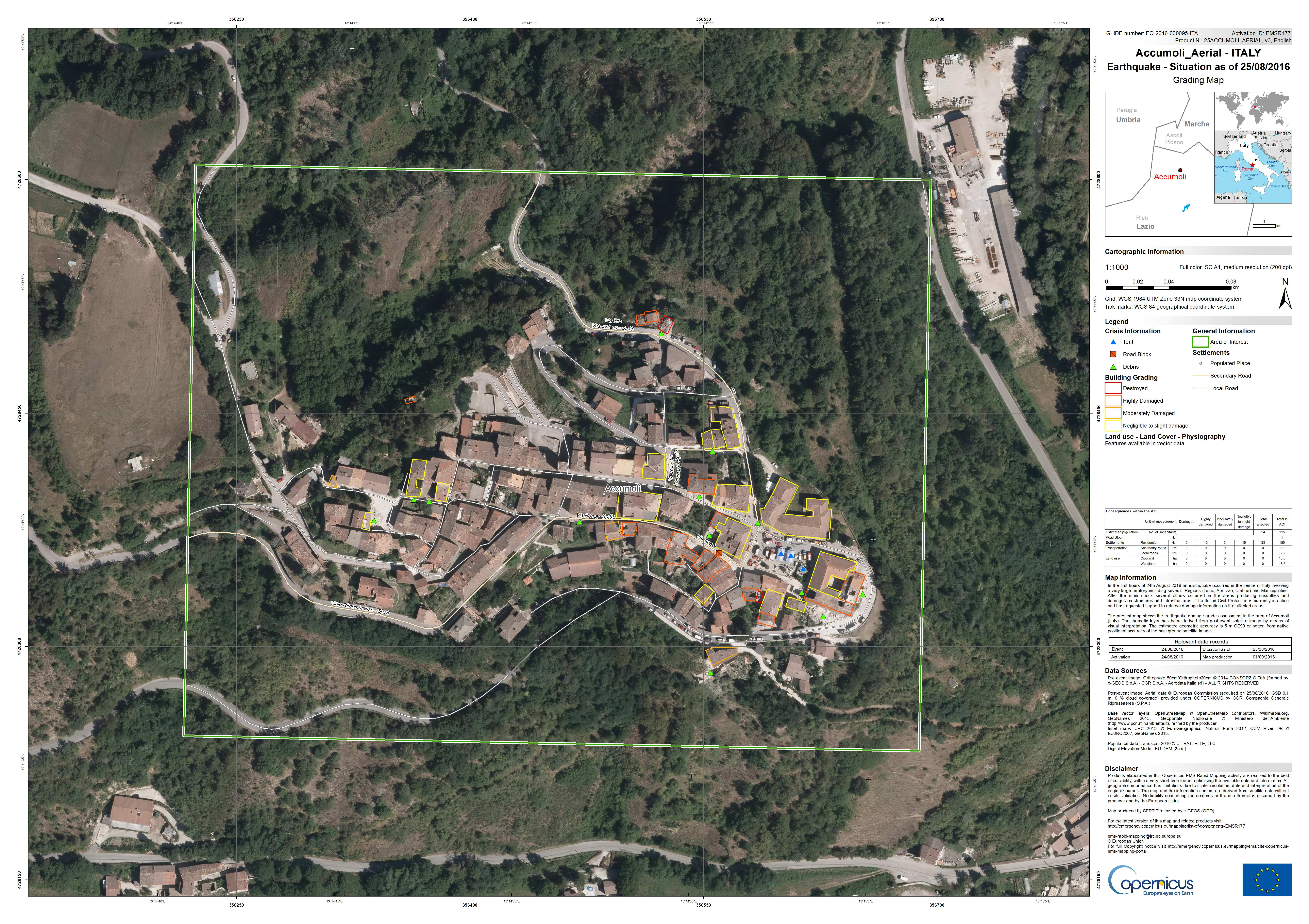
Fig. 4.1.4.2 – Example of damage assessment after an Earthquake, based on aerial imagery. NOTE: this map is based on aerial images and not on satellite ones, that’s why it is possible to see the details so well. Accumoli is an old village in central Italy, with small and old buildings that could be assessed with difficulty on a lower resolution image. https://emergency.copernicus.eu/mapping/system/files/components/EMSR177_25ACCUMOLIAERIAL_GRADING_OVERVIEW_v3_200dpi.jpg
As already anticipated, the possibility to see only the roof top of buildings is a strong limitation for damage assessment after an earthquake, because there are severe damages that can be visible only on the walls. One extreme case, showing the limitations of the top view is the “pancake effect” or also soft storey which can unfortunately occur and which consists in the collapse of one floor of the building, without the complete collapse of the building (Fig. 4.1.4.3).
Fig. 4.1.4.3 – Example of “soft storey”, corresponding to collapse of one floor of a building. Source: Teruna, Daniel & Majid, Taksiah & Budiono, Bambang. (2014).
Of course, in case of pancake or soft storey effect, the building cannot be retrofitted and must be demolished, in practice it should be labelled as “destroyed” even if the top of the building seems to be intact. Usually, crisis maps show a disclaimer, which specifies that the maps show only the damages that could be assessed on the available imagery, therefore, the map has limitations that cannot be overcome. Despite the crisis maps limitations, the feedback of the users is very positive: these maps are useful as a support during the emergency activities. In order to be able to single out these types of damages and to be able to see at least the damage visible on the external walls of buildings, it would be necessary to have access to oblique images, i.e. images that are acquired not with nadir view, but with 45° angle view (Fig. 4.1.4.4). These types of images can be acquired by aerial instruments or UAV (Unmanned Aerial Vehicles) and cannot be often available.
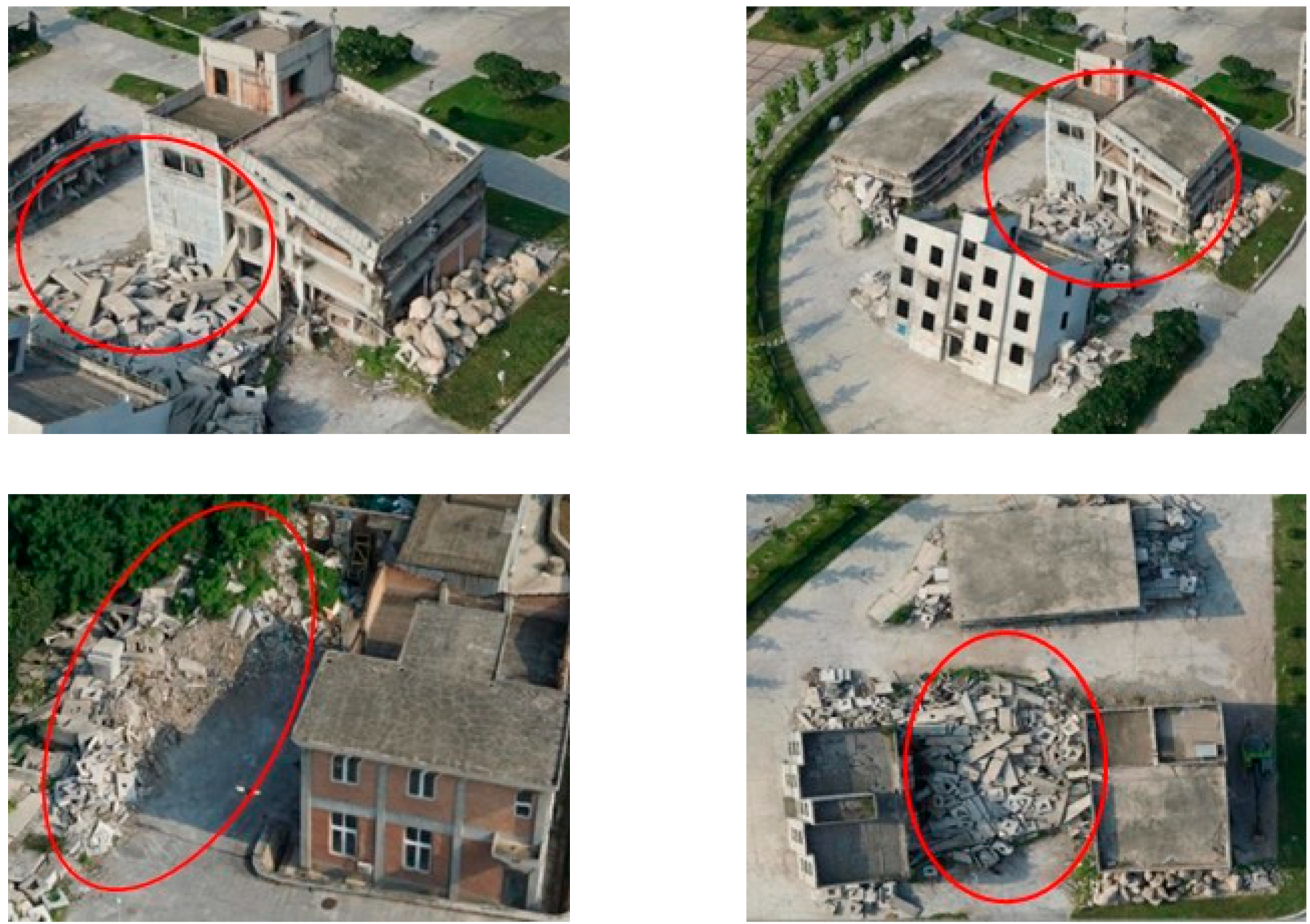
Fig. 4.1.4.4 – Examples of oblique images, acquired with UAV, showing damaged and destroyed buildings. Source: Zhang, Rui; Li, Heng; Duan, Kaifeng; You, Shucheng; Liu, Ke; Wang, Futao; Hu, Yong. 2020. “Automatic Detection of Earthquake-Damaged Buildings by Integrating UAV Oblique Photography and Infrared Thermal Imaging” Remote Sens. 12, no. 16: 2621. https://doi.org/10.3390/rs12162621
4.1.5. Crisis maps for Fires
As it has been discussed in the section dedicated to Remote Sensing, vegetation can be detected with optical satellite imagery (3.2.2.2). Healthy and dead vegetation have very different spectral signatures, due to the response of vegetation in particular in green and Near InfraRed (NIR) bands. In order to detect the extension of the burnt area after a fire event, different techniques can be considered, such as exploiting spectral indices, like the NDVI (Normalised Difference Vegetation Index, Fig. 4.1.5.1), or supervised and unsupervised classification (3.2.3.2). As anticipated, the experience of the mapper is crucial, e.g. to correctly set a threshold for the NDVI to discriminate between burnt and not burnt areas or to select the training sets for the classification algorithm to detect healthy vegetation and burnt areas. To perform these steps, visual interpretation is crucial.
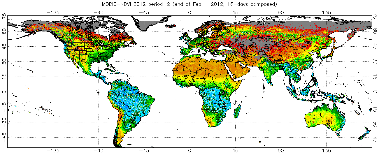
Fig. 4.1.5.1 – Example of global map of NDVI Source: https://www.star.nesdis.noaa.gov/smcd/emb/vci/VH/modis_browse16daysNDVI.php
Fires evolve and spread fast, so, unless the fire has already extinguished, the monitoring of its expansion could be needed. Consider that fires can produce a lot of smoke, which could affect the visibility during the fire event. However, in majority of cases, during the satellite image triggering and acquisition, the fire could have stopped spreading, so, unless there are clouds, the burnt area should be visible on the satellite image. An advantage when detecting fires is represented by the fact that the burnt scar stays for some time as it is, until new vegetation grows, so even a satellite image acquisition which follows the fire of some days can be suitable.
Fig. 4.1.5.2 shows InfraRed False Colour images (3.3.1.2) pre and post a fire event. As it is known, in this representation the red colour represent healthy vegetation, while where the red colour has disappeared in the post event image, the burnt scar is present.
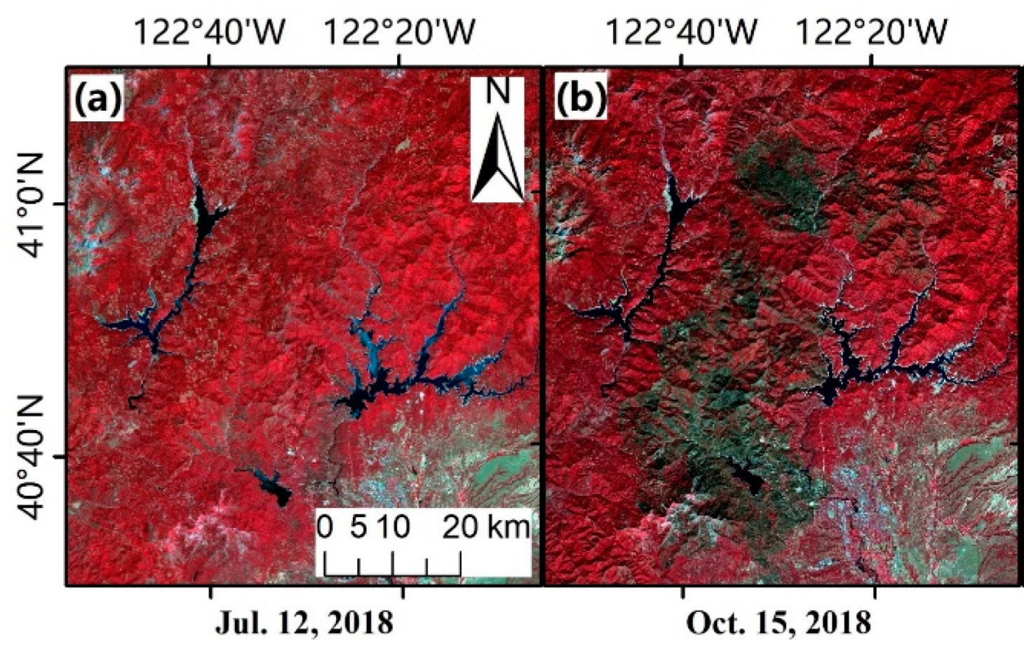
Fig. 4.1.5.2 – Example of satellite images displayed in infrared false colour (3.3.1.2) pre and post a fire event. Source: Liu, Meng; Popescu, Sorin; Malambo, Lonesome. 2020. “Feasibility of Burned Area Mapping Based on ICESAT−2 Photon Counting Data” Remote Sens. 12, no. 1: 24. https://doi.org/10.3390/rs12010024. Satellite images visualized as false color composites (Near Infrared-Red-Green): (a) pre-fire Sentinel−2 image on July 12, 2018, (b) post-fire Sentinel−2 image on October 15, 2018, in northern California.
The delimitation of the burnt scar can be done with semi-automatic procedures (e.g. exploiting the NDVI and/or image classification) or manually digitizing after photointerpretation, in order to produce the crisis map (see an example of crisis map for a fire event in Fig. 4.1.5.3). The NDVI can be exploited to discriminate between healthy vegetation and burnt areas, singling out a threshold between the two, again, thanks to visual interpretation and the experience of the operator.
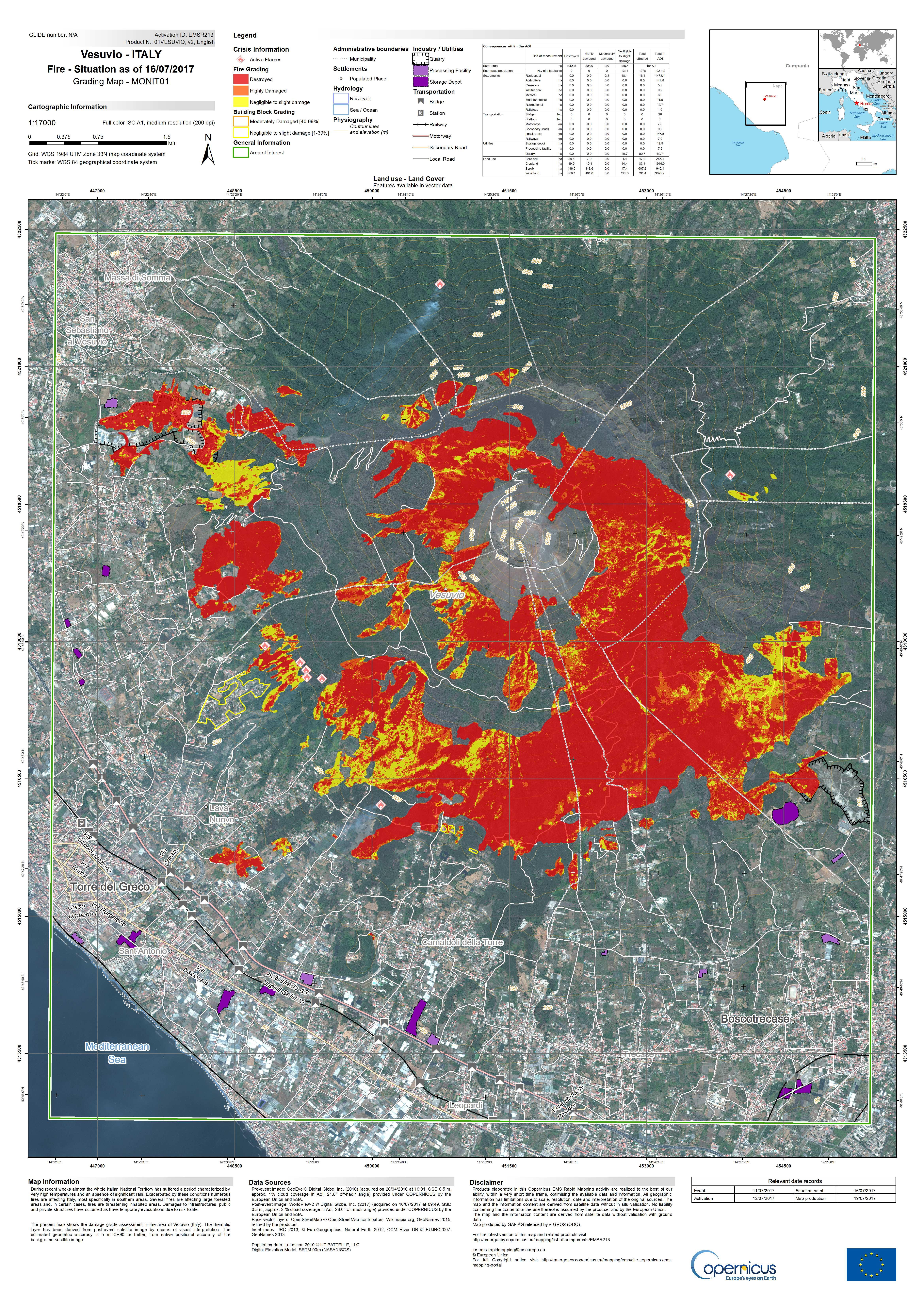
Fig. 4.1.5.3 – Example of crisis map for a fire event. Source: https://emergency.copernicus.eu/mapping/ems-product-component/EMSR213_01VESUVIO_02GRADING_MONIT01/2
4.1.6. Crisis maps for Floods
In case of flood events, usually the main aim of a crisis map is to delineate the flooded area, i.e. the presence of water in places where it is not normally present. In fact, when producing a crisis map for a flood event, the areas which are normally covered in water (e.g. river beds or lakes) should not be included in the flood extent, but should be marked in a different way (Fig. 4.1.6.1).
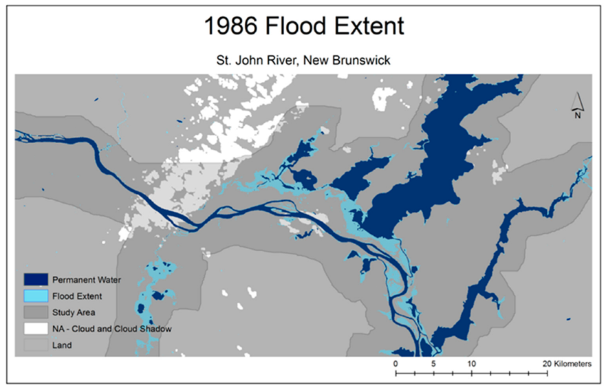
Fig. 4.1.6.1 – Example of map showing permanent waters and flood extent. Source: Olthof, Ian. 2017. “Mapping Seasonal Inundation Frequency (1985–2016) along the St-John River, New Brunswick, Canada using the Landsat Archive” Remote Sens. 9, no. 2: 143. https://doi.org/10.3390/rs9020143
Flood can come also with other types of damages, in particular, if the flood is due to a typhoon, a very heavy storm or a tsunami, also buildings and other types of structures could be affected. In that case, in order to detect also those types of damages, the same principles described for earthquakes should be applied.
In this section, we are going to discuss how to detect the water presence and, consequently, the flooded area on a satellite image.
SAR (Synthetic Aperture Radar) and flood mapping
Often, flooded areas are detected on SAR (Synthetic Aperture Radar) imagery, which are not treated in this Document. SAR images have very different characteristics with respect to Optical ones (optical satellite imagery was introduced in chapter 3). We limit our discussion saying that SAR images are not affected by the presence of clouds, because radar waves pass through them and saying that water can be “quite easily” detected on SAR images because water looks black on a SAR image. Of course also these types of images have limitations, in fact, for example, shadows look black as well and it is very difficult to detect flooded areas in urban areas due to the presence of buildings.
The acquisition of suitable optical satellite imagery for a flood event can be very difficult, first of all because of the possible cloud coverage. In fact, often floods are due to meteorological events which could lead to the presence of clouds for many days. In addition, a flood event rapidly evolves over time: water extent grows, reaches a peak, then recedes. The speed of these variations can be very different from case to case, ranging from hours to days. It could happen that a suitable optical satellite image is available only when the water presence is very different with respect to the peak (for this reason, often SAR images are preferred, not being very much affected by the presence of clouds). In some cases, flood traces can be visible even after the event, for example, vegetation or crops could have changed their look due to the fact that they have been soaked with water, or the terrain could still be very wet and look different on the satellite image with respect to dry terrain.
When suitable optical imagery is available, in particular if it is possible to access images with an acceptable level of cloud coverage, the flood delineation can be performed. In this case, similarly to the case of burnt area detection, both spectral indices (e.g. Normalised Difference Water Index, NDWI, see 3.2.2.2) and supervised or unsupervised classification can be exploited. Also in this case, when considering and index, the thresholding definition and the training and test sets selection are very important steps which rely on the experience of the mapper.
Fig. 4.1.6.2 shows multispectral satellite imagery and the NDWI computed with those images: it is possible to see how the presence of water is highlighted (corresponding to blue colour) by the NDWI.
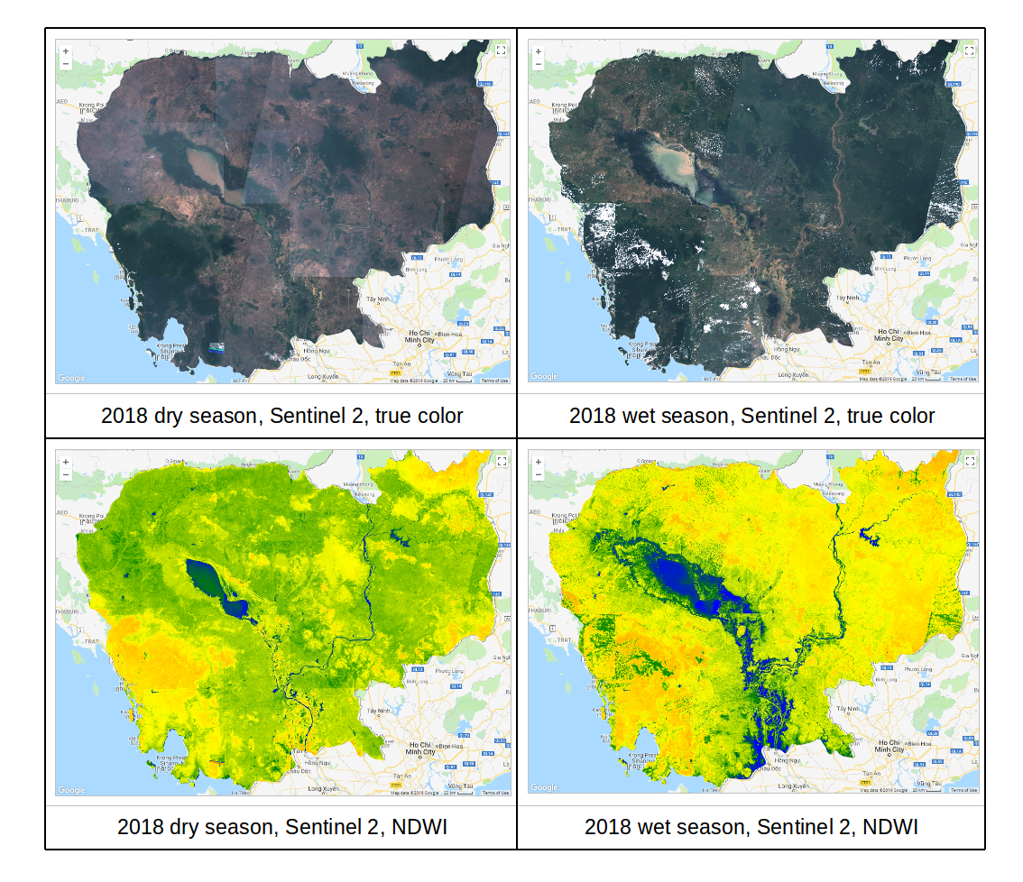
Fig. 4.1.6.2 – Satellite images and corresponding NDWI for different seasons and different presence of water (blue colour). Source: https://mygeoblog.com/2019/04/29/cambodia-2-flood-mapping-using-sentinel-2/ Processed in Google Earth Engine
Fig. 4.1.6.3 shows satellite optical images acquired during different phases of the flood event: it is possible to see the different amount of water which is present. Fig. 4.1.6.4 shows the inundated areas detected on these images exploiting the NDWI.
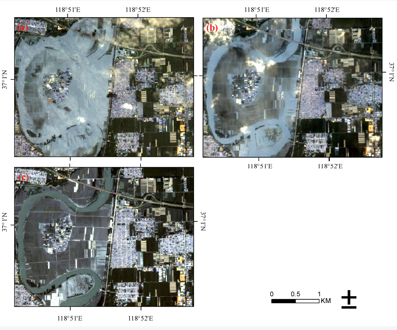
Fig. 4.1.6.3 – Planet images in the studied area on 20 August 2018 (a), 21 August 2018 (b) and 27 August 2018 (c). Source: Huang, Minmin; Jin, Shuanggen. 2020. “Rapid Flood Mapping and Evaluation with a Supervised Classifier and Change Detection in Shouguang Using Sentinel-1 SAR and Sentinel-2 Optical Data” Remote Sens. 12, no. 13: 2073. https://doi.org/10.3390/rs12132073
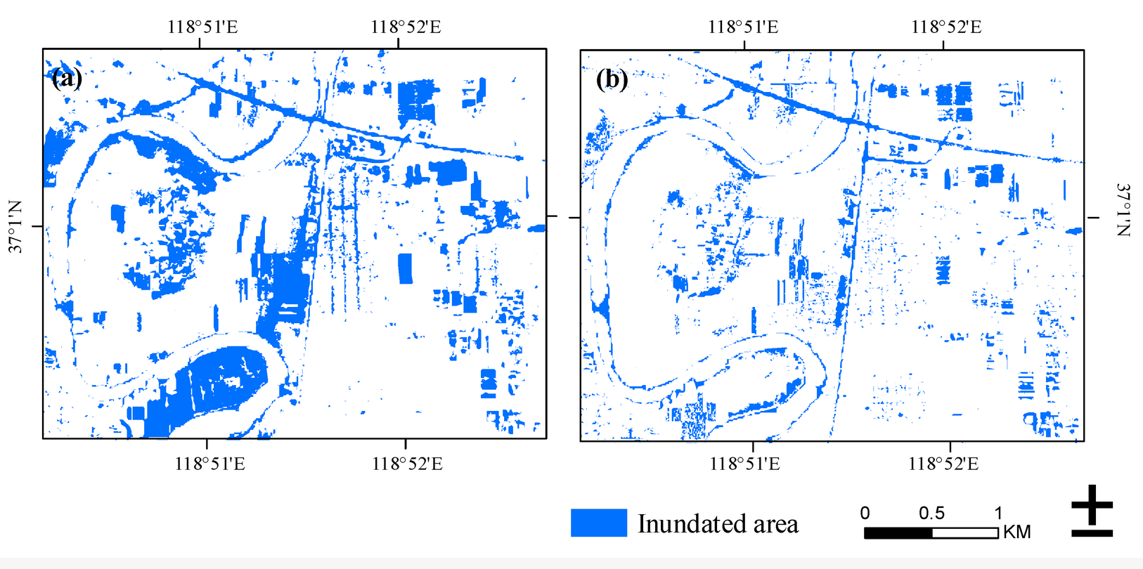
Fig. 4.1.6.4 – Flood map produced by normalized difference water index (NDWI) on 21 August 2018 (a) and 27 August 2018 (b). Source: Huang, Minmin; Jin, Shuanggen. 2020. “Rapid Flood Mapping and Evaluation with a Supervised Classifier and Change Detection in Shouguang Using Sentinel-1 SAR and Sentinel-2 Optical Data” Remote Sens. 12, no. 13: 2073. https://doi.org/10.3390/rs12132073
Flood can be detected as well exploiting supervised or unsupervised classification algorithms, an example is visible in Fig. 4.1.6.5. Then, after the processing, the flooded area must be extracted. Fig. 4.1.6.6 shows an example of crisis map for a flood event.
Fig. 4.1.6.5 – Flood mapping with supervised classification. Source: Shahabi, Himan et al., Flood Detection and Susceptibility Mapping Using Sentinel-1 Remote Sensing Data and a Machine Learning Approach: Hybrid Intelligence of Bagging Ensemble Based on K-Nearest Neighbor Classifier, Remote Sens. 2020, 12(2), 266; https://doi.org/10.3390/rs12020266
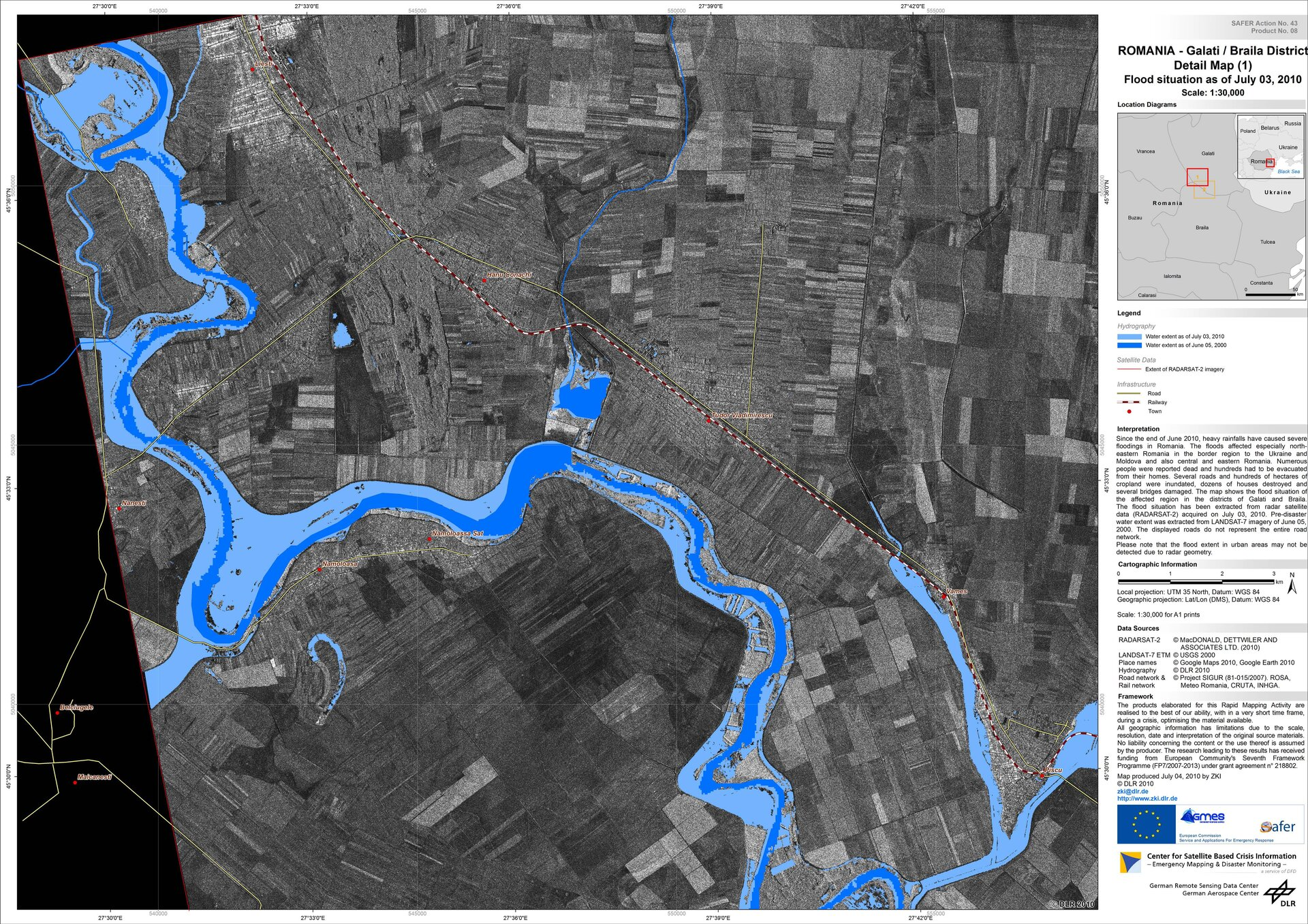
Fig. 4.1.6.6 – Example of crisis map for a flood event. https://www.esa.int/ESA_Multimedia/Images/2012/05/Danube_flood_mapping
4.1.7. Crisis maps validation
Validation is a very important step of data production. Data quality parameters (3.2.4), such as positional and thematic accuracy, completeness and consistency, should be assessed on every mapping product. The best way for validating data is with “ground truth”, e.g. up to date data acquired in field that can be considered as a reference. In principle, every crisis map should be validated with ground truth. It is easy to understand that this is not possible for all events for which crisis maps are produced, in particular in real time, due the difficulties in accessing the area of the disasters, the costs and the time constraints. For this reason, not all products are validated, some of them are, on a sample basis. In this case, dedicated teams are sent in field in order to acquire the needed data. However, all maps are quality controlled, concerning all parameters that do not need data coming from the field, such as map readability, completeness and consistency of legend items, correctness of interpretation text and of the cartographic representation, consistency among map scale and satellite imagery.
Supplementary info
If you are interested in deepening the topic of crisis map validation you can refer to the Join Research Centre Validation Protocol for Emergency Response Geo-information Products https://ec.europa.eu/jrc/en/publication/eur-scientific-and-technical-research-reports/validation-protocol-emergency-response-geo-information-products
4.1.8. Early warning and monitoring services
In addition to the crisis mapping, Copernicus EMS delivers services for early warning and monitoring of fires, floods and drought. Let’s introduce these services one by one. These services are also included in the Copernicus EMS activation workflow (Fig. 4.1.8.1).
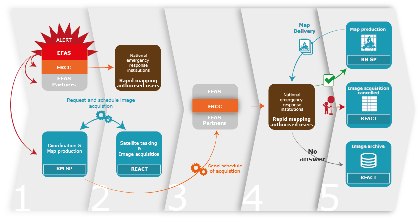
Fig. 4.1.8.1 – The early warning and monitoring services integration in Copernicus EMS workflow. Source: https://emergency.copernicus.eu/mapping/ems/linking-early-warning-systems
4.1.9. European Flood Awareness Systems (EFAS) and Global Flood Awareness Systems (GloFAS)
European Flood Awareness Systems (EFAS, https://www.efas.eu) and Global Flood Awareness Systems (GloFAS, https://www.globalfloods.eu/) are two similar services, dedicated to flood early warning and monitoring, at two different scales: EFAS is focused on Europe, while GLOFAS is a global service, mapping the whole world. In the following, we are focusing on EFAS.
National or regional authorities can become partners and have access to real time information from EFAS. EFAS operations are coordinated by the Joint Research Centre of the European Commission, other partners take care of collecting meteorological information, processing data to provide forecasts and collecting information about real time water discharge and water level data. Thanks to EFAS, it is possible to put in place the necessary the preparedness measures to better face upcoming events. The EFAS dissemination service sends notification information about high probability of flooding.
On the Web interface (Fig. 4.1.9.1) of the Service it is possible to find several information layers:
- Flood Summary layers, on current and past flood situations
- Hydrological layers, maps of forecasts
- Flash flood layers, warnings based on the Enhanced Runoff Index, based on climatological data
- Initial conditions layers, displays background information e.g. simulated soil moisture or snow water equivalent
- Meteorological layers, accumulated rainfall
Forecasts are coming from the German Weather Office and ECMWF(European Centre for Medium-Range Weather Forecasts). EFAS early warning can be used to trigger Copernicus EMS Rapid Mapping.
GLOFAS is a similar service and has a similar Web map interface (Fig. 4.1.9.2).
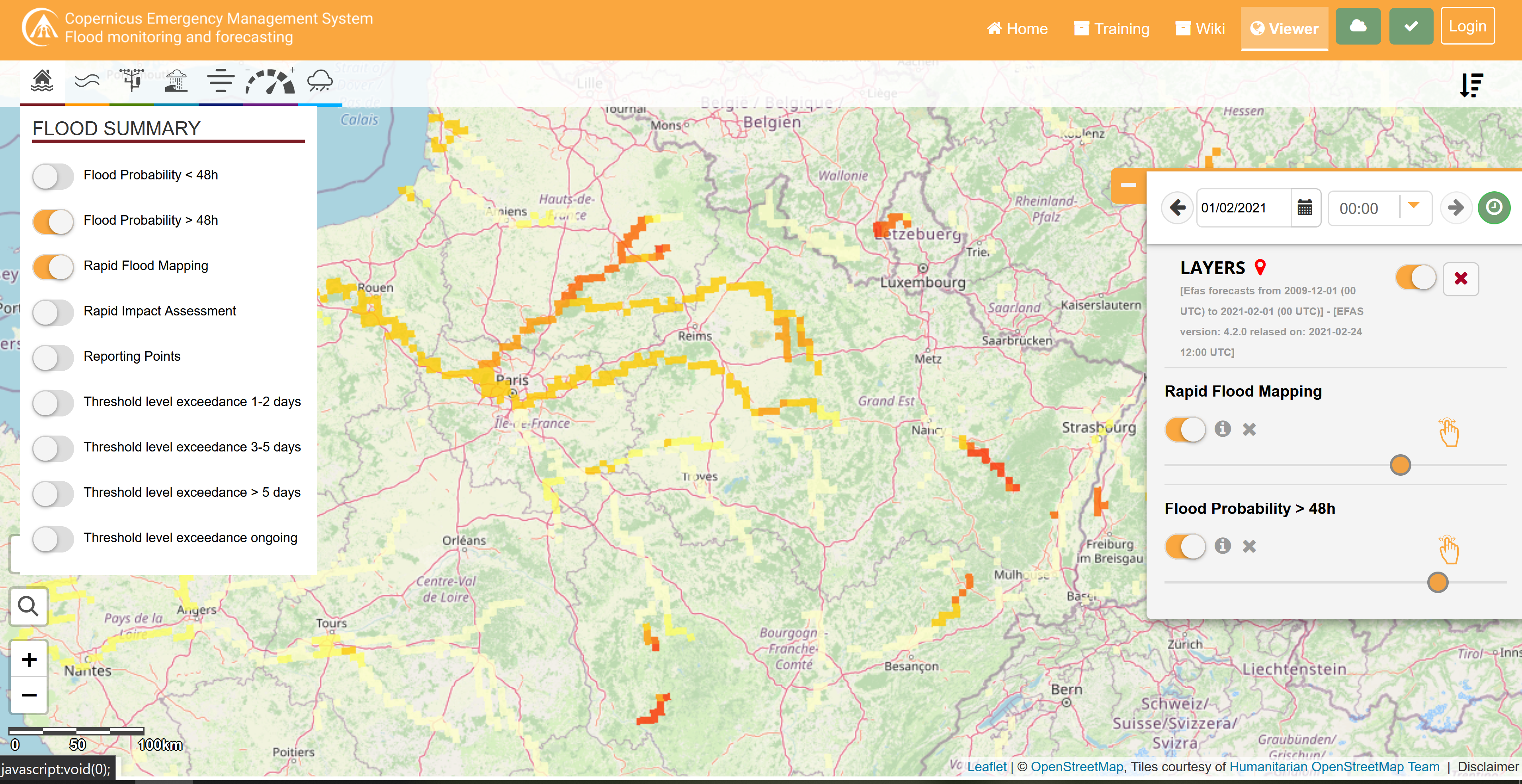
Fig. 4.1.9.1 – EFAS Web map interface. Source: https://www.efas.eu/efas_frontend/#/home
Supplementary info
If you are interested, you can watch this video about EFAS https://www.youtube.com/watch?v=rL84noOfy_U&feature=youtu.be or this video about GLOFAS https://www.youtube.com/watch?v=s2YaDjvMt-8&pbjreload=101
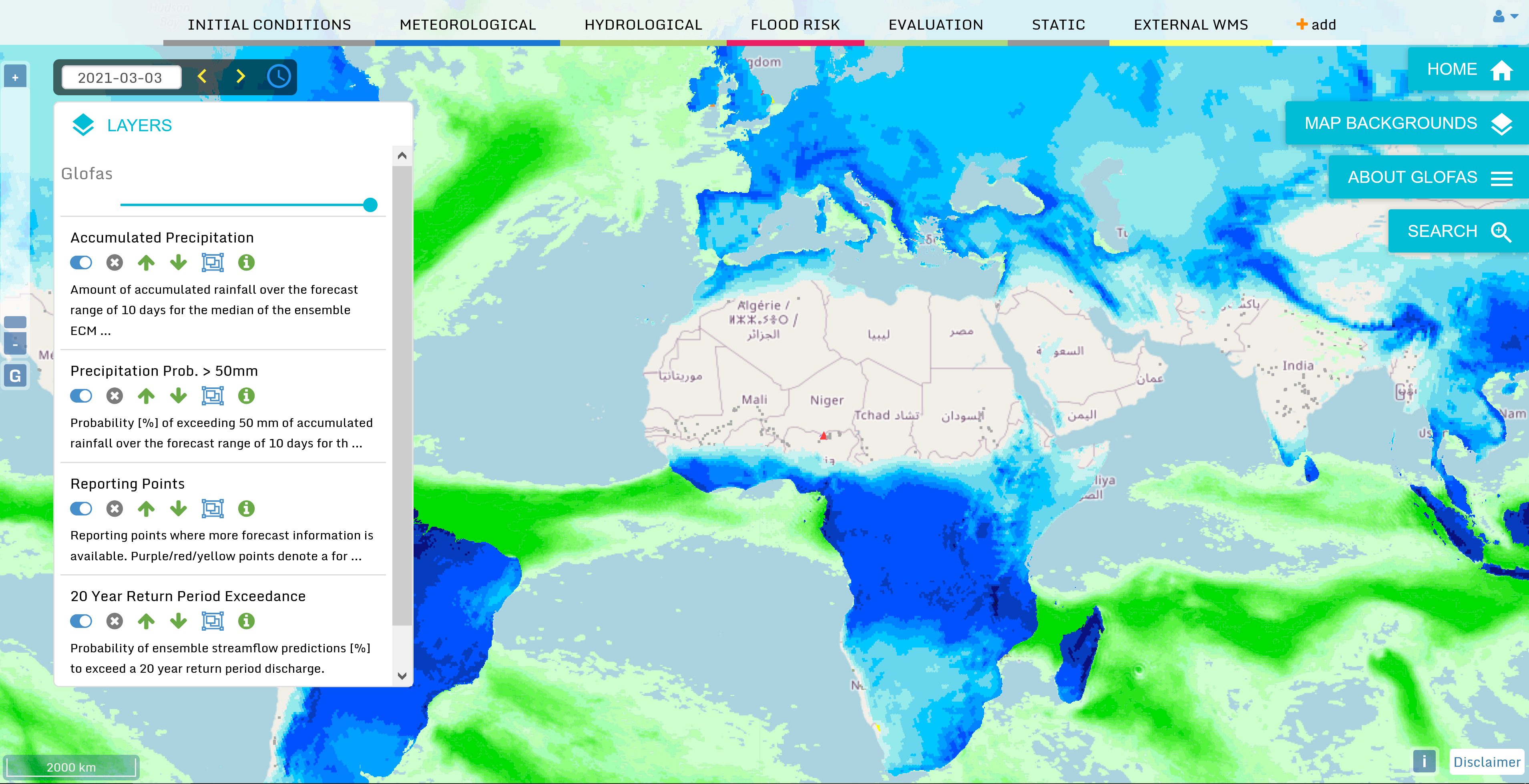
Fig. 4.1.9.2 – EFAS Web map interface. Source: https://www.globalfloods.eu/glofas-forecasting/
4.1.10. European Forest Fire Information System (EFFIS) and Global Wildfire Information System (GWIS)
European Forest Fire Information System (EFFIS) and Global Wildfire Information System (GWIS) are two additional services provided by Copernicus EMS, providing fire events monitoring and archive of past events for Europe (EFFIS) and the whole world (GWIS).
EFFIS is an early warning system for forest fires. The service includes fire forecast, fire detection and ongoing fire monitoring. With respect to the post event phase, the following data are made available: burnt area maps, land cover damage assessment, emission assessment, potential soil erosion and vegetation regeneration. The fire danger forecast provides short and long term fire danger forecast, as well as monthly and seasonal fire forecast. The service is able to show and monitor active fires, thanks to the detection of hot spots (in thermal infrared band) from MODIS (1 km spatial resolution) and VIIRS (375 m spatial resolution). The data are constantly updated (6 times a day) and the processed data are made available 2-3 hours after the image acquisition (https://effis.jrc.ec.europa.eu/about-effis/technical-background/active-fire-detection). In addition, the service provides maps of burnt areas mapping, relying on medium (mainly MODIS and VIIRS) to high resolution satellite imagery.
EFFIS (Fig. 4.1.10.1) and GWIS (Fig. 4.1.10.2) data can be exploited in different ways:
- To monitor fires in almost real time
- To explore the archive of past events (Fig. 4.1.10.3 and Fig. 4.1.10.4)
- To analyse the spatial distribution of events over time
- To produce risk maps, combining the fire information with land cover and urban areas distribution.
The interface and the typology of the available data for EFFIS is very similar to GWIS ones.
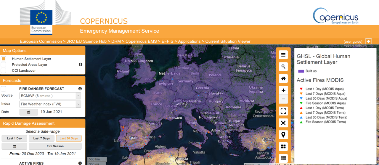
Fig. 4.1.10.1 – The EFFIS current situation viewer allows for selecting different background layers, fire danger forecast, damage assessment (active fires, burnt areas and fuels) based on MODIS and VIIRS (for last 1 day, 7 days or 30 days or regarding the fire season). https://effis.jrc.ec.europa.eu/static/effis_current_situation/public/index.html
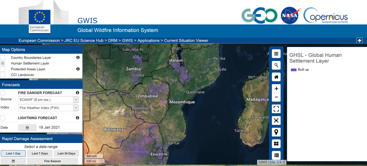
Fig. 4.1.10.2 – The GWIS current situation viewer allows for selecting different background layers, fire danger forecast, damage assessment (active fires, burnt areas and fuels) based on MODIS and VIIRS (for last 1 day, 7 days or 30 days or regarding the fire season). https://gwis.jrc.ec.europa.eu/static/gwis_current_situation/public/index.html
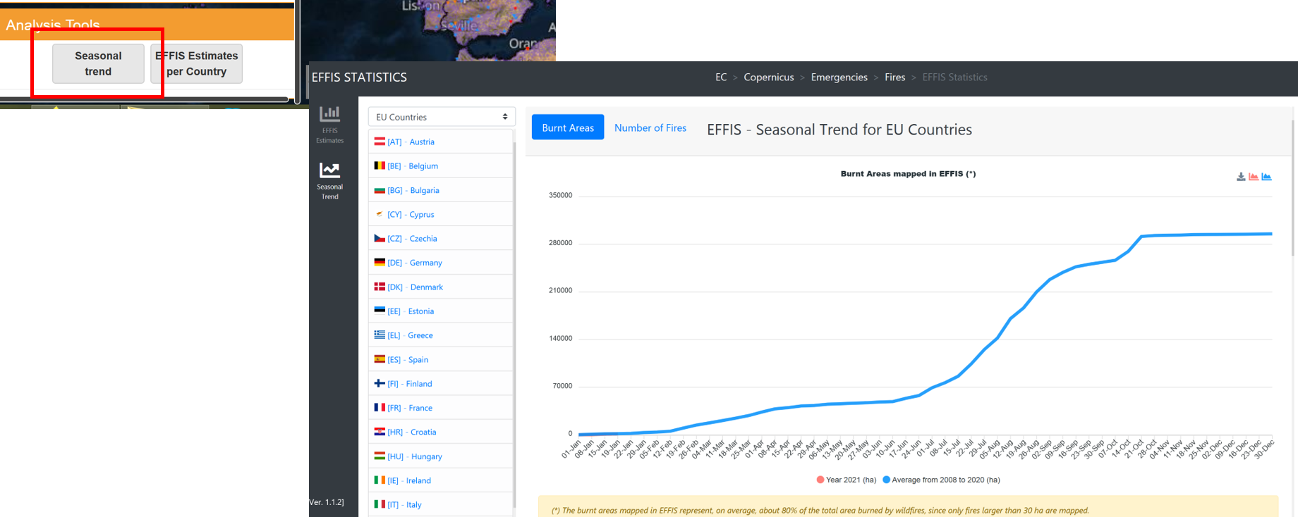
Fig. 4.1.10.3 – The EFFIS current situation viewer allows also to access analysis tools showing seasonal trends and EFFIS Estimates per Country (https://effis.jrc.ec.europa.eu/static/effis_current_situation/public/index.html)
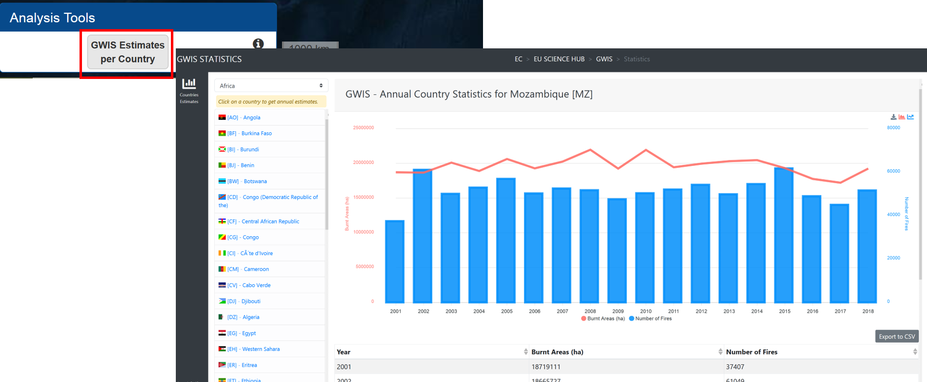
Fig. 4.1.10.4 – The GWIS current situation viewer allows also for accessing analysis tools showing estimates of statistics per Country https://gwis.jrc.ec.europa.eu/static/gwis_current_situation/public/index.html
Supplementary info
If you are interested, you can watch this video about EFFIS https://www.youtube.com/watch?v=s_rymArjxCc
PLEASE NOTE: Most of these analyses can be performed directly on the Web applications, another option is to download the data and process them in a GIS software or to load a Web Service, such as a WMS or WMST, into the desktop GIS.
4.1.11. European Drought Observatory (EDO) and Global Drought Observatory (GDO)
European Drought Observatory (EDO) and Global Drought Observatory (GDO) provide monitoring and early warning for the Drought phenomenon over Europe and the whole world respectively. Drought is a critical phenomenon linked to precipitation deficiency and prolonged shortages of water which can have significant impacts on human life and activities. EDO Web Service provides drought indicators for Europe which can be displayed on a map (Fig. 4.1.11.1). The indicators provide information about precipitation, soil moisture, conditions of vegetation, hydrological streamflow and temperature. The service allows to explore the current situation as well as the forecast and the available time series, which can be analysed thanks to the available plot tools.
The interface and the available tools are similar for the GDO (Fig. 4.1.11.2).
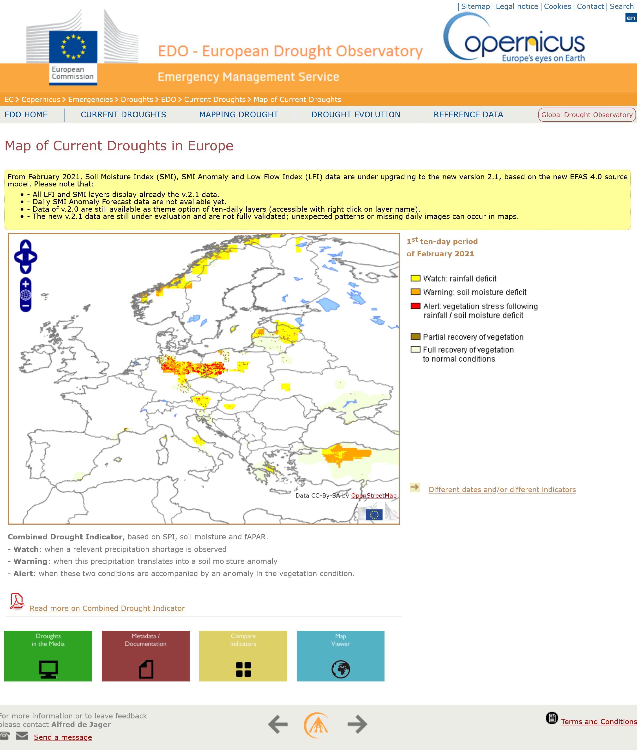
Fig. 4.1.11.1 – The EDO Web map interface. Source : https://edo.jrc.ec.europa.eu/edov2/php/index.php?id=1052
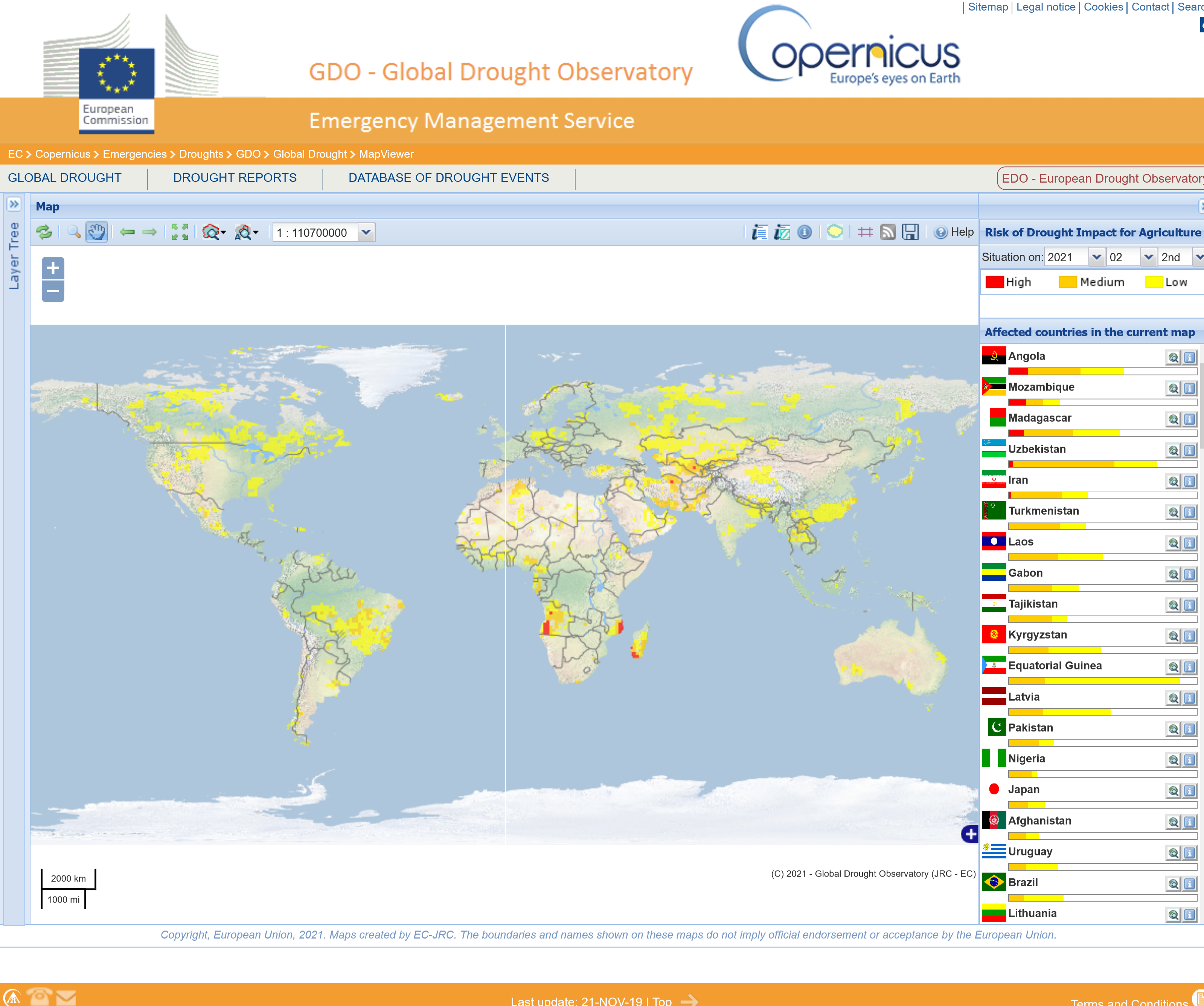
Fig. 4.1.11.2 – The GDO Web map interface Source: https://edo.jrc.ec.europa.eu/gdo/php/index.php?id=2001