3.2. Principles of image analysis
3.2.1. The spectral signature
3.2.1.1. What is a spectral signature
Each natural and manmade material reflects the sunlight depending on its chemical composition, physical properties, texture, moisture, surface roughness, and alteration or degradation state.
This reflected sunlight is called reflectance and is represented with the symbol \(\rho\).
In other words, the material’s properties and status define the brightness (i.e. the reflectance) of the “colours” (i.e. the wavelengths) sensed in the different “lights” (i.e. the spectral bands).
This variation of reflectance with wavelengths is called spectral signature.
Since each material has a unique spectral signature (like a fingerprint), that means:
- If we know the object material, we can use its spectral signature to monitor health status or degradation (for more details see Spectral indices for environmental monitoring. For exercises see Monitoring lake’s trophic state (difficulty: advanced) and Monitoring crops’ vegetative stage (difficulty: easy)),
- If we don’t know the object material, we can use its spectral signature for its identification (for more details see Automatic land cover mapping. For exercises see Mapping crop types (difficulty: intermediate)).
3.2.1.2. Land cover vs land use
Land cover describes the information on different physical coverage of the Earth’s surface.
Example of land cover classes are:
- Farmlands,
- Glaciers,
- Urban areas,
- Forests,
- Lakes.
A very efficient method to determine the land cover is analysing satellite images.
On the other hand, land use describes how people use the land and which activities people do in a specific land cover type.
Some examples of land use classes are:
- Recreational,
- Residential,
- Commercial,
- Industrial.
Fig. 3.2.1.1 shows the difference between land cover and land use.
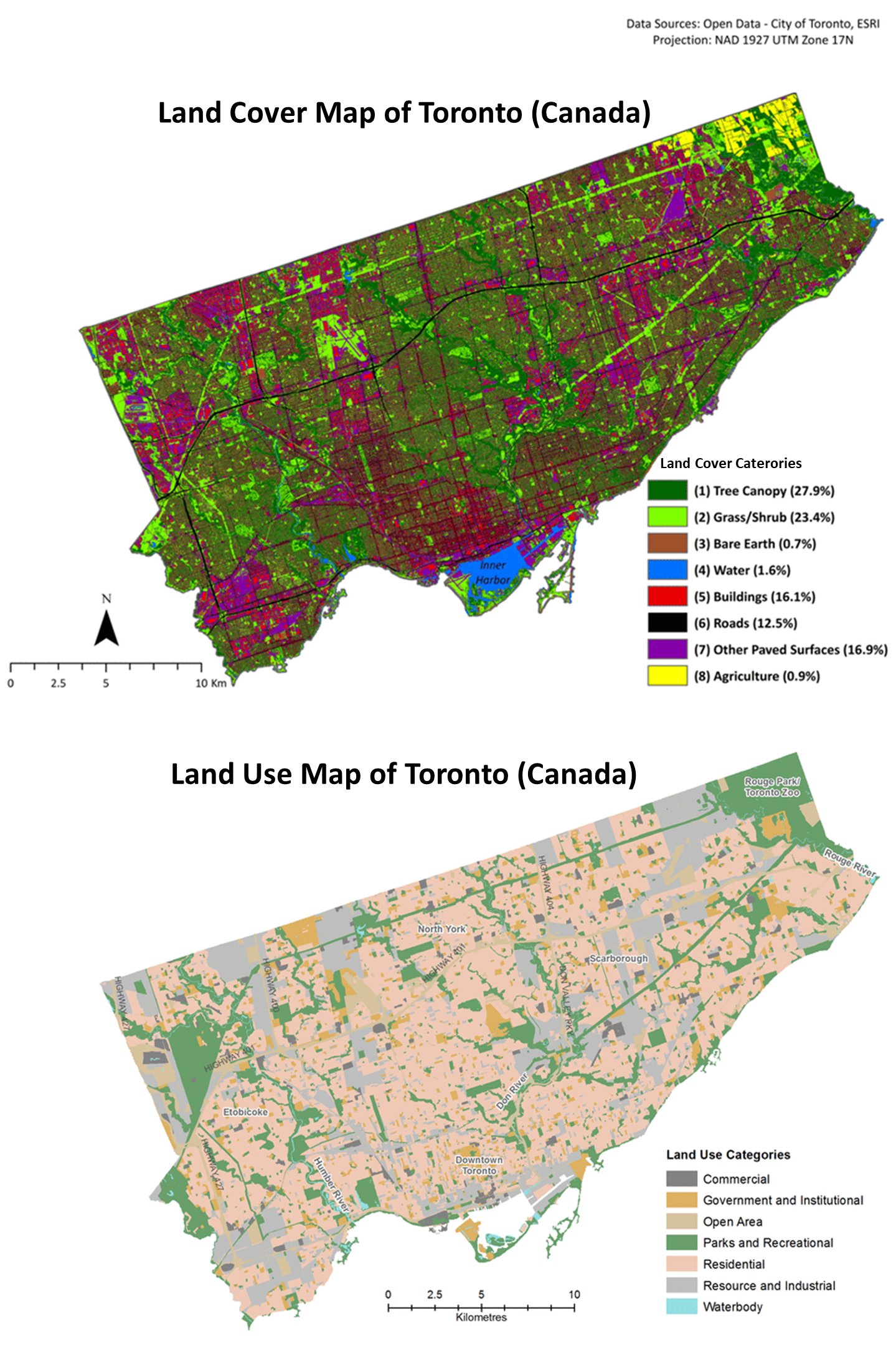
Fig. 3.2.1.1 Land cover map vs land use map for the city of Toronto, Canada (credit: open data - City of Toronto, ESRI).
Warning
Remote sensing systems can provide information only on the physical coverage. Thus land use CANNOT be determined by analysing satellite images.
3.2.1.3. Spectral signatures of the main macro land cover classes
When studying the Earth’s ecosystems, we are interested in monitoring our planet’s changes. Fig. 3.2.1.2 shows the distribution of the main macro land covers on Earth.
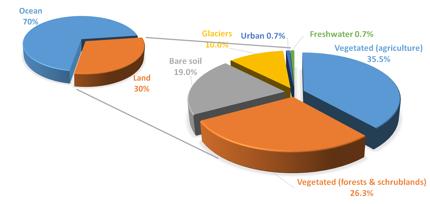
Fig. 3.2.1.2 Distribution of main land covers on Earth.
Thus, we use satellites to study how such land covers’ spectral signatures change in time.
Fig. 3.2.1.3 - Fig. 3.2.1.8 show the typical spectral signatures of the main macro land covers.
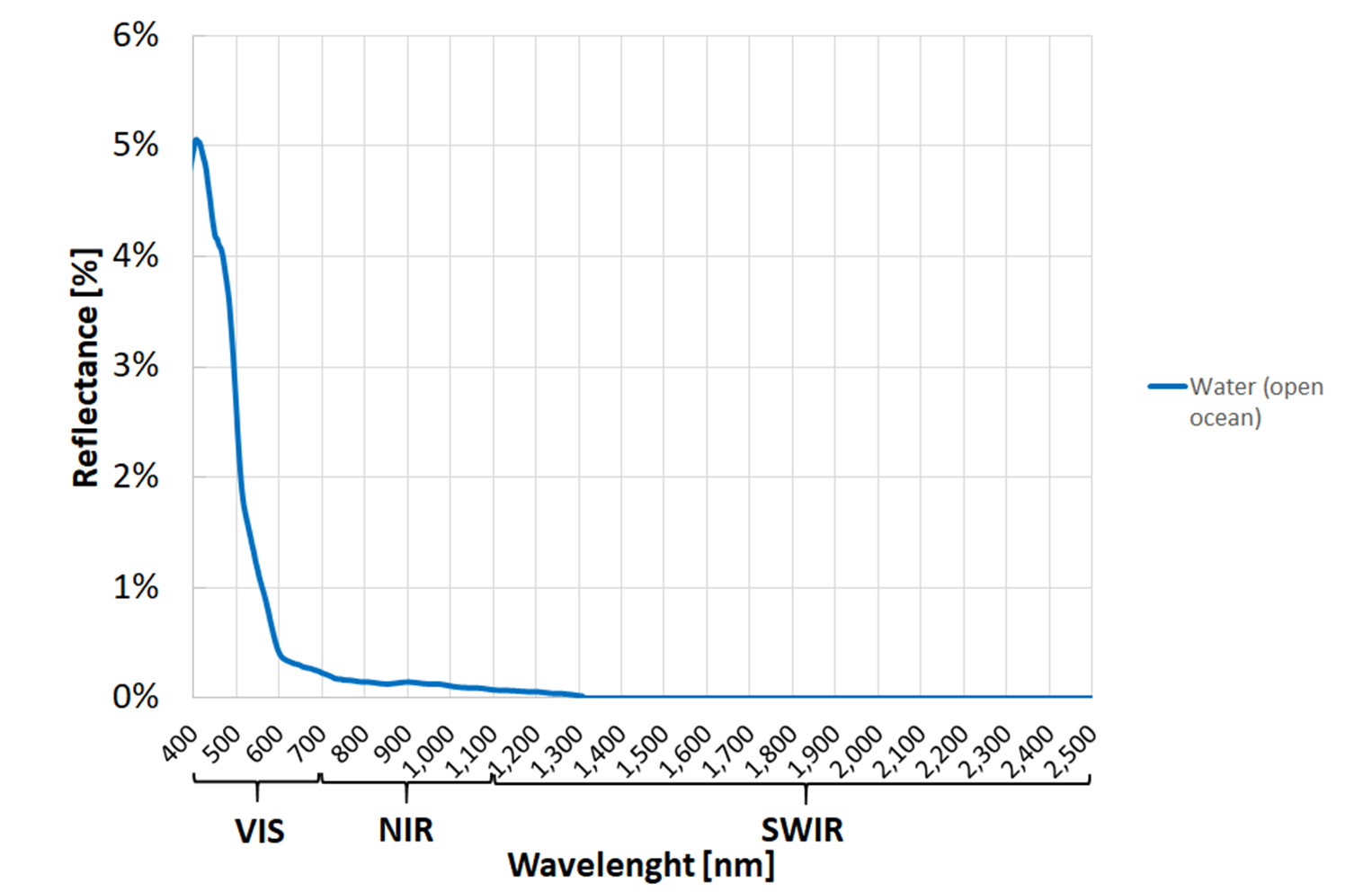
Fig. 3.2.1.3 Typical spectral signature of clear water (open Ocean).
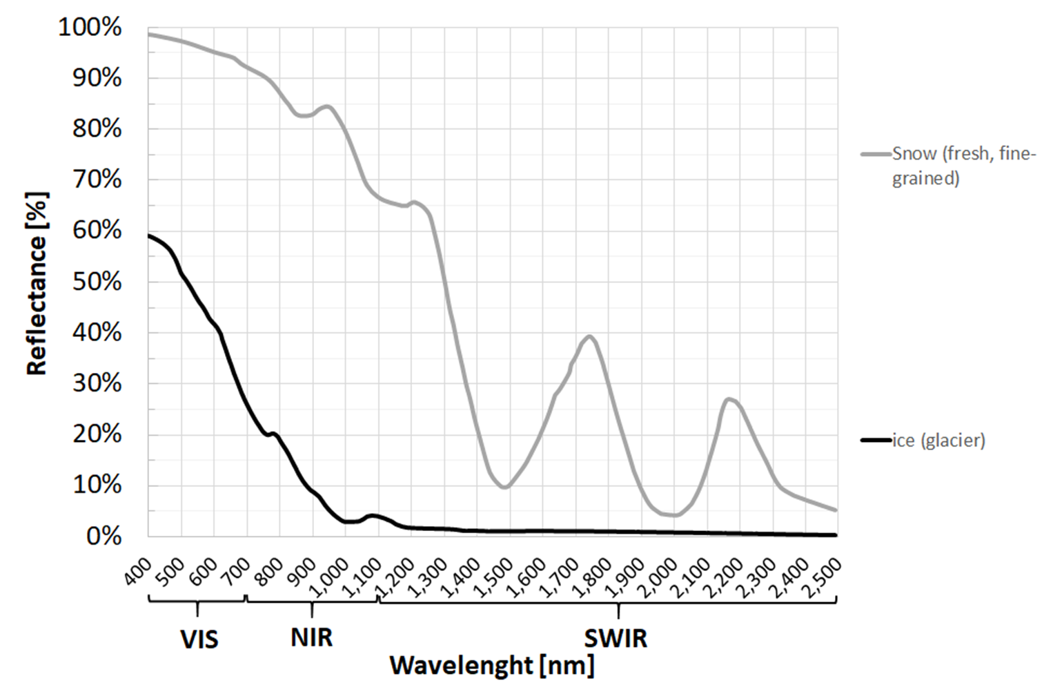
Fig. 3.2.1.4 Typical spectral signatures of snow and ice.
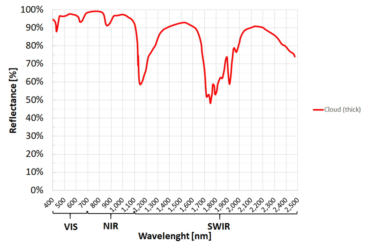
Fig. 3.2.1.5 Typical spectral signature of clouds.
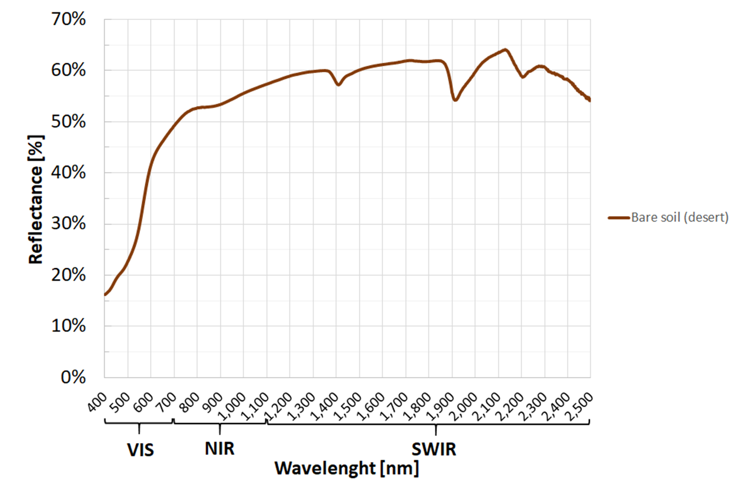
Fig. 3.2.1.6 Typical spectral signature of bare soil (unvegetated).
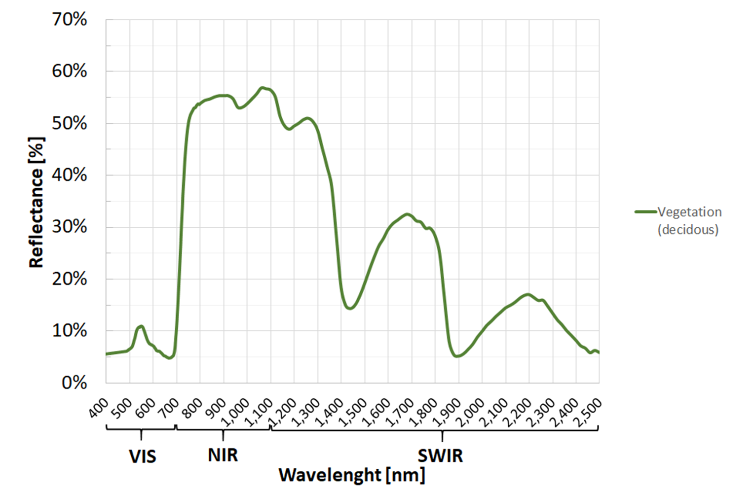
Fig. 3.2.1.7 Typical spectral signature of healthy vegetation.
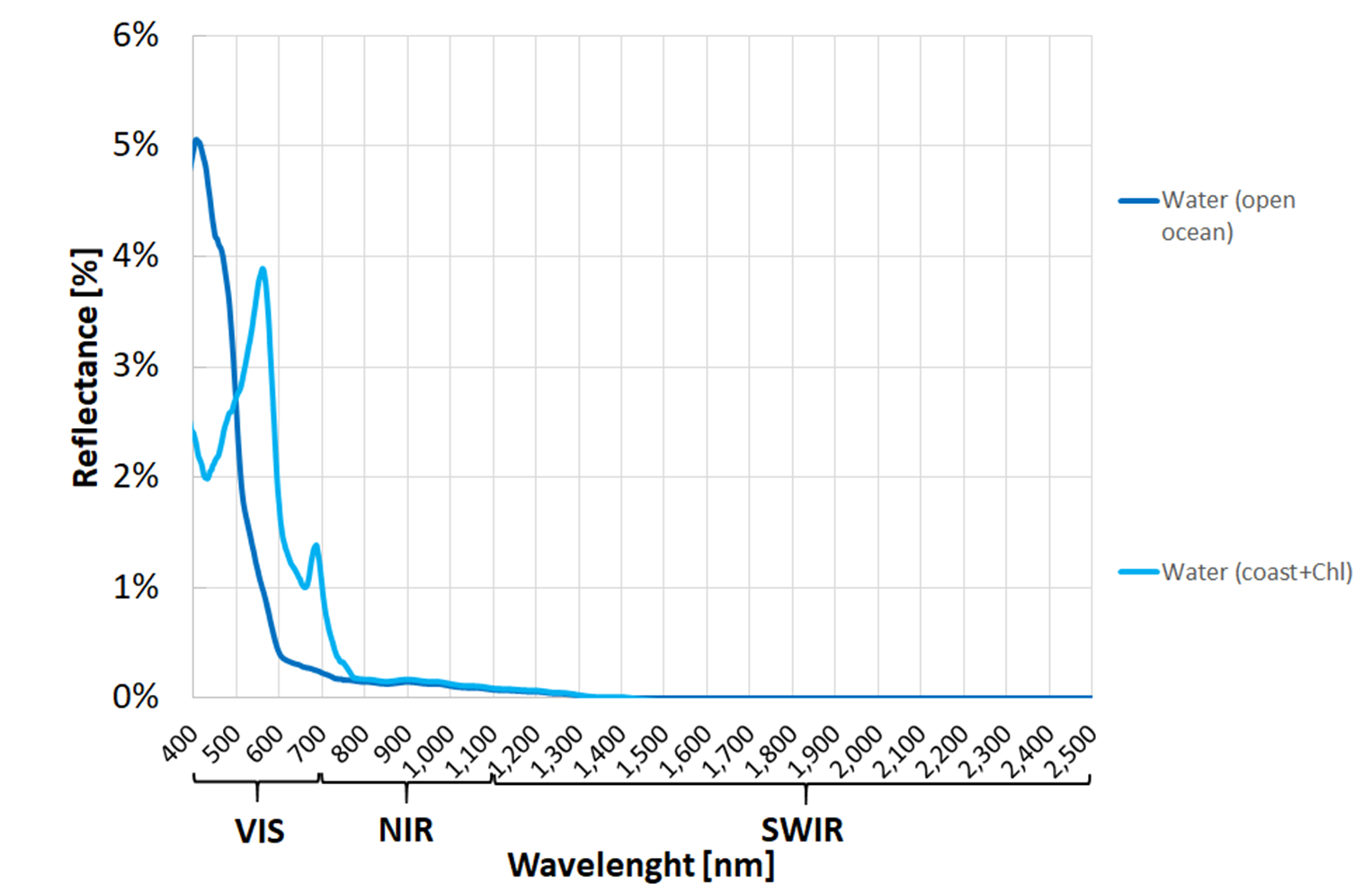
Fig. 3.2.1.8 Typical spectral signatures of clear water (open Ocean) and polluted water (coastal water with chlorophyll content).
Note
The acquisition of images in the VISIBLE, NEAR INFRARED, and SHORT-WAVE INFRARED spectral bands and the analysis of their spectral signatures is the principles of multispectral Earth observation.
Hint
Small activity
Try the Remote Sensing Virtual Lab to see the spectral signatures of the land covers (cretits: Karen Joyce).
3.2.1.4. How to measure spectral signatures with satellites
Remember that satellites record the surface reflectance in different spectral bands and produce multiband grayscale images (see Spectral characteristics).
Thus, if we look at a single image pixel and plot its values stored in all the multiband image’s spectral bands, we approximate its continuous spectral signature with a polyline (a line made of segments). Fig. 3.2.1.9 shows an example.
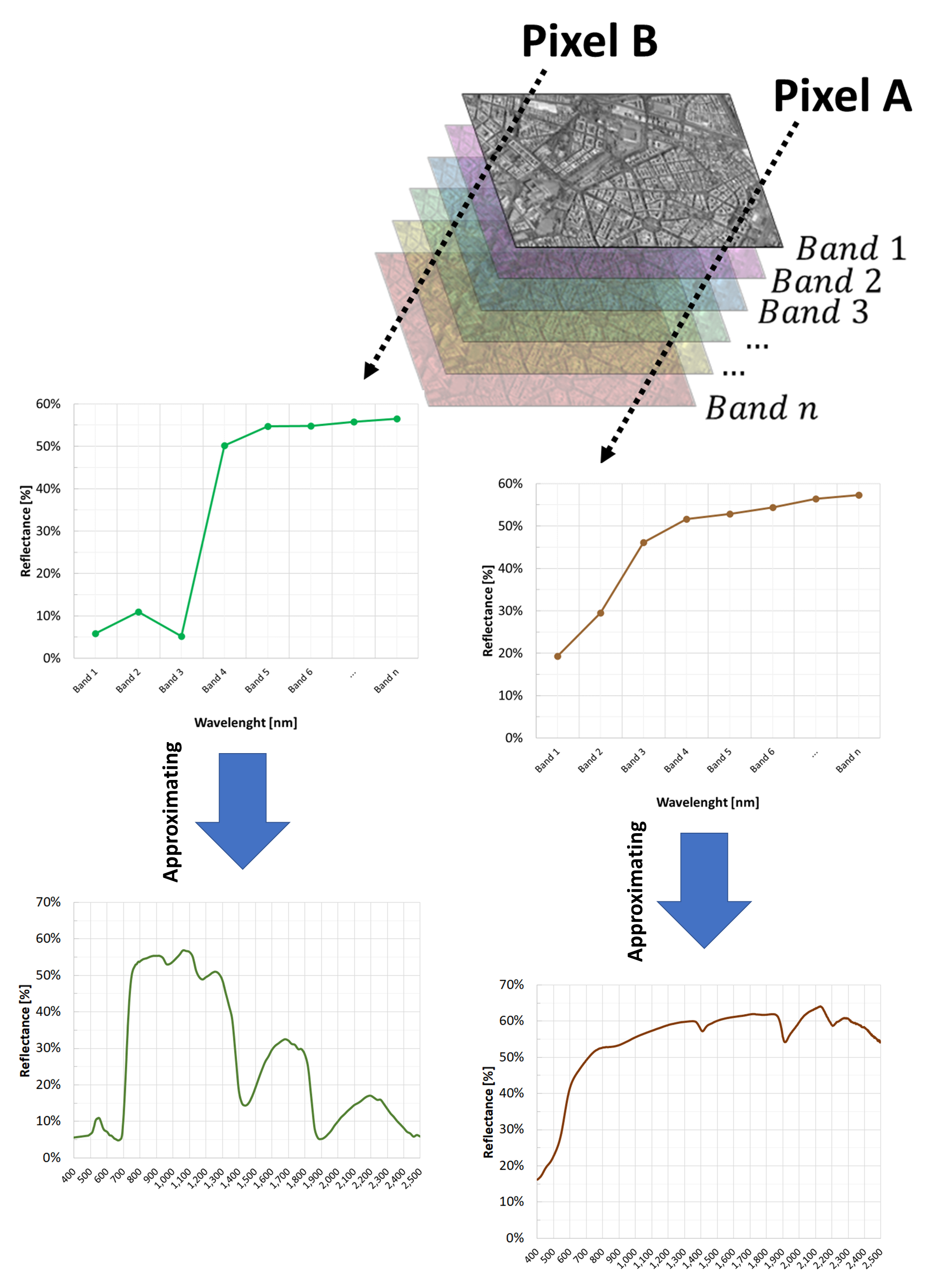
Fig. 3.2.1.9 How to calculate the spectral signature with satellite images.
Warning
Remember to use ONLY atmospherically corrected images!
Multispectral satellite images capture both the sunlight reflected by the Earth’s surface and the light scattered by the atmosphere. However, when monitoring the environment, atmospheric scattering is a noise that must be removed before image manipulation or analysis.
3.2.1.5. How to compare spectral signatures
Spectral signatures are curves that describe the variation of reflectance with wavelengths (see What is a spectral signature). The closer the curves are, the more they are similar.
Suppose to analyse a multispectral satellite image with 3 spectral bands: Band 2, Band 3, and Band 4 shown in Fig. 3.2.1.9. And suppose to collect on the image some pixels of water, sand and vegetation (Fig. 3.2.1.10).
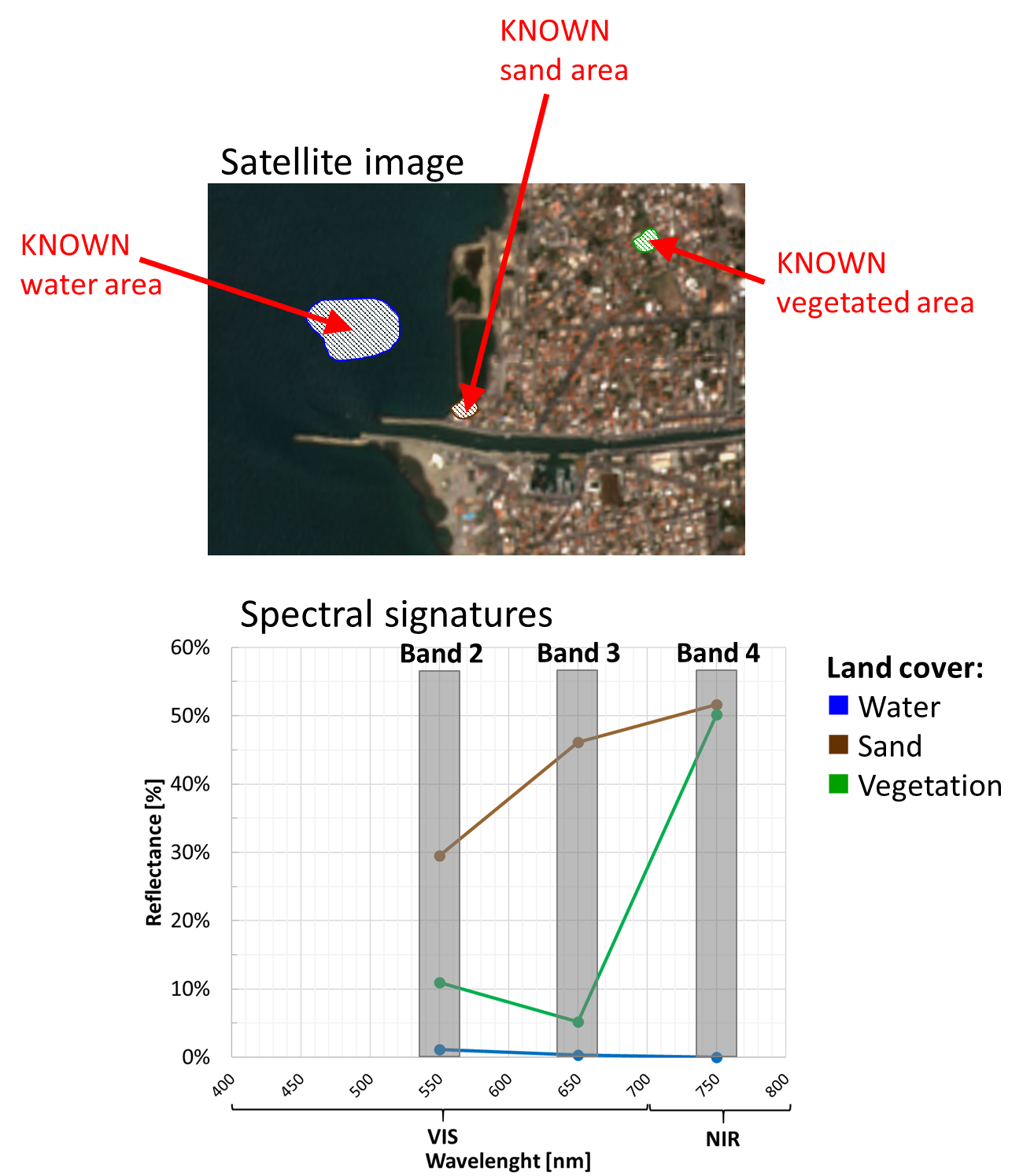
Fig. 3.2.1.10 Top: Multispectral satellite image. Bottom: spectral signatures extracted from the satellite image.
How much are “similar” the water, sand and vegetation spectral signatures?
Unfortunately, it is hard to tell how much they are “close”!
Let’s now build a reference system made of orthogonal axes that reproduce reflectances in each spectral band. This reference system is called feature space and has ONE AXIS FOR EACH SPECTRAL BAND.
Note
In the feature space, the spectral signatures become points (Fig. 3.2.1.11).
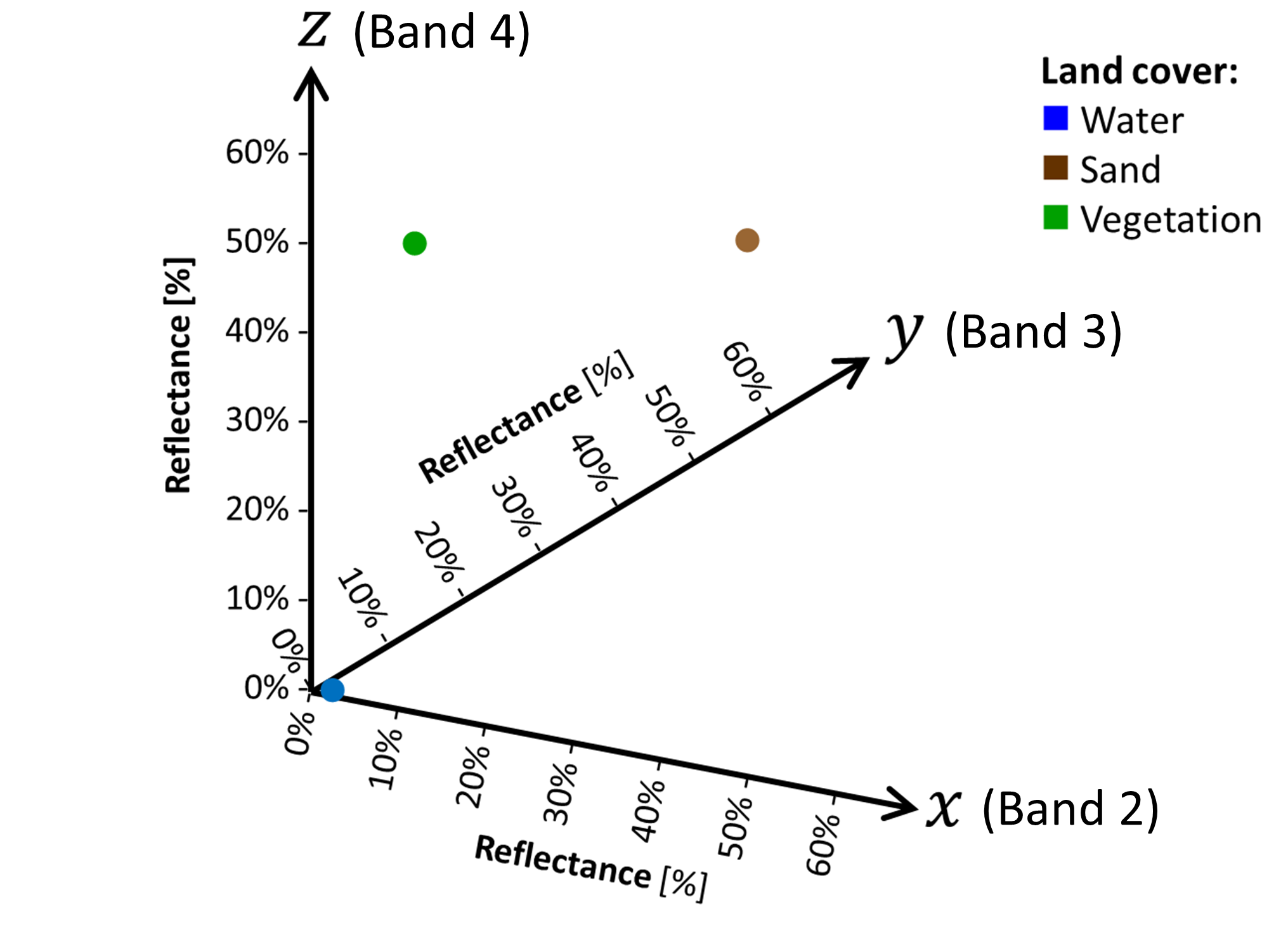
Fig. 3.2.1.11 Spectral signatures plotted in the feature space.
Now, it is simple to calculate the spectarl signatures’ similarity: the closer the points are, the more they are similar.
The Euclidean distance D is often used. Equation (3.2.1.1) shows the formula for two points (1 and 2) in 3-D feature space:
where:
1 is the first spectral signature,
2 is the second spectral signature,
x is the axis for spectral band 1,
y is the axis for spectral band 2,
z is the axis for spectral band 3.
Note
Usually, satellite images have more than 3 spectral bands. Thus, the feature space has more than 3 axes.
Note
About spectral signatures in the feature space:
- Spectral signatures (curves) are transformed into points,
- Similar spectral signatures are points close to each,
- Image pixels with similar spectral signatures are grouped into a cluster (called spectral class).
3.2.2. Spectral indices for environmental monitoring
3.2.2.1. What is a spectral index
A spectral index is a math expression applied to a multispectral image to highlight specific properties of different land covers, their state of alteration, amount or health.
Spectral indices combine the reflectance information from multiple spectral bands into ONE numeric value. Thus, they turn satellite images from a qualitative visual inspection tool into a quantitative numerical analysis tool.
Table 3.2.2.1 shows the most common mathematical formulas.
| Family | Pros | Cons | Example |
|---|---|---|---|
| Difference | Simple | Absolute values might depend on external factors (e.g. atmospheric disturbance) | CRI |
| Ratio | Less affected by residual atmospheric effects | Unbounded range of values | RVI |
| Normalized | Can be used to compared different situations | Are not linear | NDVI |
| Any complex mathematical expression | Could map the phenomenon more accurately | Might be challenging to handle or interpret | EVI |
The most popular spectral indices are those to retrieve the status of vegetation and crops. However, there are also indices designed to:
- Estimate soil properties,
- Delineate burned areas,
- Monitor built-up features,
- Map water bodies,
- Estimate the abundance of minerals or lithotypes,
- Evaluate the snow cover,
- And many others.
3.2.2.2. How spectral indices are designed
Every land feature reflects the sunlight differently (the spectral signature), depending on their physical state, chemical composition, moisture content, state of alteration (e.g. weathering) or health (for vegetation). Besides, any variation of these parameters produces a corresponding modification in the spectral signature.
Let’s see some examples for VEGETATION.
Look at the spectral signature of a vegetated image pixel (Fig. 3.2.2.1).
The gap between the low reflectance in the Red band (due to chlorophylls), and the high reflectance in the NIR band (due to internal leaf structure) is an indicator of the greenness of the biosphere.
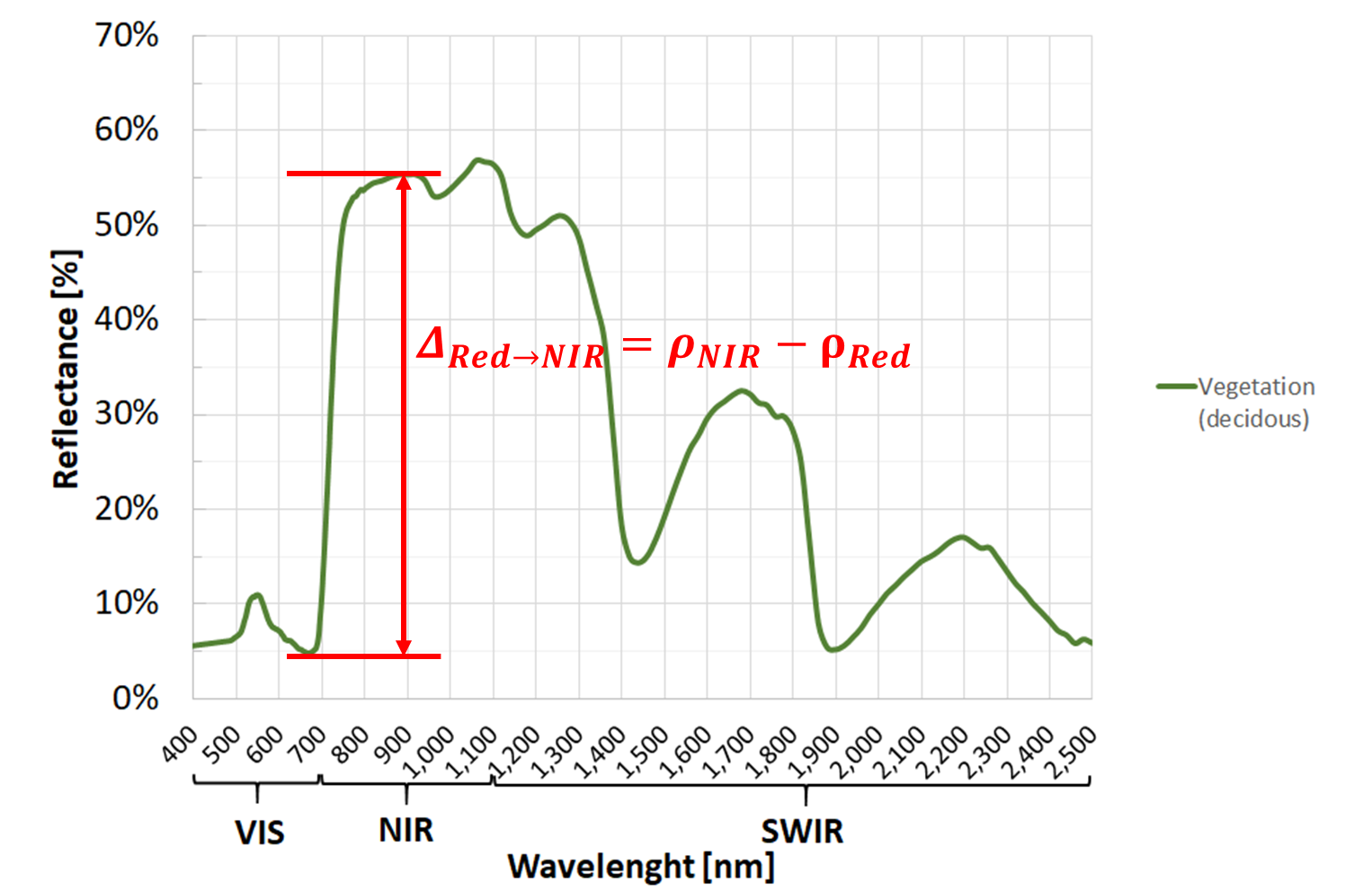
Fig. 3.2.2.1 Spectral signature of a decidous tree with highlighted the gap between the Red and NIR.
In the example of Fig. 3.2.2.1, we have \(\rho_{Red}=0.05\) and \(\rho_{NIR}=0.55\).
Moreover, the more vigour the vegetation is OR the more green biomass is present, the larger this gap is (Fig. 3.2.2.2). Thus, the difference between NIR and Red reflectances is used as a proxy for overall “amount and health” of green vegetation.
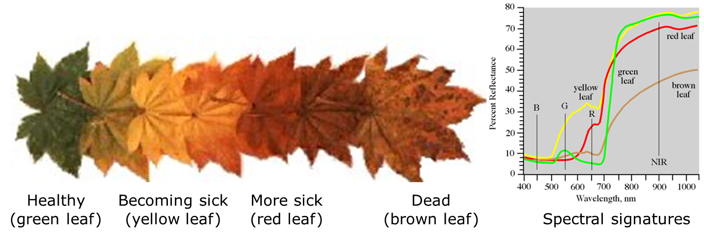
Fig. 3.2.2.2 Colours and spectral signatures of healthy and senescing leaves.
a. Ratio Vegetation Index (RVI)
This is the basic greenness vegetation index and it is effective over a wide range of different conditions. Equation (3.2.2.1) shows its simple mathematical formula:
RVI is a positive index (\(RVI\geq0\)). The larger the ratio, the more “amount of green and healthy vegetation” is present in the image pixel.
In the example of Fig. 3.2.2.1, we have:
Typical values for vegetation cover range from RVI=4 (parse or sick vegetation) up to RVI=30 (very dense and very healthy vegetation).
Healthy vegetation generally falls between values of 4 to 10.
Note
Unfortunately, RVI is not bounded from above. That makes difficult to compare values for different vegetation covers.
Caution
The values and thresholds of the spectral index described above are intended as general recommendations.
The analyst’s experience can suggest more appropriate values to the specific case study.
b. Normalized Difference Vegetation Index (NDVI)
This is the most known and used greenness vegetation index. Equation (3.2.2.2) shows its mathematical formula:
NDVI is a normalized index ranging from -1 to 1, but for VEGETATED LANDS it has positive values. The larger the ratio, the more “amount of green and healthy vegetation” is present in the image pixel.
In the example of Fig. 3.2.2.1, we have:
The threshold NDVI=0.2 is often used to differentiate bare ground (NDVI<0.2) from vegetated land (NDVI>0.2). Thus:
- Moderate values (0.2<NDVI<0.6) are typical for shrubs, grass and crops,
- Higher values (NDVI>0.6) are typical for forests.
Opposite to RVI, FOR VEGETATION COVER NDVI is bounded from below (often NDVI=0.2) and bounded from above (NDVI=1). Thus, it is a useful index to compare different vegetation covers and types.
Tip
Vegetation amount vs health
If we are looking at a mixed image pixel with healthy vegetation, then:
- Moderate values (0.2<NDVI<0.4) are typical for sparse vegetation,
- Intermediate values (0.4<NDVI<0.6) are typical for moderately-density vegetation,
- And higher values (NDVI>0.6) are typical for high-density vegetation.
On the other hand, if we are looking at a fully covered vegetated image pixel:
- Moderate values (0<NDVI<0.2) are typical for very sick vegetation,
- Intermediate values (0.2<NDVI<0.6) are typical for moderately healthy vegetation,
- And higher values (NDVI>0.6) are typical for very healthy vegetation.
While NDVI is meaningful ONLY for vegetated areas, it can be calculated for all land covers. In this case, NDVI will have the following values:
- NDVI close to -1 is a typical value for clear water (see Fig. 3.2.1.3),
- -1<NDVI<0 are typical values for polluted water (see Fig. 3.2.1.8), and for snow or ice (see Fig. 3.2.1.4),
- NDVI close to 0 is a typical value for clouds (see Fig. 3.2.1.5),
- Slightly positive NDVI (0<NDVI<0.2) are typical values for bare soil (see Fig. 3.2.1.6).
Caution
The values and thresholds of the spectral index described above are intended as general recommendations.
The analyst’s experience can suggest more appropriate values to the specific case study.
Hint
Small activity
Most satellite-based crop monitoring systems use NDVI (or similar spectral indices) to show farmers which parts of their fields have more stressed vegetation.
See CropSAT for a free online demo to highlight where to increase the fertilization rate (suggestion: try the location “Paderno Ponchielli, CR, Italia”).
c. Additional spectral indices
The list of existing spectral indices is very long.
The Index DataBase is a collection of spectral indices for different applications and sensors. Here you find a selection of 250 spectral indices designed to fit the images of the Sentinel-2 satellite.
For instance, spectral indices can be used to map floodings occurring more frequently due to climate change.
The Normalized Difference Water Index (NDWI) is built on the effects of water/moisture on the soil’s spectral signature: with the increasing of water, the ratio \(\frac{\rho_{Green}}{\rho_{NIR}}\) decreases. Equation (3.2.2.3) shows its mathematical formula:
NDWI is a normalized index ranging from -1 to 1, but for WATER it has positive values. The larger the ratio, the more “amount of water” is present in the image pixel.
The threshold NDWI=0.3 is often used to differentiate non-flooded areas (NDVI<0.3) from flooded areas (NDWI>0.3).
Warning
A DIFFERENT spectral index, also called Normalized Difference Water Index (NDWI), (\(NDWI=\frac{\rho_{NIR}-\rho_{SWIR}}{\rho_{NIR}+\rho_{SWIR}}\)) uses NIR and SWIR spectral bands to detect water stress in vegetation (e.g. drought).
Caution
The values and thresholds of the spectral index described above are intended as general recommendations.
The analyst’s experience can suggest more appropriate values to the specific case study.
Or spectral indices can be used to map glaciers retreat due to climate change.
The Normalized Difference Snow Index (NDSI) is built on the different SWIR reflectance of snow (low) and clouds (high). Equation (3.2.2.4) shows its mathematical formula:
NDSI is a normalized index ranging from -1 to 1, but for SNOW it has positive values.
The threshold NDSI=0.4 is often used to differentiate not-snow cover (NDVI<0.4) from snow cover (NDWI>0.4).
Caution
The values and thresholds of the spectral index described above are intended as general recommendations.
The analyst’s experience can suggest more appropriate values to the specific case study.
Hint
If you like to import the spectral indices of the Index DataBase into Sentinel Hub EO Browser, try these javascript.
d. Build your own spectral index
All you need to know is the spectral signature of the standard/unaltered state of the land or object you are monitoring and how the phenomenon you are studying affects its reflectance.
Now you can create an expression with one or more spectral bands that returns a value that is proportional to the phenomenon observed!
3.2.3. Automatic land cover mapping
3.2.3.1. Supervised image classification
Automatic mapping of land cover classes is done with supervised image classification.
The basic idea is to train a mathematical model to recognise spectral signatures. This is done using the spectral signatures of the training samples, which are image pixels selected in sites with KNOWN land cover (called training sites).
For each class, pick some training samples on the satellite image and label them with their actual land cover (Fig. 3.2.3.1). Thus, all the categories have a reference spectral signature defined by their training samples (often their mean value) and a label (i.e. the land cover class).
Remember to collect training samples for ALL land cover classes you want to map. Otherwise, some categories will not be recognised!
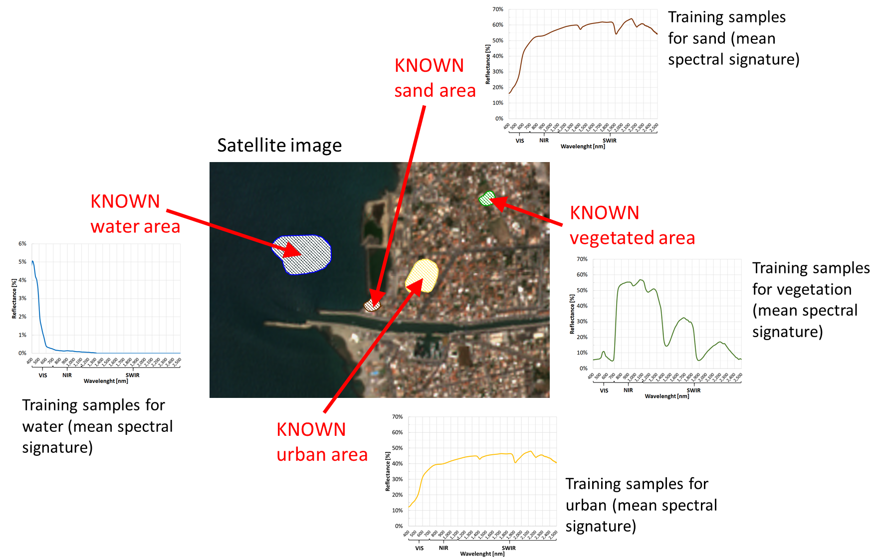
Fig. 3.2.3.1 Training sites and training samples.
Now we want the classification algorithm to predict each image pixel’s UNKNOWN land cover based on their spectral signature’s similarity with the KNOWN training samples (see How to compare spectral signatures).
The output is a classification map with all the classes defined by the training samples (Fig. 3.2.3.2).
Note
In other words, the classification map is a prediction based on the knowledge of some limited training sites.
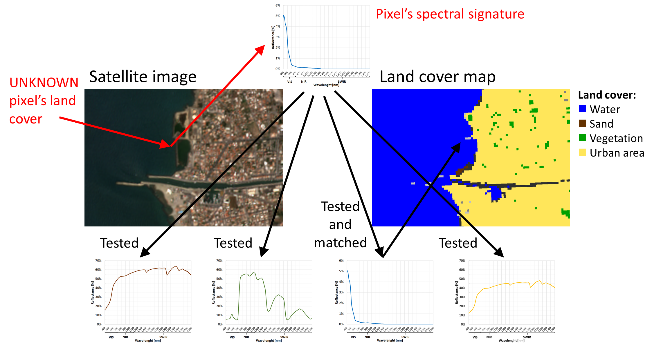
Fig. 3.2.3.2 Prediction of the land cover.
Tip
How many training samples?
Unfortunately, different classification techniques require a different number of (optimal) training samples!
SUGGESTION: a starting point for multispectral images like Sentinel-2 or Landsat could be about 200 image pixels for each class.
3.2.3.2. Classification strategies
A massive number of classification strategies are used in remote sensing. They have different requirements, constraints and accuracy.
The subject is so vast that we cannot generalize and is out-of-scope for this training.
Minimum Distance (to Means)
A simple and popular method is the Minimum Distance (to Means) classifier. This technique:
- Use the training samples (with KNOWN land cover) to calculate a mean spectral signature for each land cover class,
- Measures the spectral signature of each image pixels with UNKNOWN land cover,
- Compares 1. and 2.,
- Assigns each image pixel to the land cover class with the “closest” (with minimum EUCLIDEAN distance) spectral signature.
Thus, the Minimum Distance (to Means) classifier labels the image pixels based their “global” distance with the training samples.
Note
See Mapping crop types (difficulty: intermediate) to check how the Minimum Distance (to Means) classifier works.
Hint
Small activity
Navigate the CORINE land cover map of Europe (inventory of 44 land cover classes with minimum mapping unit of 25 ha for areal phenomena and 100 m for linear phenomena).
Spectral Angle Mapper
Another simple yet popular method is the Spectral Angle Mapper classifier. This technique:
- Use the training samples (with KNOWN land cover) to calculate a mean spectral signature for each land cover class. Training samples might be just ONE spectral signature for each land cover class (called endmembers),
- Measures the spectral signature of each image pixels with UNKNOWN land cover,
- Compares 1. and 2.,
- Assigns each image pixel to the land cover class with the “closest” spectral signature (with minimum ANGULAR distance).
Thus, the Spectral Angle Mapper classifier labels the image pixels based their “angulal” distance with the training samples.
Hint
Small activity
See how the Spectral Angle Mapper classifier works (Credit: rdrr.io).
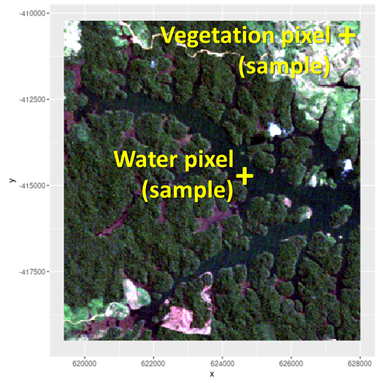
Fig. 3.2.3.3 Satellite image with water and vegetation samples.
Tip
Let’s try including a new forset class using as training sample the image pixel with coordinates x = 620000, y = -415000. What happens?
See also
For additional information on the RStoolbox library, see Tools for Remote Sensing Data Analysis in R.
3.2.4. Map validation
3.2.4.1. Precision or accuracy?
Precision and accuracy are often used as synonyms. But they are not!
- Precision refers to the degree to which repeated attempts (under unchanged conditions) are close to each other, independent of their true value. Thus, a precise quantity might be completely wrong because biased!,
- Accuracy refers to the degree to which repeated attempts (under unchanged conditions) are close to the true value. Thus, an accurate attempt is precise and not biased.
Let’s see how precision and accuracy work. Assume that two archers are participating in a tournament.
The first archer always hit the same spot. He is precise.
However, his arrows are systematically displaced from the target’s centre (Fig. 3.2.4.1). Thus, the second archer is inaccurate.
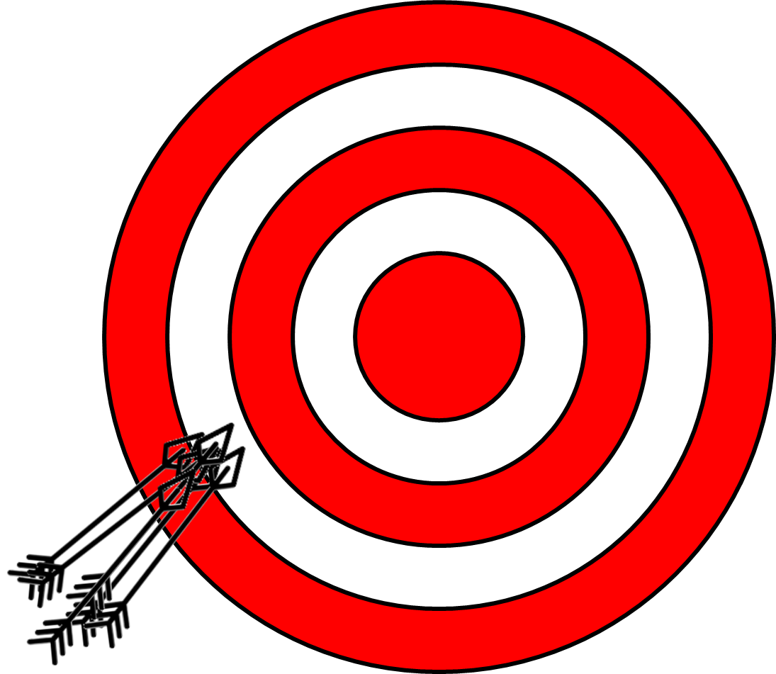
Fig. 3.2.4.1 The first archer’s shots.
The second archer fires all his arrows grouped in the target’s centre (Fig. 3.2.4.2).
The archer is precise and unbiased. Thus, the first archer is accurate.
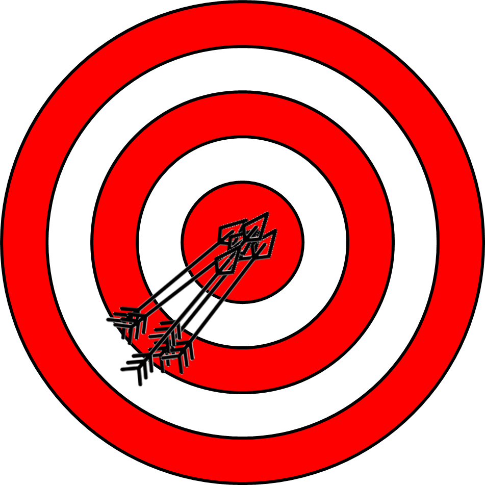
Fig. 3.2.4.2 The second archer’s shots.
Hint
For a land cover map:
- Accuracy refers to the degree to which the information on the map matches the real world,
- Precision refers to how exactly is the data used to create the map. This is also related to its spatial resolution, spectral characteristics, or time of acquisition (see Fundamentals of multispectral Earth observation).
3.2.4.2. How much is accurate a map?
Referring to the mapping process, accuracy is the most used performance metric and tells “how many sites are mapped correctly.”
Map accuracy is estimated using the confusion matrix, a table that relates the actual land cover of some KNOWN reference locations, called the testing samples, with their predicted values in the map.
Fig. 3.2.4.3 shows an example of a confusion matrix computed for a 4-class thematic map. In this table:
- Columns represent the instances of testing samples in the actual land cover class,
- Rows represent the instances of testing samples in the predicted land cover class,
- Instances belonging to the main diagonal (green cells) are the number of testing samples classified correctly.
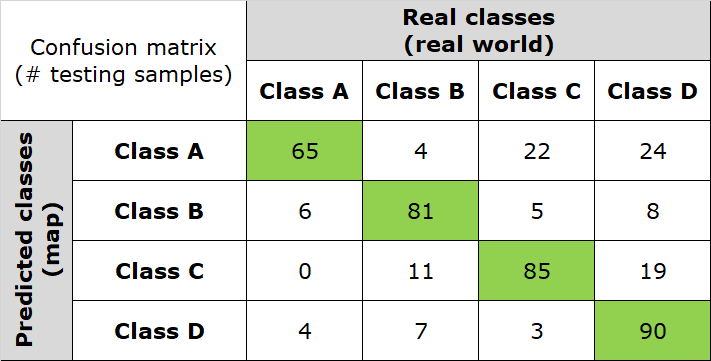
Fig. 3.2.4.3 Confusion matrix. Number of testing samples correctly classified.
Fig. 3.2.4.4 highlights the number of misclassified testing samples (red cells).
Overall, the confusion matrix has 434 testing samples.
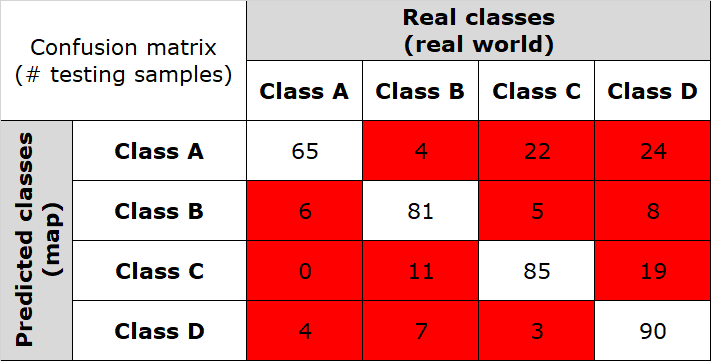
Fig. 3.2.4.4 Confusion matrix. Number of misclassified testing samples.
Note
What are the testing samples?
To evaluate the map’s accuracy, we must compare predicted land cover classes with actual land cover classes. This is done using the testing samples, which are image pixels randomly collected, but those actual land cover is KNOWN. Results are then extended from the testing samples to the full map.
GUIDELINE: testing samples must be randomly collected for ALL land cover classes. There should be no less than 50 testing samples for each land cover class.
a. Overall accuracy
Suppose we want to quantify the proportion of correct predictions, without giving any insight into the single accuracy of land cover classes. In other words, how many testing samples are globally labelled correctly in the classified map?
It is called overall accuracy and is usually expressed as a percent, with 0% being a perfect misclassification and 100% being a perfect classification:
In the example of Fig. 3.2.4.3 we have:
Note
The overall accuracy is the primary indicator used to evaluate maps.
b. Producer’s accuracy
Suppose we want to quantify the proportion of correct predictions for each of the real-world land cover class. In other words, for a given land cover class in the real world, how many testing samples are labelled correctly in the classified map?
This is the accuracy from the point of view of the mapmaker (the producer). It is called producer’s accuracy and is usually expressed as a percent, with 0% being a perfect misclassification and 100% being a perfect classification:
In the example of Fig. 3.2.4.3 we have:
Thus, the classifier is mapping real world class A with higher accuracy.
Note
The producer’s accuracy is an indicator of how well the actual land cover information is mapped.
c. User’s accuracy
Suppose we want to quantify the proportion of correct predictions for each of the mapped classes. In other words, for a given class in the map, how many testing samples are really present on the ground?
This is the accuracy from the point of view of the map user. It called is called user’s accuracy and is usually expressed as a percent, with 0% being a perfect misclassification and 100% being a perfect classification:
In the example of Fig. 3.2.4.3 we have:
Thus, the classifier is predicting the map’s class A with lower accuracy.
Typically, user’s and producer’s accuracy for a given land cover class are different. In the example of Fig. 3.2.4.3, 86.7% of the testing samples for real-world class A are correctly identified as class A in the map (producer’s accuracy). However, only 56.5% of the areas identified as class A in the map are actually being class A on the ground.
Note
The user’s accuracy is an indicator of how well the map describes the actual land covers.
Hint
Small activity
Which is the accuracy of your map?
Calculate the overall accuracy and the per-class producer’s accuracy and user’s accuracy of your own map. Try the free Confusion matrix online calculator.
See also
For additional information, see the practical guide on Map Accuracy Assessment and Area Estimation of FAO.
(v.2103211807)