1.9. QGIS visualization for rasters
Styling your geospatial data, you can effectively convey geospatial information to an intended public, allowing them to understand at first glance the phenomena represented through your map. In this exercise, we will see some basic styling on different types of raster data, starting by our examples:
- Land_cover: retrieved and adapted for the extent, from Copernicus Land Monitoring Service-Corine Land Cover 2018 official website, it is a land cover map with 40 land cover classes (defined with different values).
- Temperature_distribution: it reports water surface temperature for Como, Lugano and Maggiore lakes on the 14th April 2020.
Raster styling depends on the type of information to disseminate; particularly, if the information is of qualitative type (e.g. land cover classes) or quantitative (e.g. temperature map) the symbolization to be used will be different. Moreover, some types of symbolization can be more suitable for raster data with wide range of values, while some others for raster with small range of values.
To start, let’s add to QGIS the two raster layers from the Geopackage you were provided to your Layers panel. You will get the following view of QGIS interface (Fig. 1.9.1). You can also rearrange the layers by selecting one of them and dragging and dropping it to make it appear at the top or at the bottom with respect to the other one.
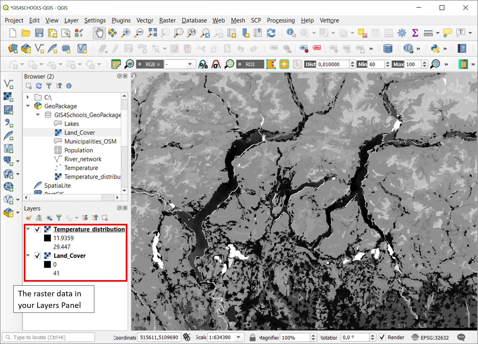
Fig. 1.9.1 – The first visualization of Temperature_distribution and Land_Cover raster data, when loaded on QGIS.
As you see by the screen, these layers need some styling to be better understood. With styling, here, we simply refer to a change in their visual properties. This can be done, separately, for both raster data (Fig. 1.9.2), by right-clicking on them, in the Layers Panel, and selecting Properties, as it was done for vector data. There, from Symbology tab (as in Figure) you can select the Render Type (1) (Multiband colour, paletted/unique values, singleband gray, singleband pseudocolor, hillshade) with its settings (as it is here the color gradient and contrast enhancement). You can also eventually define the Colour Rendering as well as the Resampling options.
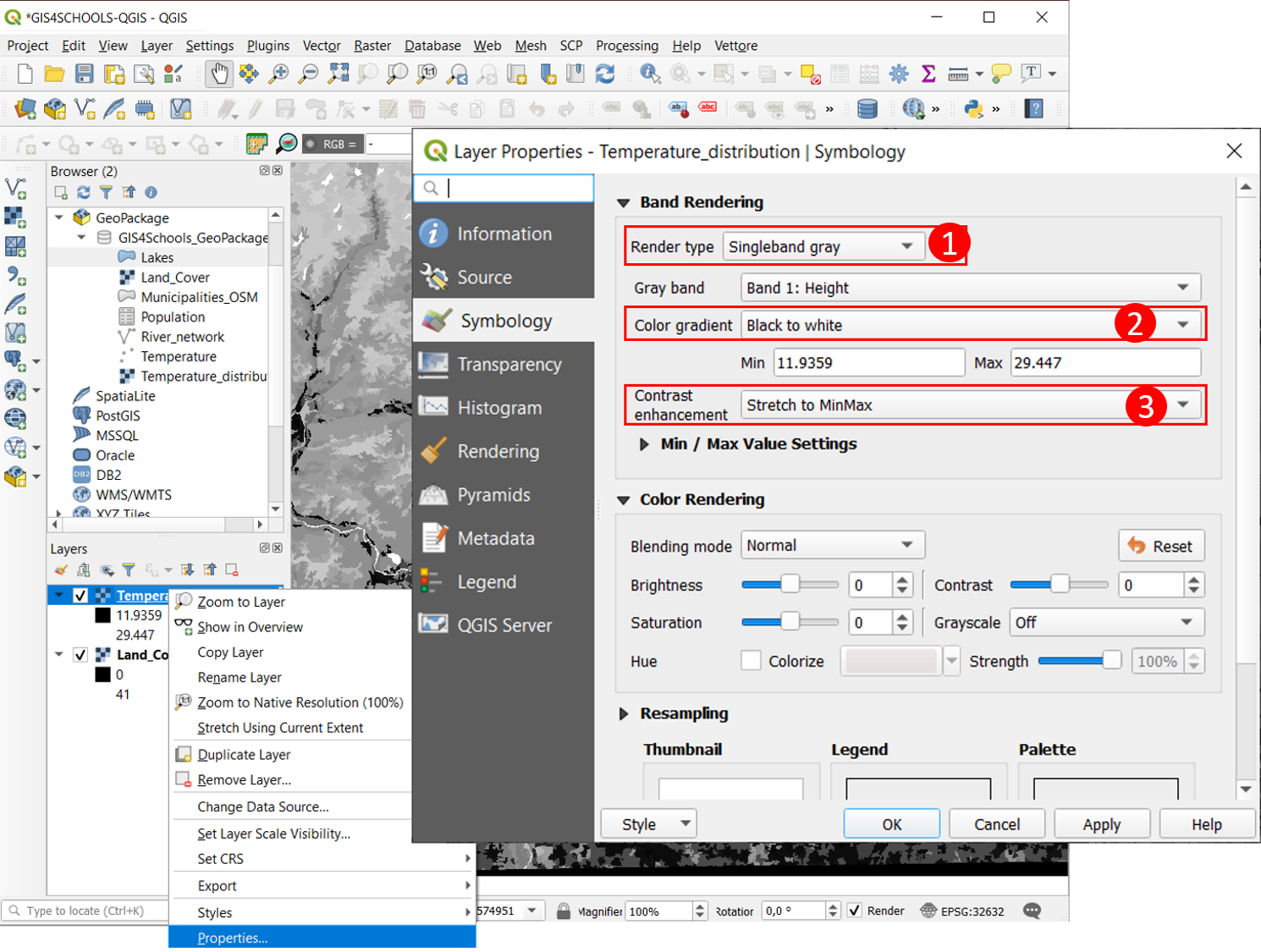
Fig. 1.9.2 – The choice for Raster Data Symbology Properties. The default Singleband gray Render Type.
Hereafter, the following basic render types are described and applied on the previously mentioned raster data.
1.9.1. Singleband gray
It is the Default view of both raster data when they are loaded on QGIS. it consists in representing them with just one color gradient that goes from black, for lower values, to white, for higher ones. This Render type is useful when showing quantitative information, with a wide range of values to be represented within the raster (e.g. heights in a Digital Elevation Model, DEM, or, as in this case, the values of the Temperature_distribution raster layer).
See Fig. 1.9.2. Try to invert Temperature_distribution raster Singleband gray Color gradient (2) and look at changes. Also, try to enhance differences, within the temperature values of the raster, by choosing the most suitable Contrast Enhancement (3) as well as by changing Min/Max Value Settings (where Min/Max values are used to define the extent to which the gradient is stretched and/or clipped).
1.9.2. Singleband-pseudocolor
The Singleband-Pseudocolor render type, as the Singleband-gray, is suitable for showing quantitative information. It allows to choose a color ramp and also (choosing for Mode: Equal Interval or Quantile) a number of classes there to categorize the different intervals of values to be represented. Choosing for Mode:Continuous the number of classes cannot be manually set.
Refer to Fig. 1.9.2.1 steps and result. Select Render Type: Singleband-Pseudocolor (1), choose a meaningful Color ramp (2) (here e.g. Reds), select Mode: Equal Interval (3) and insert 10 as number of Classes (4), click on Classify and the temperature values will be divided in 10 equal intervals from their minimum to their maximum. Click on Apply and look at final layer visualization.
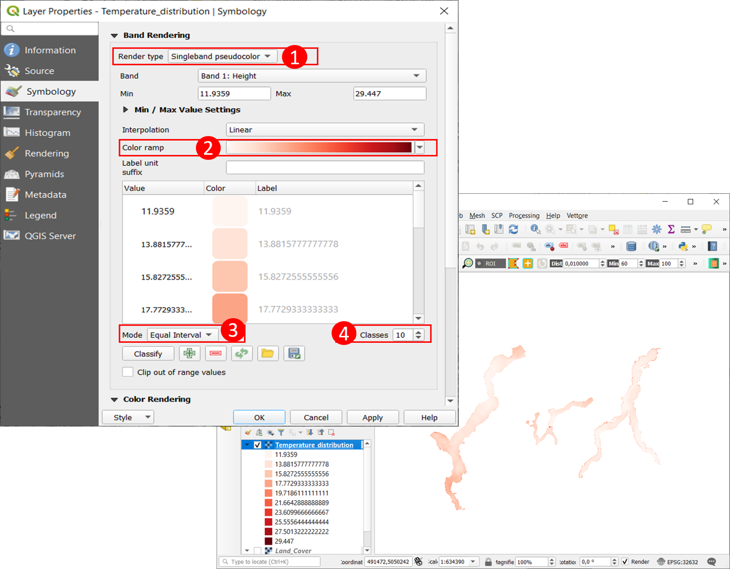
Fig. 1.9.2.1 – The Singleband-Pseudocolor Render Type, application on Temperature_distribution raster data.
1.9.3. Paletted/unique values
This Render Type is suitable for representing qualitative information as well as raster data with a small range of values. It consists in representing each different value within the raster with a different color. This is the most suitable choice to display the qualitative land cover classes of Land_cover raster. Let us apply Paletted/unique values Render type on Land_cover layer by following the instructions in Fig. 1.9.3.1. You can apply Random colours or also Load Style: Land_Cover_style.
Select Render Type: Paletted/unique values (1) and leave Color ramp to Random colors (2): click on Classify (3) and then on Apply to see each land cover class be displayed with a different colour, linked to its pixel value, from 0 to 41. Try to manually change some of these randomly assigned colours by right-clicking on a color assigned to a specific value and then clicking on Change color… (4). It is possible also to change the label for each value.
Click on Style (5) → Load Style… to load the Land_Cover_style that is in your exercise folder. See it is a Paletted/unique values render type. It is a style provided by the Copernicus Land Monitoring Service, to show Corine Land Cover 2018 data: it links all the possible values that can be found in Corine Land Cover data to the labels and colours of the classes they refer to. It is for this reason that it stores symbols and labels for more classes than the ones that are really present in the area under study (e.g. value 44, representing Sea and Ocean). Try to remove these empty classes with the minus button, next to Classify (3). To understand which classes are empty you can compare this style to the previous Random colors visualization to see the missing classes there (e.g. values from 42 to 48).
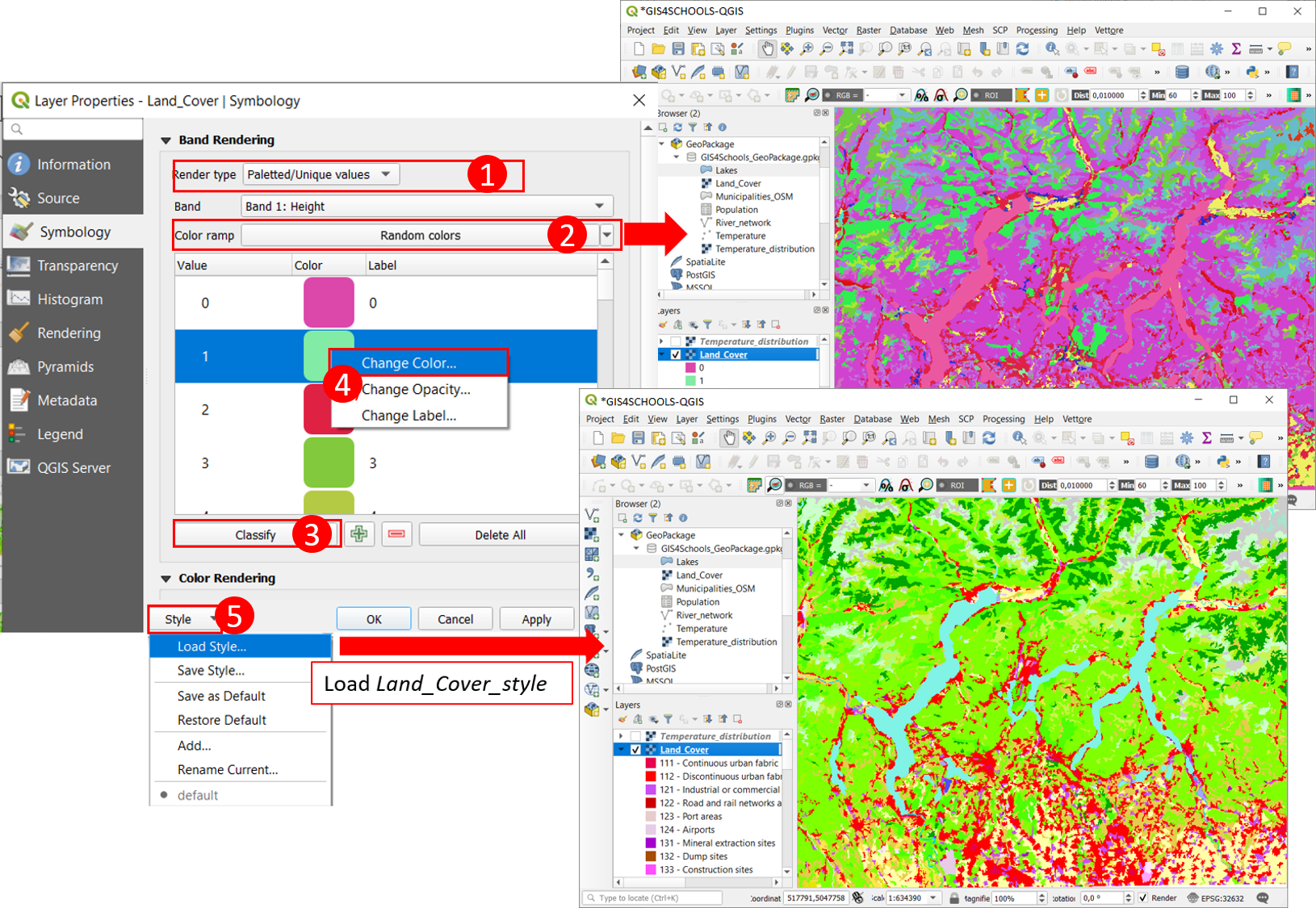
Fig. 1.9.3.1 – The Paletted/Unique Values Render Type, application on Land_Cover raster data, with Random colors or Land_Cover_style.
The exercise folder also contains the Temperature_distribution_style to be loaded on Temperature_distribution raster layer. There is also the possibility of saving the styles that you make in a way to easily recall them in a second moment, or also on other similar raster data.
These raster visualization modes are just a few basic examples that can be done. Styling depends on the type of data you have (e.g. Multiband render type is commonly used with satellite imagery) and by the type of information you want to provide.