3.4. Hands-on exercises
3.4.1. Monitoring lake’s trophic state (difficulty: advanced)
3.4.1.1. Download the data
Important
DATA FOR THE EXERCISE
Click here to download the data for this exercise (1.1 GB).
3.4.1.2. The environmental problem
The trophic state of a water body describes the amount of nutrients (mainly phosphorus and nitrogen) available to grow aquatic vegetation and phytoplankton. However, when water becomes rich with nutrients, phytoplankton’s rapid growth (called algae bloom) could cause negative impacts on the marine environment, like:
- The disruption of the normal ecosystem functioning,
- The consumption of oxygen in the water, resulting in the death of aquatic organisms and fishes,
- The reduction of sunlight reaching aquatic plants under the water surface,
- The production of harmful toxins.
Lakes are usually classified into 4 trophic states, according to chlorophyll’s concentration present in the water. Table 3.4.1.1 shows the most common definitions.
| Trophic level | Chlorophyll’s concentration | Primary productivity |
|---|---|---|
| Oligotrophic | 0-2.6 mg/m3 | Low due to nutrient deficiency |
| Mesotrophic | 2.6-20 mg/m3 | Intermediate |
| Eutrophic | 20-56 mg/m3 | High due to excessive nutrients |
| Hypereutrophic | >56 mg/m3 | Very High due to excessive nutrients |
Warning
The role of climate change
Climate change may indirectly cause eutrophication by increasing runoff from the land, affecting nutrient load, due to increased precipitation resulting from global warming.
3.4.1.3. Scope of the exercise
This exercise shows a very simple method to monitor the eutrophic level of a lake with satellites.
3.4.1.4. Study area
Lake Trasimeno is located in central Italy, in the Umbria region on the border with Tuscany. The lake is the fourth for surface area in Italy (mean surface area 121 km2), has two minor tributaries but none natural emissaries, and is surrounded by a natural park.
The lake is very shallow (4-5 m average depth). Its water level is usually at the highest level in April/May (less than 6 m) and at the minimum level in September/October. For its peculiar characteristics, in summer Lake Trasimeno is prone to eutrophication.
3.4.1.5. Satellite images
The analysis is done using ten cloud-free Sentinel-2 images collected in the following dates of Summer 2016:
- 18 July 2016,
- 4 August 2016,
- 14 August 2016,
- 24 August 2016,
- 27 August 2016,
- 3 September 2016,
- 13 September 2016,
- 23 September 2016,
- 26 September 2016.
Warning
Remember to use ONLY atmospherically corrected images!
Today (February 2021), Sentinel-2 data collected on 2016 are only provided as L1C products. That means these satellite images are NOT corrected for the atmospheric disturbance. Thus, they are NOT ready for image processing!
Atmospheric correction is an advanced topic not covered in training. Thus, this exercise uses the most simple atmospheric compensation technique, called Dark Object Subtraction (DOS), to derive pseudo L2A products.
3.4.1.6. The modelling
The Ratio Vegetation Index (RVI) is a spectral index proportional to chlorophyll’s concentration. Thus, it could be used as a proxy for its estimation.
Phytoplankton are microorganisms that float on the water body and contain chlorophyll. Thus, they could be detected with RVI.
In this exercise we use a simple linear regression model described by equation (3.4.1.1):
For Sentinel-2 images, we calculate Equation (3.4.1.1) as follows:
3.4.1.7. Chlorophyll’s concentration and water level
The Ratio Vegetation Index (RVI) is proportional to chlorophyll’s concentration, but it does not represent its exact value. Thus, we need some experimental data of known chlorophyll’s concentration vs RVI value for the calibration of the equation (3.4.1.2).
Fig. 3.4.1.1 shows Lake Trasimeno with superimposed five sampling locations (green dots) where the chlorophyll’s concentration was measured on 18 July 2016. These data are used for the model’s calibration.
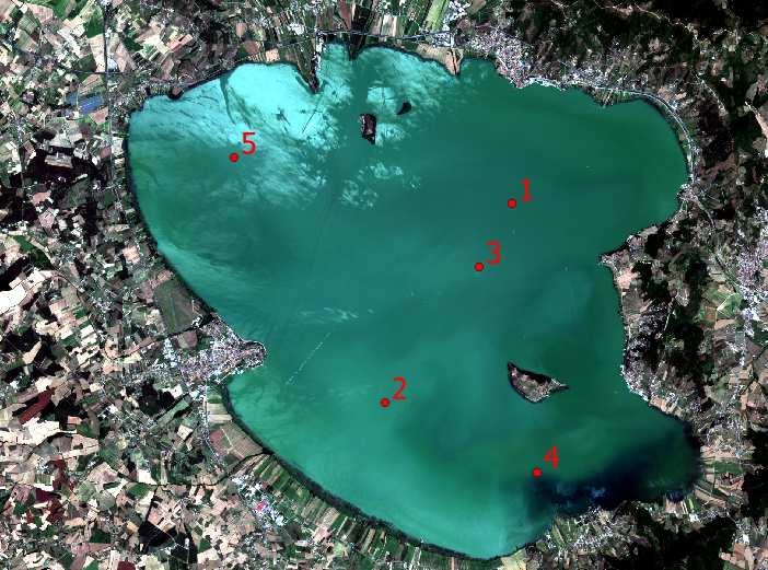
Fig. 3.4.1.1 Lake Trasimeno with superimposed the sampling locations (green dots).
| Site # | Coordinates E, N (WGS84 - UTM 32N (EPSG:32632)) | Chlorophyll [mg/m3] |
|---|---|---|
| 1 | 754795, 4783085 | 20.5 |
| 2 | 751675, 4778175 | 12.5 |
| 3 | 753995, 4781525 | 19.0 |
| 4 | 755425, 4776475 | 15.0 |
| 5 | 747955, 4784225 | 18.0 |
| Month | Water level changes (compared to the previous month) |
|---|---|
| May | +2 m |
| June | -2 m |
| July | -12 m |
| August | -16 m |
| September | -5 m |
| October | +2 m |
3.4.1.8. QGIS set-up
Open QGIS. Go to the menu bar and click Plugins → Manage and Install Plugins... (Fig. 3.4.1.2).
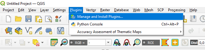
Fig. 3.4.1.2 Sample screenshot.
In the search bar write SCP and select the Semi-Automatic Classification Plugin. Press Install plugin in the bottom-right corner of the window and close the window (Fig. 3.4.1.3).
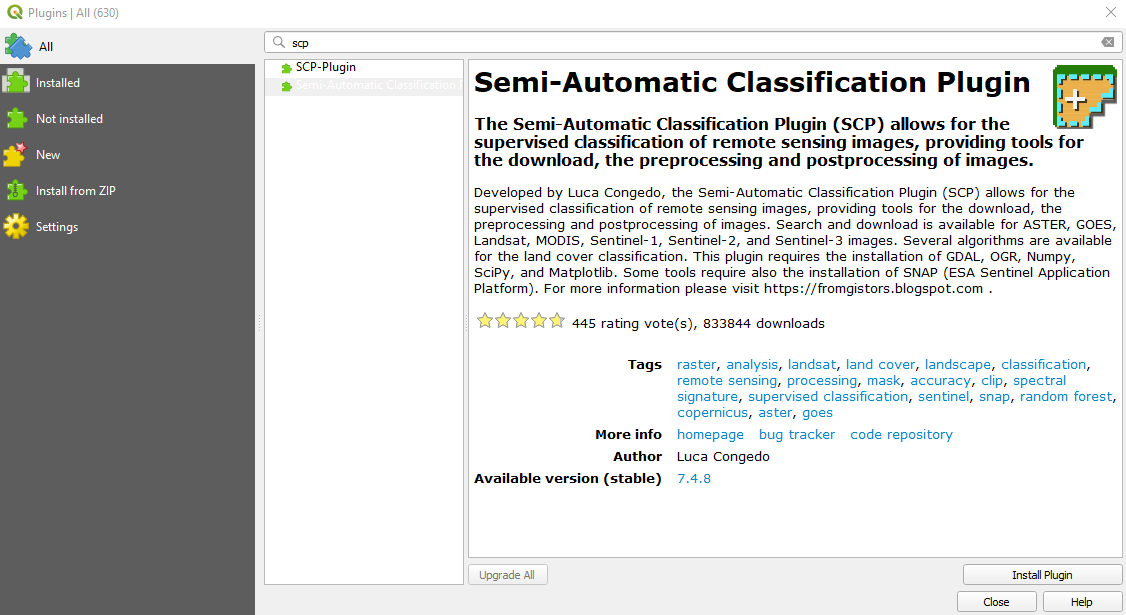
Fig. 3.4.1.3 Sample screenshot.
In QGIS main window, select New Empty Project (Fig. 3.4.1.4).
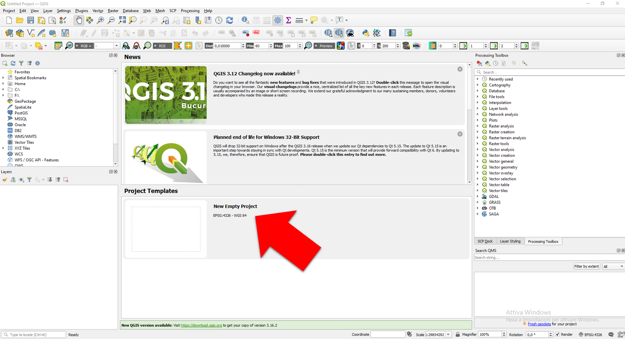
Fig. 3.4.1.4 Sample screenshot.
3.4.1.9. Prepare the satellite images
Open the Semi-Automatic Classification Plugin (SCP) (Fig. 3.4.1.5).
Fig. 3.4.1.5 Sample screenshot.
In the left-side window open Preprocessing → Sentinel-2 (Fig. 3.4.1.6). This tool provides the pre-processing tasks to prepare the satellite images for the analysis.
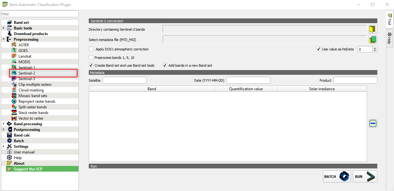
Fig. 3.4.1.6 Sample screenshot.
Select the following parameters (Fig. 3.4.1.7):
Directory containing Sentinel-2 bands:open the folder..\GIS_4_School\4.1_Monitoring_lake_trophic_state→S2A_MSIL1C_20160718T101032_N0204_R022_T32TQN_20160718T101028.SAFE→S2A_MSIL1C_20160718T101032_N0204_R022_T32TQN_20160718T101028.SAFE→GRANULE→L1C_T32TQN_A005596_20160718T101028→IMG_DATA,Select metadata file (MTD_MSI):select the file MTD_MSIL1C in the folderS2A_MSIL1C_20160718T101032_N0204_R022_T32TQN_20160718T101028.SAFE→MTD_MSIL1C,Apply DOS1 atmospheric correction:select this option. This command applies the simple DOS atmospheric correction to the satellite images.
Click the button RUN and select the output directory (Fig. 3.4.1.7).
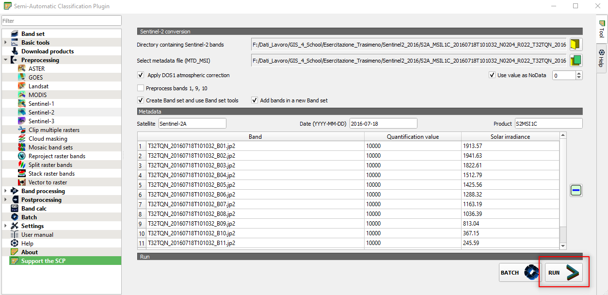
Fig. 3.4.1.7 Sample screenshot.
The outcomes of this processing are 10 spectral bands:
- 4 bands with 10-meters spatial resolution saved in GeoTiff format,
- 6 bands (with original 20-meters spatial resolution) resampled to match the 10-meters spatial resolution of the first 4 bands, saved in GeoTiff format.
Now we want to merge all the spectral bands in a single image. This is called multiband image (or multispectral image).
In the Semi-Automatic Classification Plugin window, select Band set (Upper left corner) and flag the option Create raster of band set (stack bands) (Fig. 3.4.2.13).
Click the button RUN and select the output directory (Fig. 3.4.1.8). The output file will be named as the input bands followed by stack_raster.
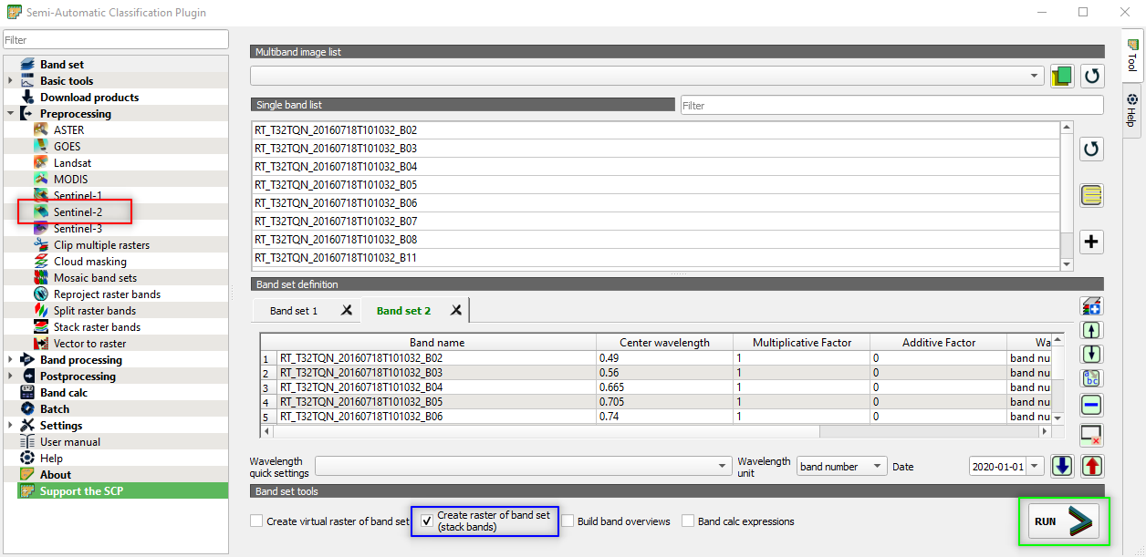
Fig. 3.4.1.8 Sample screenshot.
Remove from QGIS all the layer, except RT_T32TQN_20160718T101032_B0stack_raster. To remove a layer, right-click the layer in the windows Layers and select Remove layer.
The image is loaded in QGIS. However, its colours are not what we expect because the satellite’s spectral bands are not loaded in the correct order (Fig. 3.4.1.9).
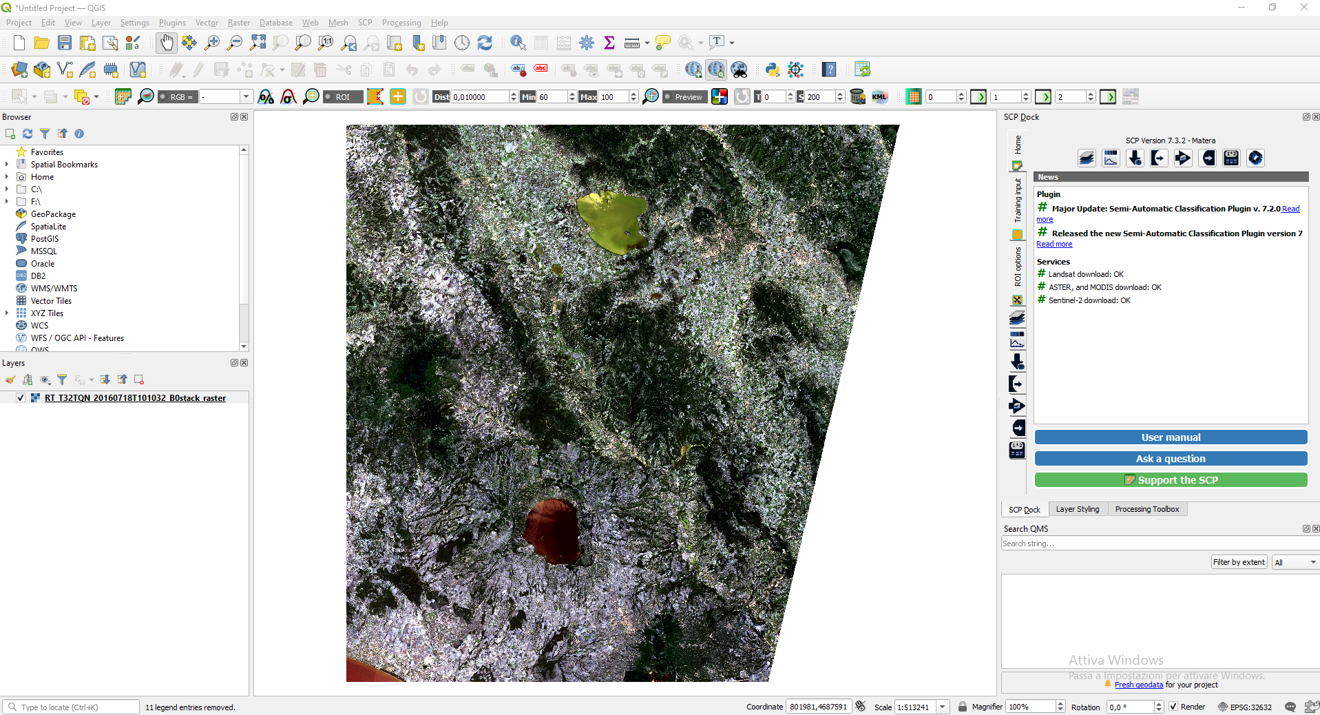
Fig. 3.4.1.9 Sample screenshot.
To solve this problem, we need to tell QGIS which spectral bands correspond to Red, Green and Blue.
3.4.1.10. Load the satellite images with the correct colours
Right-click on the image name → Properties → Symbology and set (Fig. 3.4.1.10):
Red band:setBand 03. The satellite’s band 3 collects the Red reflected sunlight,Green band:setBand 02. The satellite’s band 2 collects the Green reflected sunlight,Blue band:asBand 01. The satellite’s band 1 collects the Blue reflected sunlight.
Click the button Apply and then click the button OK.
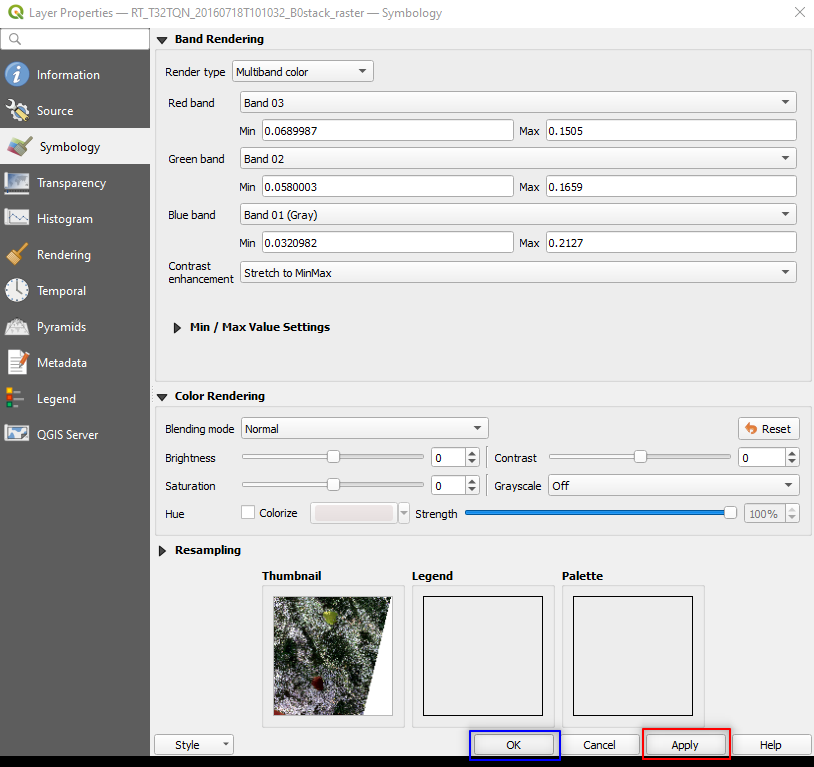
Fig. 3.4.1.10 Sample screenshot.
Now QGIS shows the satellite image with the correct colours (Fig. 3.4.1.11).
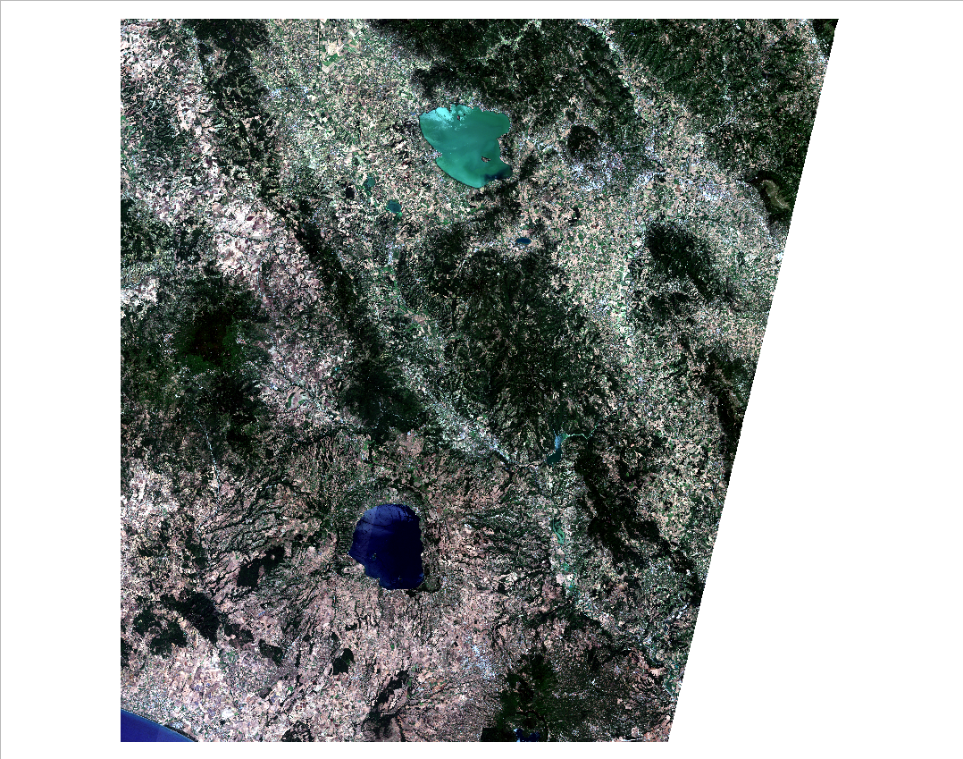
Fig. 3.4.1.11 Sample screenshot.
3.4.1.11. Resize the image
The Sentinel-2 images cover a larger area than our study area. Thus, we can resize them before starting the data processing.
Import in QGIS the vector layer ..\Study_area\trasimeno_proj.shp.
To resize (i.e. clip) the satellite image, search in the Processing Toolbox panel the command clip and open the tool Clip raster by mask layer in the GDAL package (Fig. 3.4.1.12).
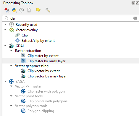
Fig. 3.4.1.12 Sample screenshot.
Hint
If the Processing Toolbox panel is not loaded, open the QGIS menu View → Panels and select Processing Toolbox.
A new window appears (Fig. 3.4.1.13). In the Clip Raster by Mask Layer window, set the following parameters:
Input layer:setRT_T32TQN_20160718T101032_B0stack_raster,Mask layer:setTrasimeno_proj,Source CRS:Not set,Target CRS:Not set,Assign a specified nodata value to output bands:Not set,Create an output alpha band:unselect,Match the extent of the clipped raster to the extent o the mask layer:select,Keep resolution of input raster:select,Set output file resolution: unselect,X Resolution of output bands: Not set,Y Resolution of output bands: Not set,Clipped (mask):Click on the three dots […]. SelectSave to fileand browse to the folder where you saved the merged images. Now save the new resized (clipped) image with the file nameRT_T32TQN_20160718T101032_Clip.
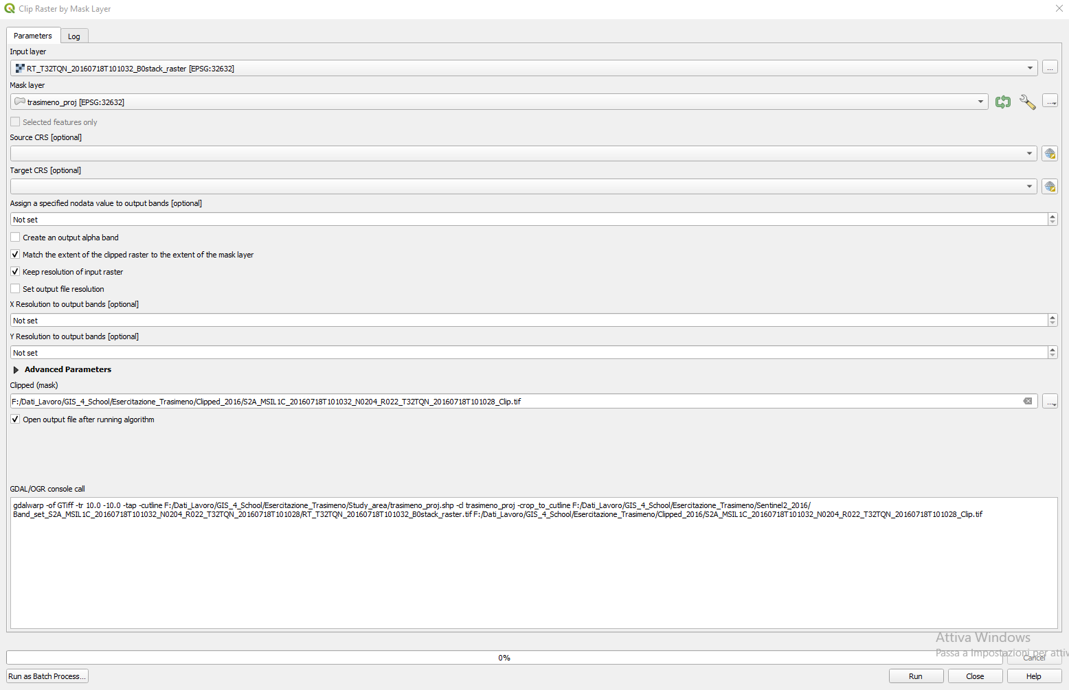
Fig. 3.4.1.13 Sample screenshot.
Click the button RUN, then CLOSE.
The new clipped image will appear in QGIS (Fig. 3.4.1.14). Now the image is smaller; thus, the subsequent data processing will be faster.
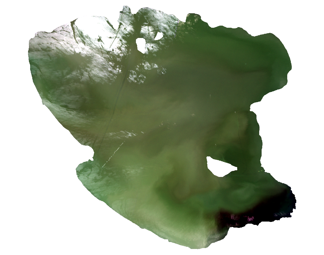
Fig. 3.4.1.14 Sample screenshot.
Like it happened when importing the full-size Sentinel-2 image, the resized image is loaded with the wrong order’s spectral bands. Thus, Lake Trasimeno has the wrong colour.
Repeat the steps described in Load the satellite images with the correct colours (Fig. 3.4.1.15).
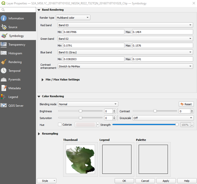
Fig. 3.4.1.15 Sample screenshot.
Now QGIS shows the satellite image with the correct colours (Fig. 3.4.1.16).
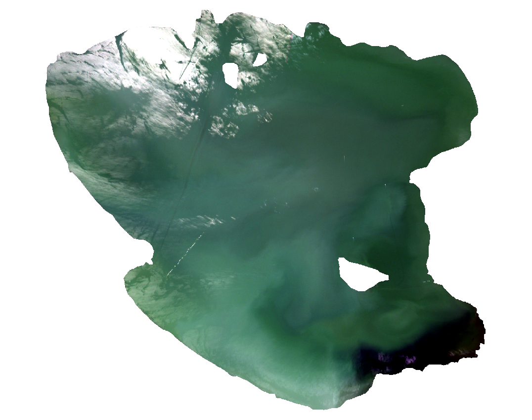
Fig. 3.4.1.16 Sample screenshot.
3.4.1.12. Calculate the Ratio Vegetation Index
Remember we use the spectral model described in (The modelling). Thus we calculate the Ratio Vegetation Index (RVI) (How spectral indices are designed) with Sentinel-2’s band 3 (B3) and band 4 (B4).
Now we do some calculations with images using the Raster Calculator. This tool allows evaluating equations based on the image pixel values.
Open Raster Calculator from the menu Raster → Raster Calculator... (Fig. 3.4.1.17).

Fig. 3.4.1.17 Sample screenshot.
Now, we have to write Equation (3.4.1.3) using QGIS syntax, so the software can understand it.
With the help of the calculator buttons, write the following expression in Raster Calculator Expression:
“RT_T32TQN_20160718T101032_Clip@4/RT_T32TQN_20160718T101032_Clip@3”
Hint
How to read QGIS equations?
“RT_T32TQN_20160718T101032_Clip@4” means:
“pick each pixel value of the resized image RT_T32TQN_20160718T101032_Clip for band 4 (@4)”.
“RT_T32TQN_20160718T101032_Clip@3” means:
“pick each pixel value of the resized image RT_T32TQN_20160718T101032_Clip for band 3 (@3)”.
Equations are calculated on a pixel basis. Thus the same equation is computed for each image pixel individually. The results are shown in a new image.
In Result Layer click on the three dots [...] next to Output layer and select where you want to save the results. Name the file Ratio_b4_b3.tif (Fig. 3.4.1.18).
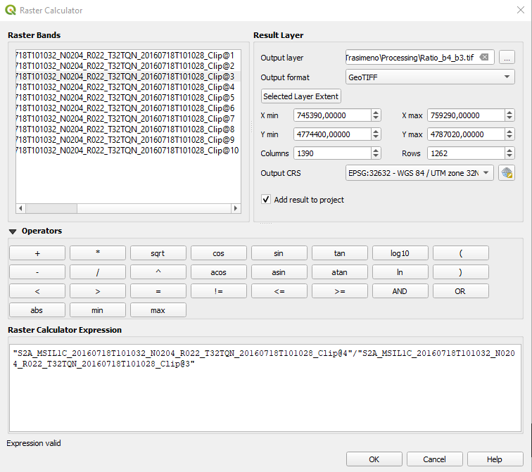
Fig. 3.4.1.18 Sample screenshot.
The output is a grayscale image, where each pixel contains its RVI value just computed (Fig. 3.4.1.19).
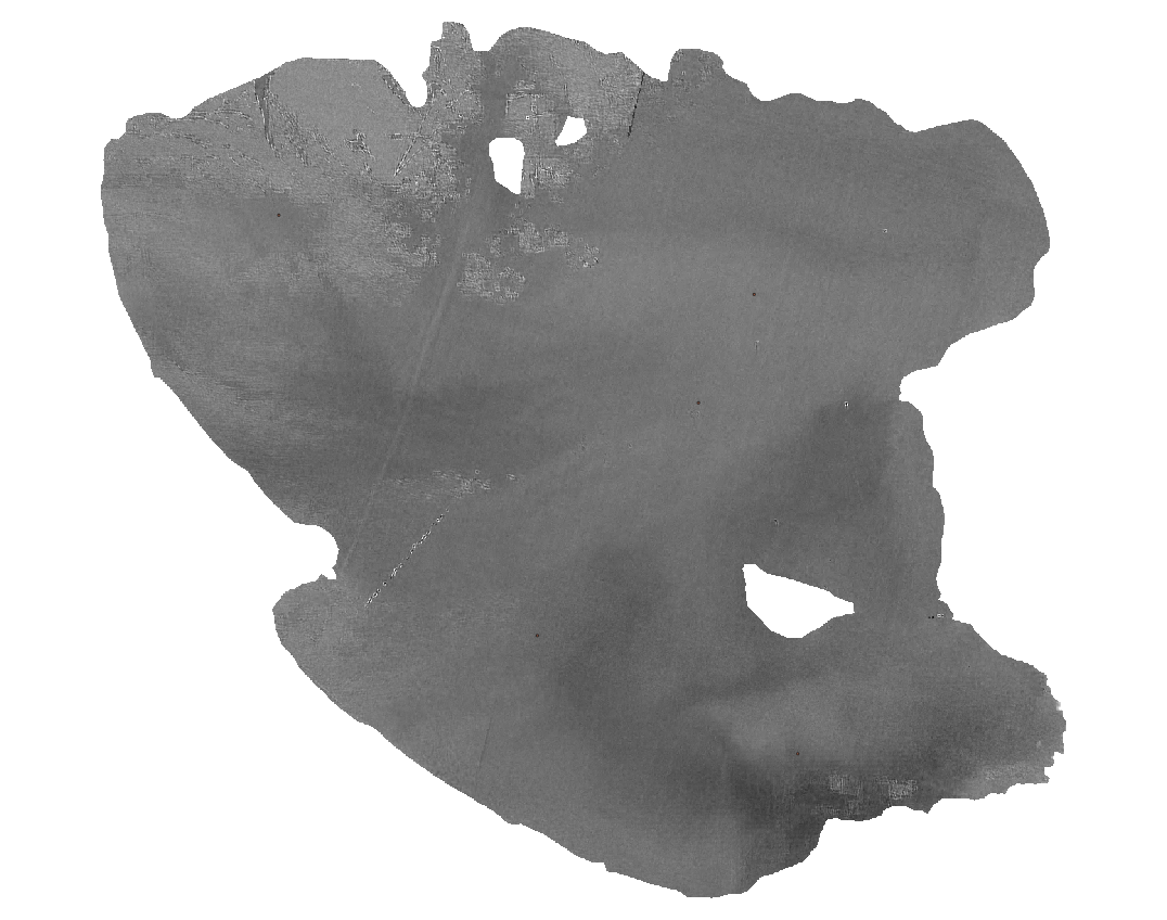
Fig. 3.4.1.19 Sample screenshot.
3.4.1.13. Sample the RVI in the calibration sites
We know chlorophyll’s concentration in the five calibration sites because it was measured on site. But also we need the satellite-derived RVI.
Import in QGIS the layer ..Points/Sampling_2016.shp. This file contains five small red polygons where the chlorophyll was sampled (Fig. 3.4.1.20).
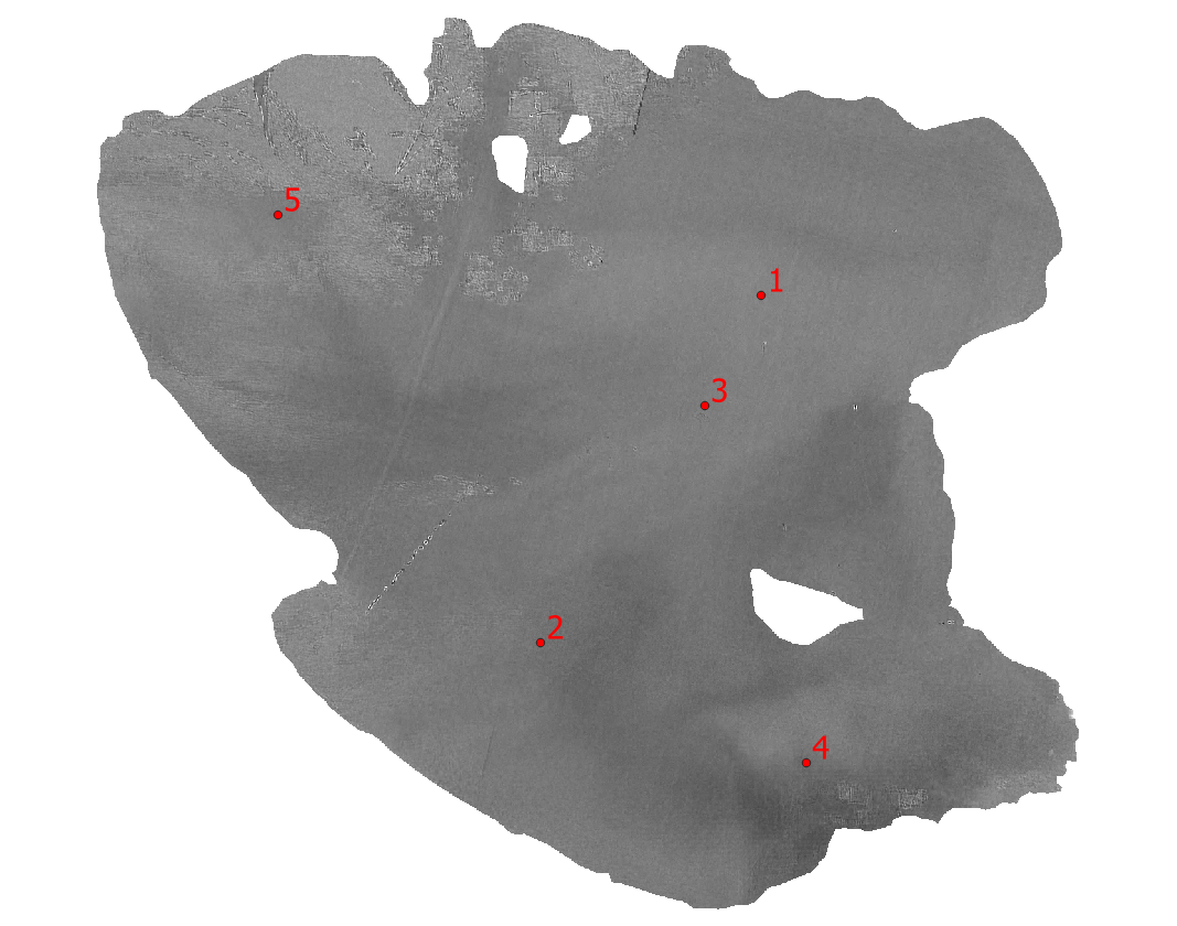
Fig. 3.4.1.20 Sample screenshot.
To extract from the satellite image the RVI of the calibration sites, we use the Zonal statistics tool.
Unlike the Cell Statistics algorithm that computes per-pixel statistics, the Zonal statistics algorithm calculates per-polygon statistics. That means the output (e.g. minimum, maximum, sum, count, etc.) is calculated only on pixels within the selected polygons.
Search in the Processing Toolbox panel for the Zonal statistics (or write zonal statistics in the Processing Toolbox search bar) and double-click on it (Fig. 3.4.1.21).
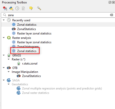
Fig. 3.4.1.21 Sample screenshot.
Hint
If the Processing Toolbox panel is not loaded, open the QGIS menu View → Panels and select Processing Toolbox.
The Zonal Statistics window opens. Select the following parameters (Fig. 3.4.1.22):
Raster layer: set to
Ratio_b4_b3,Raster band: set to
Band 1 (Gray),Vector layer containing zones: set to
Sampling_2016,Output column prefix: set to
b4/b3_,Statistics to calculate:
- Click on the three dots
[...], - Select Mean and unselect all the other statistics,
- Click the blue back arrow, located in the upper-left corner.
- Click on the three dots
Zonal statistics:
- Click on the three dots
[...], - Save to file,
- Select the folder where to save the Zonal Statistics file,
- Name the file
b4_b3_mean.
- Click on the three dots
Click the button RUN to execute the data processing.
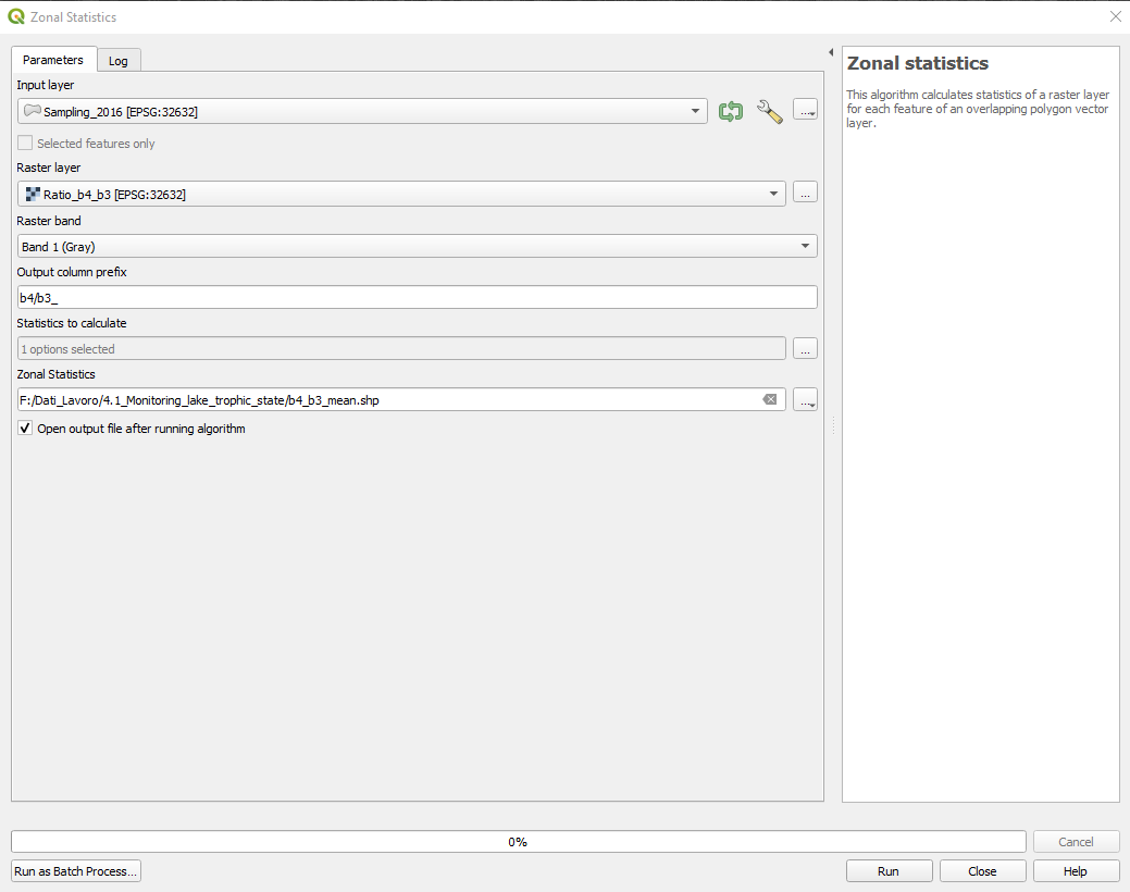
Fig. 3.4.1.22 Sample screenshot.
The data processing adds a new shapefile layer called “b4_b3_mean”. This is the copy of the shapefile “Sampling_2016”, with the addition of the new attribute (i.e. column) b4/b3_mean.
This attribute contains the RVI mean value of each polygon (i.e. rows) (Fig. 3.4.1.23).
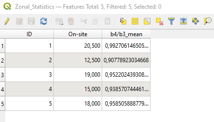
Fig. 3.4.1.23 Sample screenshot.
3.4.1.14. Calibrate the spectral model
To transform the spectral information of satellites into chlorophyll concentrations, we use the simple linear model of Equation (3.4.1.4):
Where a and b are coefficients (i.e. numbers) we have to compute using the on-site chlorophyll measures. This task is called model calibration.
We only have data for 5 calibration sites (very few). Thus we use the strategy:
Build 5 different calibration sets of chlorophyll measures, using only 4 out of the 5 measures available,
For each calibration set:
Select the coefficients a and b which give the best result.
For this task, we use a pre-compiled spreadsheet (Fig. 3.4.1.24). Open the file Regression.xls,
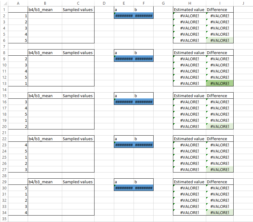
Fig. 3.4.1.24 Sample screenshot.
In cells B2-B6 copy the RVI values for the 5 calibration sites (four decimal digit are enough) (Fig. 3.4.1.25).
In cells C2-C6 copy the on-site measures of chlorophyll concentration (Fig. 3.4.1.25).
The spreadsheet automatically calculates the following data:
- Cells E2 and F2 show the estimated values for a and b using only the first 4 points,
- Cells H2-H6 show the estimated values of chlorophyll concentration for the fifth point that was left out,
- Cells I2-I6 show the difference between the estimated (column H) and the on-site measured (column C) chlorophyll concentration.
Note
The lower cell I6, the better the model. This cell shows the difference to the fifth data that was not used for the model calibration. Thus, it describes the accuracy of our model.
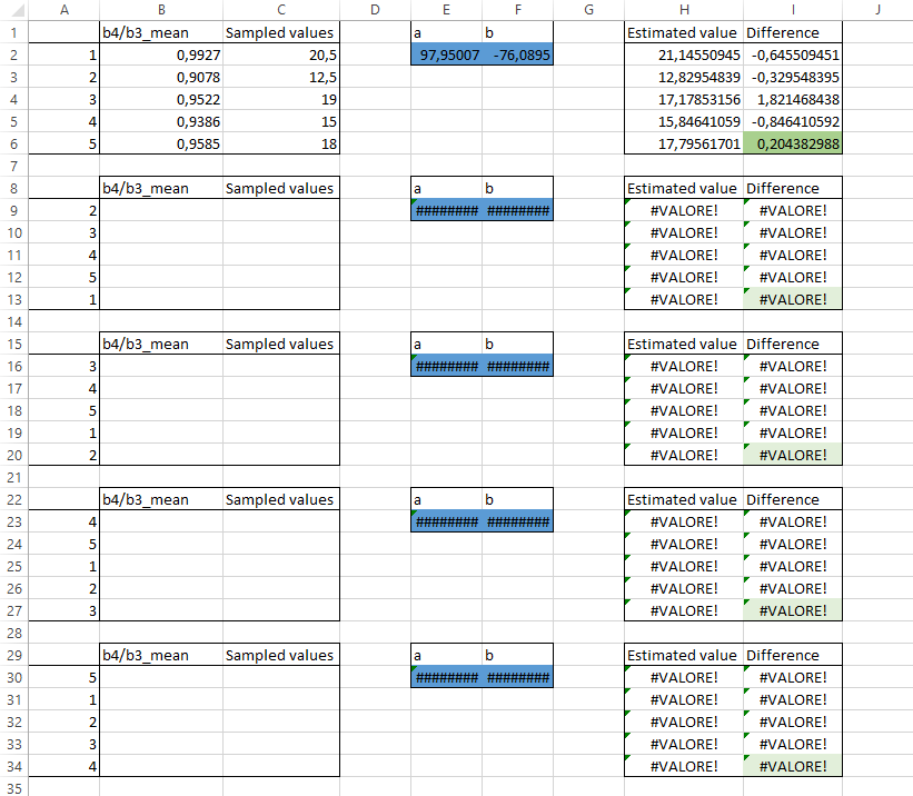
Fig. 3.4.1.25 Sample screenshot.
Now copy the values of cells B2-C6 in the other four boxes, but changing their order according to column A. This way, the fifth data used for testing the model accuracy is always different (Fig. 3.4.1.26).
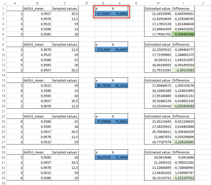
Fig. 3.4.1.26 Sample screenshot.
We see that out of the five repetitions, the second one is the best because it has the lowest difference between estimated and measured chlorophyll concentration (Fig. 3.4.1.26).
Consequently, the calibrated model becames Equation (3.4.1.5):
3.4.1.15. Create an automatic workflow
Remove all the layers from QGIS and import all the Sentinel-2 images from the folder ..\GIS_4_School\4.1_Monitoring_lake_trophic_state\Pre-processed. These images are already corrected for the atmospheric disturbance with the DOS algorithm and are, thus, ready for the processing.
Now we need to repeat the same data processing for ALL the 10 satellite images. This task is very time consuming and also prone to errors. Thus, we automate data processing.
Important
QGIS can be programmed with Python scripts. However, for most common tasks QGIS can be programmed using a Graphical Modeler that does not require any programming knowledge.
Open the Graphical Modeler tool: Processing → Graphical Modeler (Fig. 3.4.1.27).
Fig. 3.4.1.27 Sample screenshot.
The Model Designer window opens (Fig. 3.4.1.28). This tool links together single processing steps into a processing workflow.
Fig. 3.4.1.28 Sample screenshot.
First, we need to tell the Graphical Modeler that our Inputs are Sentinel-2 images. Search for Raster Layer in the left-side panel and double click it (Fig. 3.4.1.29).
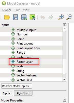
Fig. 3.4.1.29 Sample screenshot.
The Raster Layer Parameter Definition window opens. Type Sentinel-2 in the Description textbox (Fig. 3.4.1.30) and click the button OK.
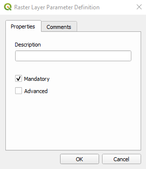
Fig. 3.4.1.30 Sample screenshot.
The first “block” of our processing chain is created (Fig. 3.4.1.31).
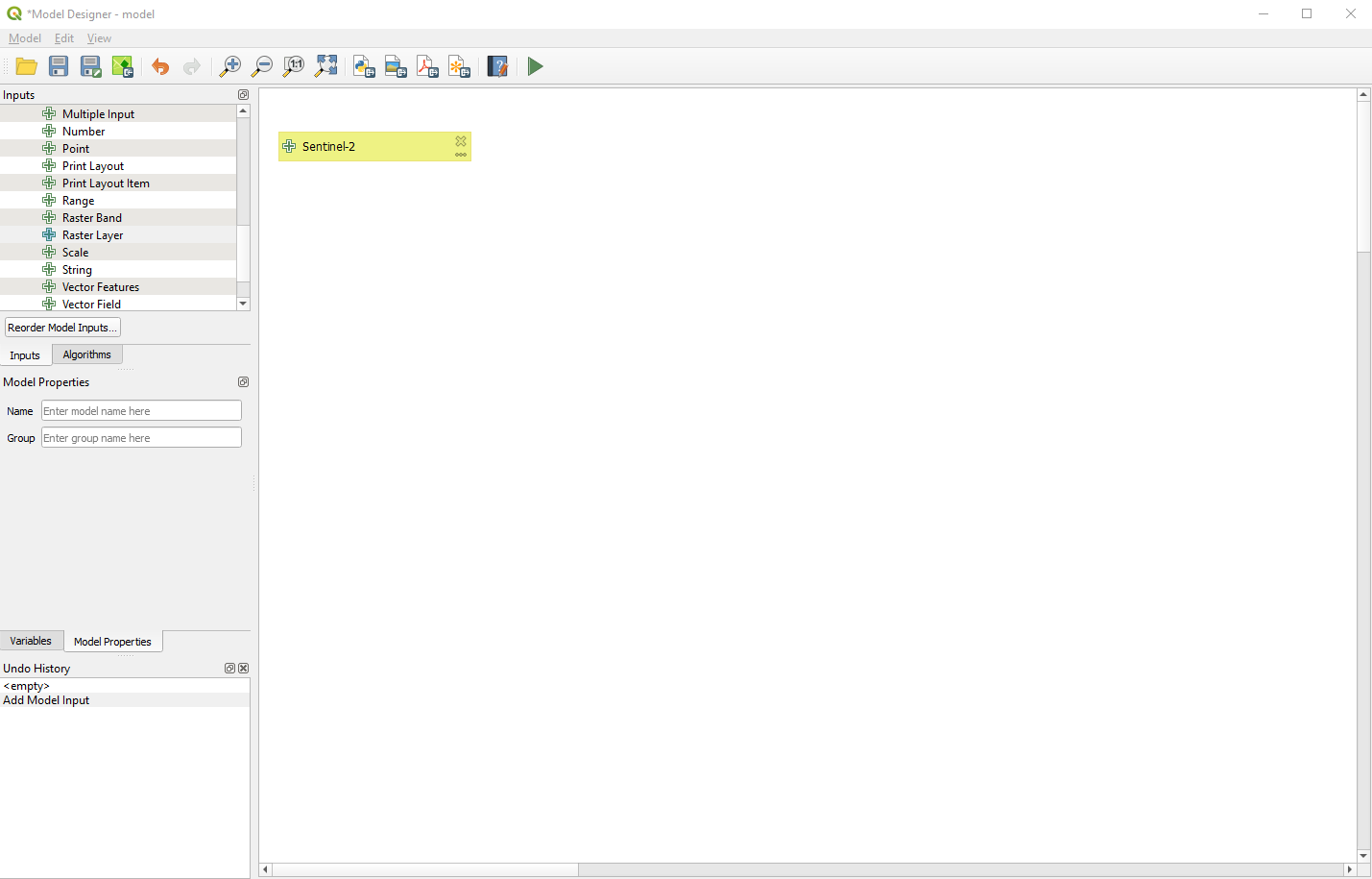
Fig. 3.4.1.31 Sample screenshot.
Now we need to build the processing “blocks” to automate:
- The estimation of chlorophyll concentration,
- The resizing of data to the study area,
- The processing of all the satellite images.
In the left-side panel click on the tab Algorithms. The list of available command changes. Search for Raster Calculator and select the tool Raster Calculator from the Raster analysis package (Fig. 3.4.1.32).
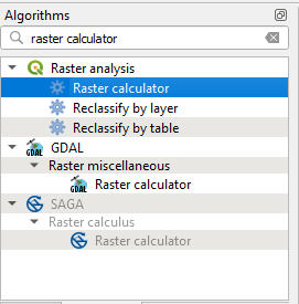
Fig. 3.4.1.32 Sample screenshot.
The Raster calculator window opens (Fig. 3.4.1.33). With the help of the calculator buttons, write the following expression:
97.95*(“Sentinel-2@4”/”Sentinel-2@3”) - 76.09
And set the following parameters (Fig. 3.4.1.33):
Reference layer(s):click on the button[123]and select Model inputSentinel-2`,Cell size:keep the default value,Output extent:keep the default value,Output CRS:keep the default value,Output:click on the drop-down list and selectValue. Type_Chl.tifand click the buttonOK.
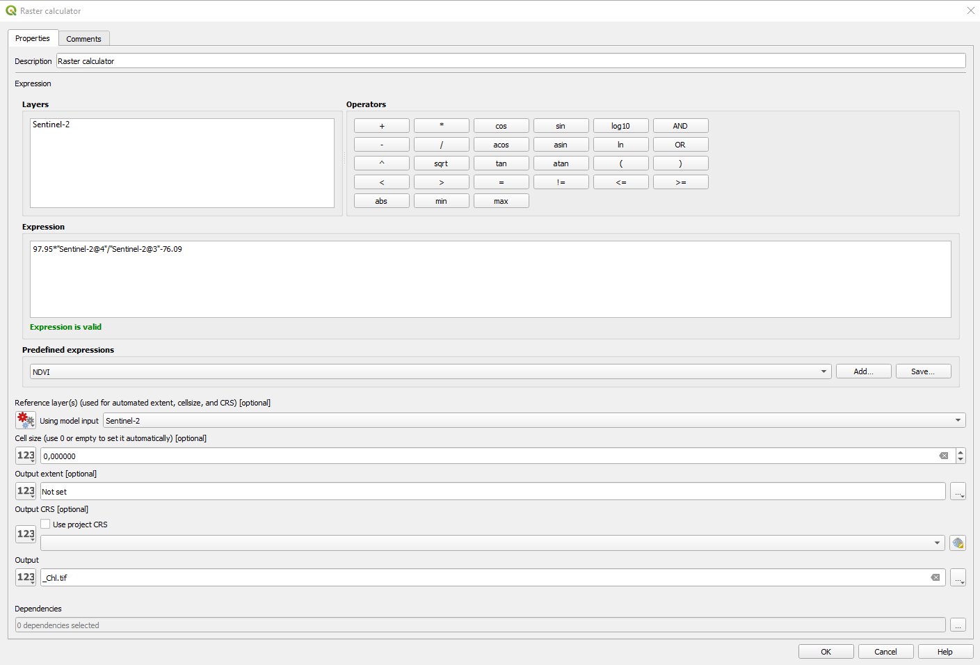
Fig. 3.4.1.33 Sample screenshot.
The second “block” appears in the Model Designer window (Fig. 3.4.1.34).
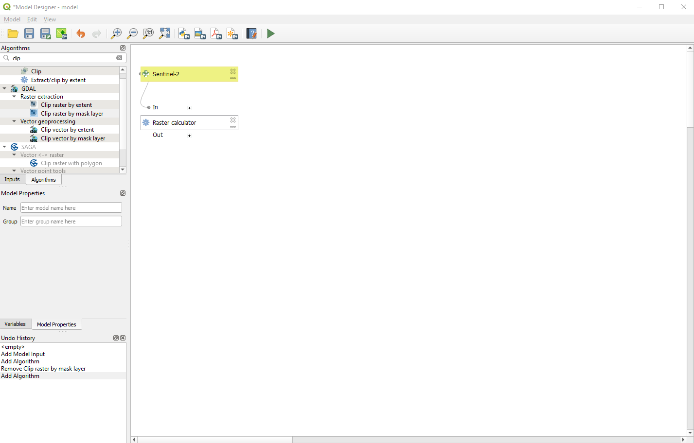
Fig. 3.4.1.34 Sample screenshot.
We now want to resize (clip) the output of our data processing to match the study area of Lake Trasimano.
Search again in the tab Algorithms for the command Clip. Click on Clip raster by mask layer from the GDAL package (Fig. 3.4.1.35).
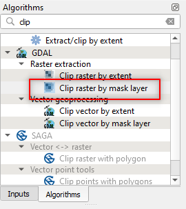
Fig. 3.4.1.35 Sample screenshot.
The Clip raster by mask layer window opens. Set the following parameters (Fig. 3.4.1.36):
Input layer:click on the button[123]and selectAlgorithm Output, and“Output” form algorithm “Raster calculator”,Mask layer: `` click the dots ``[…]and select the file../Study_area/trasimeno_proj.shp,Source CRS:leave it empty,Target CRS:leave it empty,Assign a specified nodata value to output bands:not set,Create an output alpha band:set no,Match the extent of the clipped raster to the extent of the mask layer:set yes,Keep resolution of input raster:set yes,Set output file resolution:set no,X Resolution to output bands:not set,Clipped:click on the drop-down list and selectModel Output. Type_clip.tifand click the buttonOK.
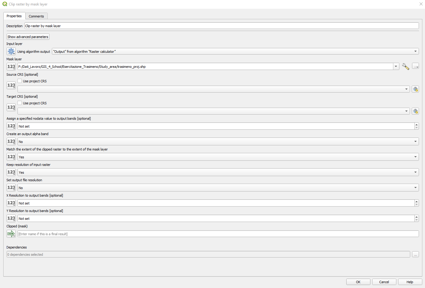
Fig. 3.4.1.36 Sample screenshot.
The last “block” appears in the Model Designer window (Fig. 3.4.1.37).
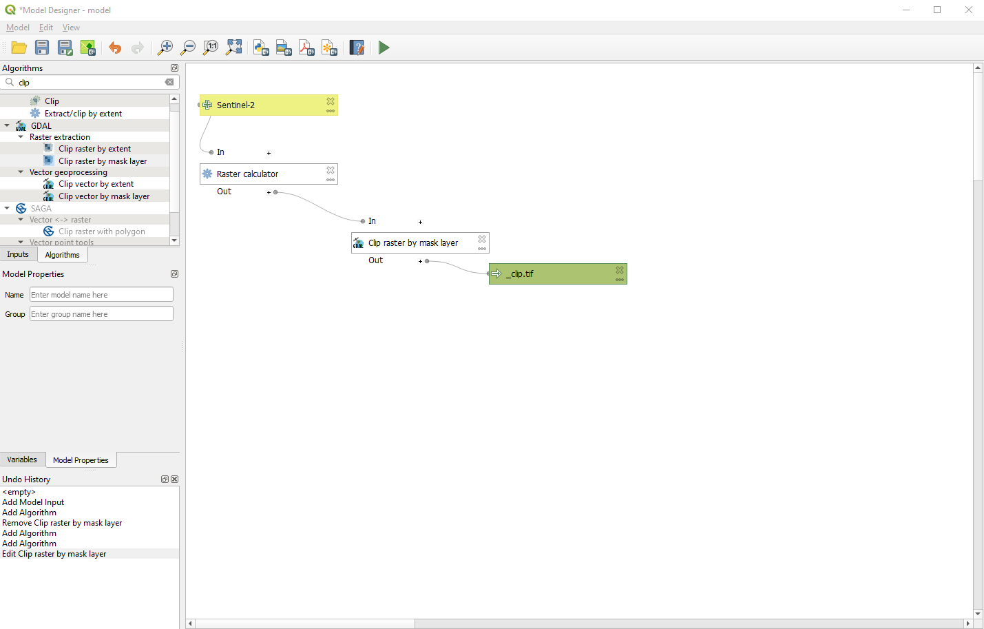
Fig. 3.4.1.37 Sample screenshot.
Let’s call our workflow Chl_Concentration. In the Model Designer window, type Chl_Concentration in Model Properties (Fig. 3.4.1.38).
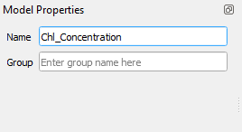
Fig. 3.4.1.38 Sample screenshot.
Finally, save the model: Model → Save model as, select a folder and save as Chl_Concentration (Fig. 3.4.1.39).
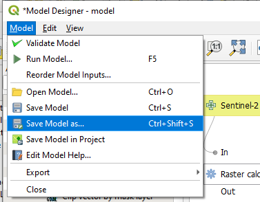
Fig. 3.4.1.39 Sample screenshot.
We have created the processing workflow (like if we have written a script) and are ready to launch it.
Note
Internally, QGIS transforms the graphical model into a Python code.
3.4.1.16. Create a batch processing to manipulate all the satellite images at once
We want to monitor the eutrophic level of Lake Trasimeno with Sentinel-2 images. Thus we have to run the processing workflow several times, each one with a different satellite image. This task is called batch processing.
To run the model, select Model → Run Model.
In the bottom-left corner select Run as Batch Process. That means the processing is not started immediately but is qued (Fig. 3.4.1.40)
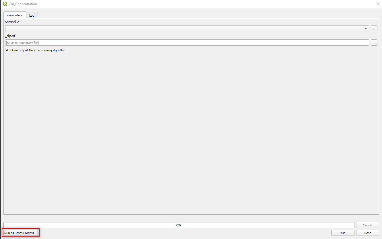
Fig. 3.4.1.40 Sample screenshot.
The Batch Processing window opens (Fig. 3.4.1.41).
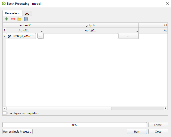
Fig. 3.4.1.41 Sample screenshot.
Select Sentinel-2 → Autofill → Select from open layers. In the Multiple selection window, select Select All and click the button OK (Fig. 3.4.1.42).
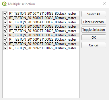
Fig. 3.4.1.42 Sample screenshot.
We QGIS knows we want to apply the data processing to ALL the Sentinel-2 images listed in (Fig. 3.4.1.43).
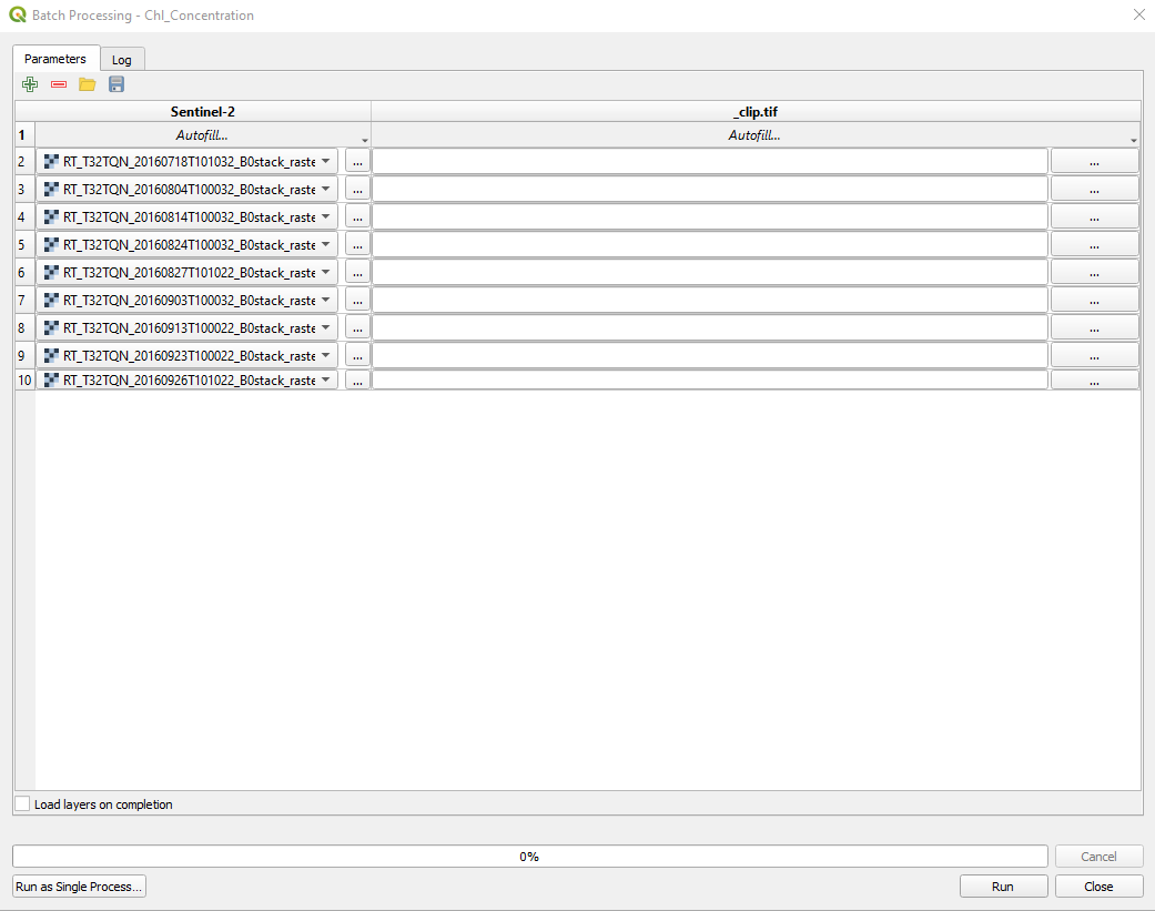
Fig. 3.4.1.43 Sample screenshot.
But QGIS still don’t know how to save the results.
Select _Clip.tif → Autofill → Calculate by Expression. In the window Expression String Builder type (Fig. 3.4.1.44):
concat(‘[file path]\’, left(@Sentinel2 ,18), ‘_Chl_clip.tif’)
where [file path] is the path where you want to save the data processing results. .. important:: Be careful to double-up all the backslashes (“\”) in the path! (e.g. c:\exercise\output\)
Hint
What does it means concat(‘[file path]\’, left(@Sentinel2 ,18), ‘_Chl_clip.tif’)?
The concat command concatenates multiple strings.
Click the button OK.
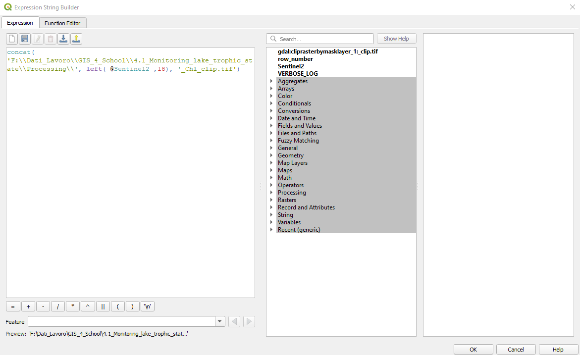
Fig. 3.4.1.44 Sample screenshot.
Now, QGIS knows how to save the results (Fig. 3.4.1.45).
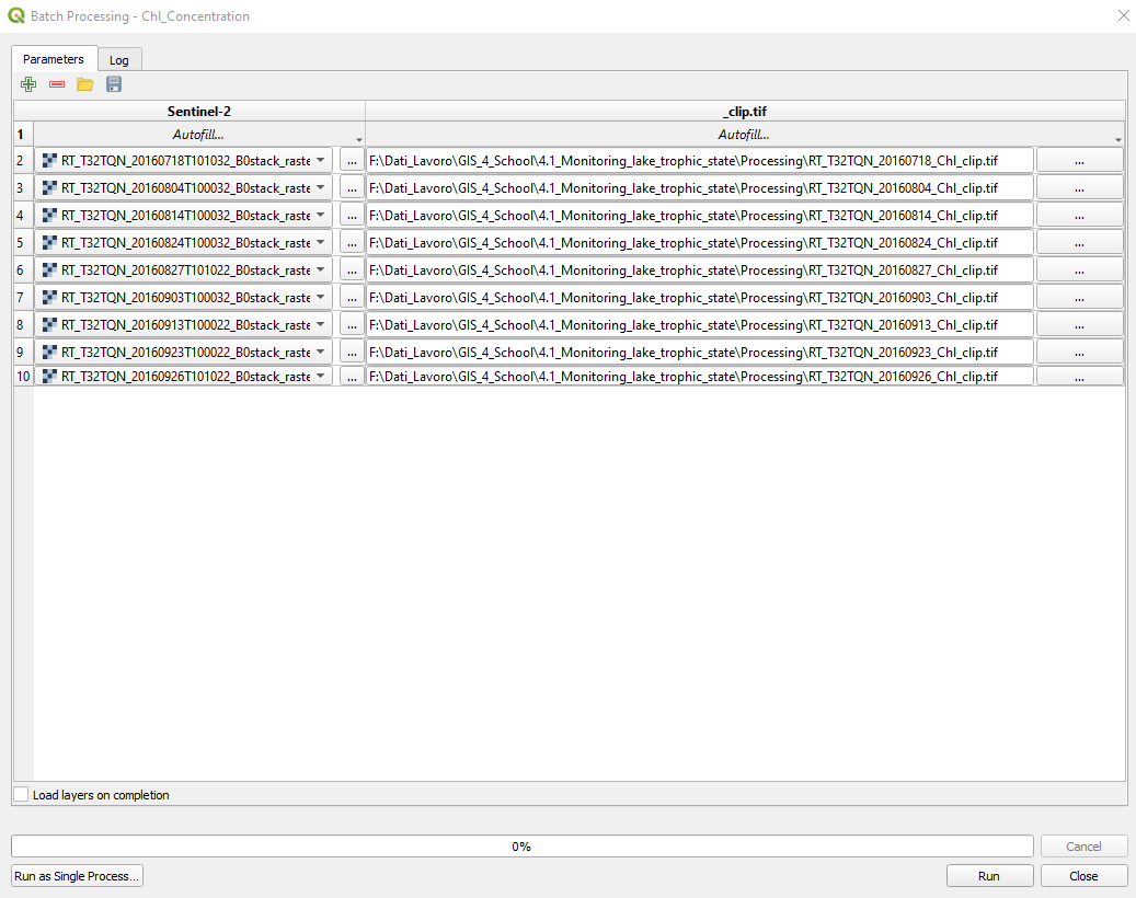
Fig. 3.4.1.45 Sample screenshot.
3.4.1.17. Estimate the chlorophyll’s concentration in Lake Trasimeno
Click the button Run. QGIS runs the processing workflow for each satellite image and saves the results in the output folder.
Remove all the layer from QGIS and import the outputs of the automatic data processing. Each image describes the map of the estimated chlorophyll concentration. (Fig. 3.4.1.46) shows an example
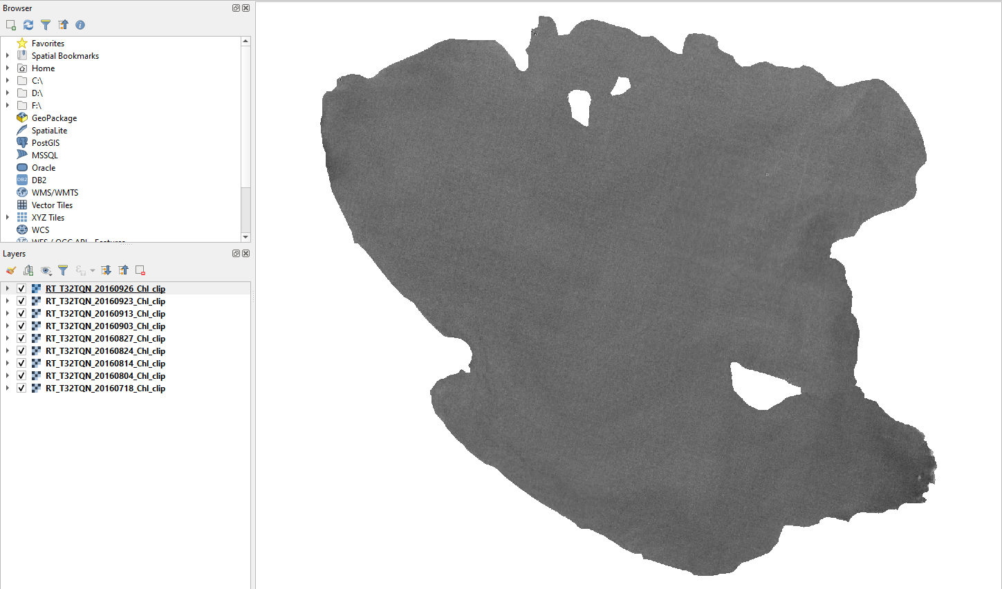
Fig. 3.4.1.46 Sample screenshot.
Order the maps from the most recent (top) to the oldest (bottom) (Fig. 3.4.1.47).
Fig. 3.4.1.47 Sample screenshot.
Let’s compare the temporal changes of the chlorophyll load.
Right-click on the map estimated for 27 August 2016 (layer T32TQN_20160827_Chl_Clip) and select Properties (Fig. 3.4.1.48).
Fig. 3.4.1.48 Sample screenshot.
In the left-side panel select Symbology and set the following parameters (Fig. 3.4.1.49):
Render type:setSingleband pseudocolor. This option colourize the map,Band:setBand 1 (Gray),Min and Max:keep the default values,Interpolation:setDiscrete. This option assigns a unique colour to all values included in the same class,Color ramp:click on the arrow and:- Select the color ramp
RdYIGn. If the color ramp RdYIGn is not listed, click onExpand All Color Ramps, - Click
Invert Color Ramp. This option shows a higher concentration in red and a lower concentration in green,
- Select the color ramp
Mode:setQuantile,Classes:set7. This option creates 7 ranges of chlorophyll concentration.
Click the button Classify. Then click the button Export color map to file and save to disk with file name colour_ramp. Now we can to apply the same colour ramp to all the maps.
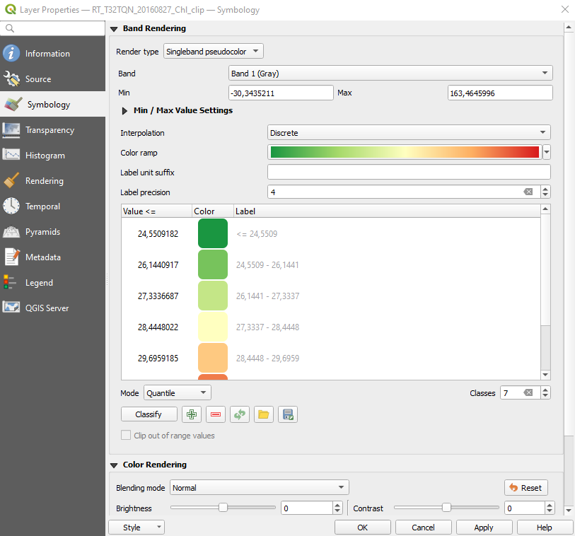
Fig. 3.4.1.49 Sample screenshot.
Click the button Apply and then OK. The map now shows chlorophyll concentration values about 55 mg/m3, making Lake Trasimeno on edge between eutrophic and hypereutrophic states in summer (Fig. 3.4.1.50).
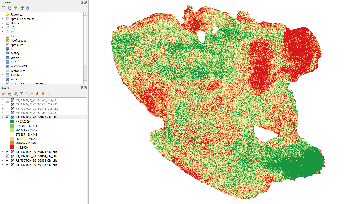
Fig. 3.4.1.50 Sample screenshot.
Now apply the saved color ramp to all the other maps. For each map, right-click on the map, select Properties and go to the Symbology menu (Fig. 3.4.1.51).
Set the render type: as singleband pseudocolor, click the button Load color map from file and load the file colour_ramp.
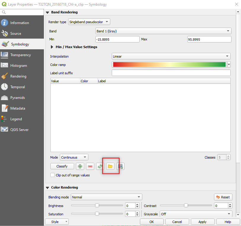
Fig. 3.4.1.51 Sample screenshot.
Click the button Apply and OK.
Now all the maps have the same colour ramp, and the eutrophic states can be compared.
3.4.1.18. Simple analysis of results
Let’s analyze the trophic level dynamics of Lake Trasimeno in summer 2016.
Keep the maps of chlorophyll load estimated for 18 July 2016 (layer T32TQN_20160718_Chl_Clip), 4 August 2016 (layer T32TQN_20160804_Chl_Clip), 27 August 2016 (layer T32TQN_20160827_Chl_Clip), 13 September 2016 (layer T32TQN_20160913_Chl_Clip), 26 September 2016 (layer T32TQN_20160926_Chl_Clip), and close the other maps.
As done in Estimate the chlorophyll’s concentration in Lake Trasimeno, right-click on each map and select Properties. In the left-side panel select Symbology and set the following parameters (Fig. 3.4.1.52):
Render type:setSingleband pseudocolor,Band:setBand 1 (Gray),Min and Max:keep the default values,Interpolation:setDiscrete,Mode:setEqual Interval,Classes:set4.
Double-click and edit the class value, colour and label as shown in Fig. 3.4.1.52.
Click the button Export color map to file and save to disk with file name colour_levels. Now we can load apply the same colour scheme to all the maps.
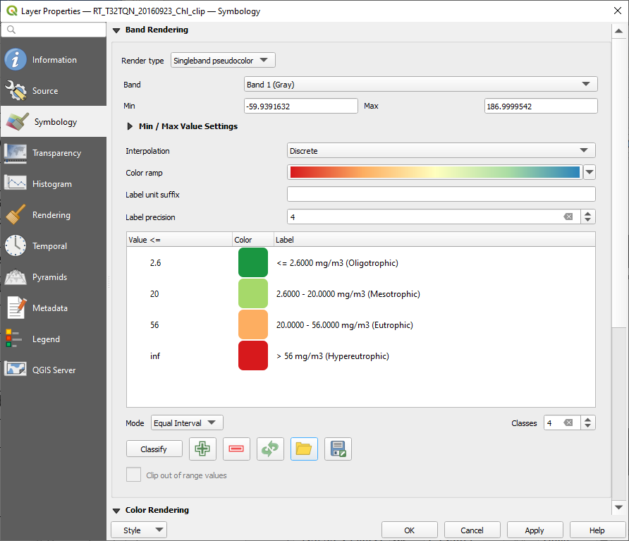
Fig. 3.4.1.52 Sample screenshot.
18 July 2016
In mid-July, the majority of Lake Trasimeno is mesotrophic. Eutrophic zones are limited to the north and shores (Fig. 3.4.1.53).
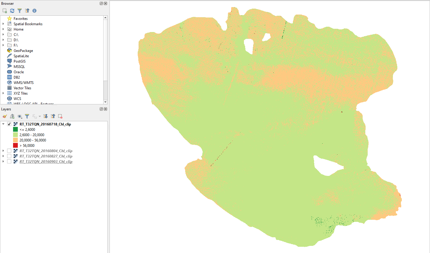
Fig. 3.4.1.53 Sample screenshot.
4 August 2016
Two weeks later, most of Lake Trasimeno is eutrophic. Only the southern lake is still mesotrophic (Fig. 3.4.1.54).
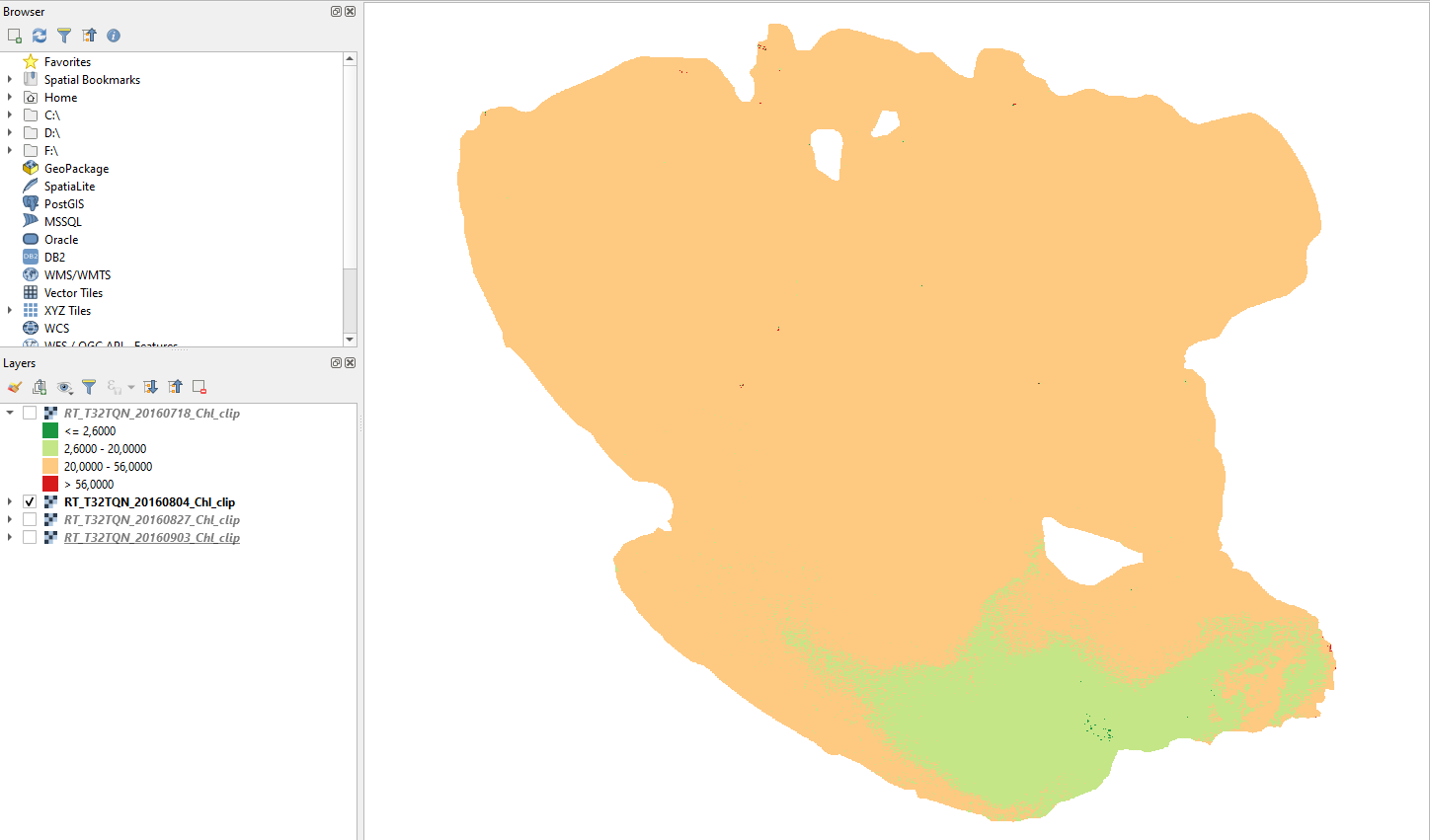
Fig. 3.4.1.54 Sample screenshot.
27 August 2016
At the end of August, almost all Lake Trasimeno is eutrophic. Only a small part of the south-east is still mesotrophic (Fig. 3.4.1.55).
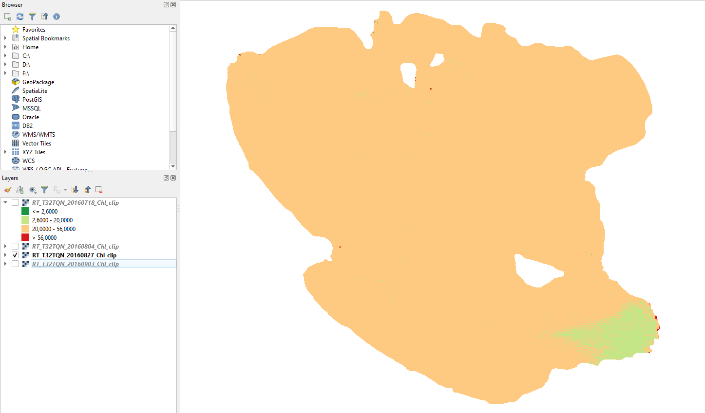
Fig. 3.4.1.55 Sample screenshot.
September 2016
In September, Lake Trasimeno turns to a stable eutrophic state. (Fig. 3.4.1.56).
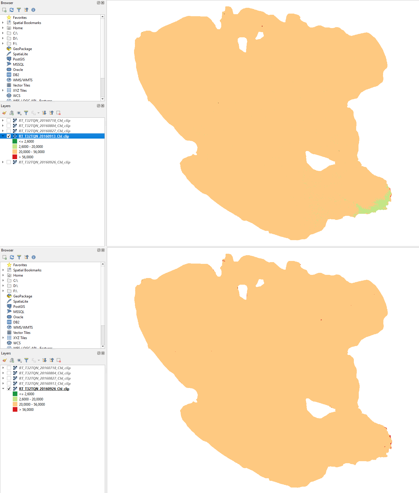
Fig. 3.4.1.56 Sample screenshot (top: 13 September 2016, bottom: 26 September 2016).
Overall, our results are consistent with the characteristics and habitat of Lake Trasimeno (see Study area).
3.4.2. Mapping crop types (difficulty: intermediate)
3.4.2.1. Download the data
Important
DATA FOR THE EXERCISE
Click here to download the data for this exercise (2.5 GB).
3.4.2.2. The environmental problem
Agriculture is highly dependent on the climate. For any crop type, the effect of climate change will depend on the crop’s optimal temperature and water availability for growth and reproduction.
The temperature increase will change farming practices. In some countries, warming could increase productivity or allow farmers to shift to crops that are currently grown in warmer areas. A higher temperature could exceed the crop’s optimum temperature in some other countries, and production will decline.
Warning
The role of climate change.
Overall, climate change may make it difficult to grow crops the same ways and in the same places as in the past.
3.4.2.3. Scope of the exercise
This exercise shows a very simple method to map crop types with satellites.
3.4.2.4. Study area
The study area is Wallonia, the southern and most extensive region of Belgium. The climate is temperate, moderately humid, with an annual rainfall of about 780 mm well distributed over the year.
The soil is loamy and moderately well-drained; thus, it does not require irrigation. The main winter crops are Wheat and Barley, while the main Summer crops are Potatoe, Sugar beet and Maize. Field size ranges from 3 ha to 15 ha.
3.4.2.5. Satellite images
The analysis is done using two cloud-free Sentinel-2 images collected in the following dates of Spring-Summer 2018:
- 18 April 2018,
- 27 June 2018.
Warning
The Sentinel-2 images used in this exercise are supplied as atmospherically corrected L2A products. THUS, THEY CAN BE USED WITHOUT ANY FURTHER PRE-PROCESSING.
3.4.2.6. Land cover information
Information on the actual land cover is provided as polygons (shapefiles). Each red polygon in Fig. 3.4.2.1 stands for a crop field with available information on the cultivated crop type.
In the study area are cultivated the following main crops:
- Barley,
- Chicory,
- Wheat,
- Flax (linseed),
- Maize,
- Peas,
- Potato,
- Sugar beet.
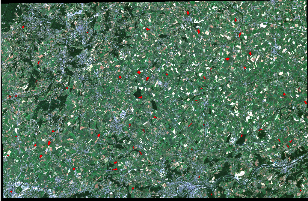
Fig. 3.4.2.1 Farmlands in the Wallonia region.
3.4.2.7. Methods
The mapping process uses the Minimum Distance supervised classification algorithm. The training samples, called Region Of Interest (ROI) in QGIS, are extracted from available land cover polygons.
3.4.2.8. QGIS set-up
Open QGIS and select New Empty Project in the main window (Fig. 3.4.2.2).
Fig. 3.4.2.2 Sample screenshot.
3.4.2.9. Prepare multiband files for 10-meter satellite images
Open the folder S2A_MSIL2A_20180418T104021_N0207_R008_T31UFS_20180418T125356.SAFE → GRANULE → L2A_T31UFS_A014734_20180418T104512 → IMG_DATA → R10m.
Each 10-meter Sentinel-2’s spectral band is stored as a single file. Now select the spectral bands with 10 m spatial resolution, those file names end with (Fig. 3.4.2.3):
- “…_B02_10m.jp2”,
- “…_B03_10m.jp2”,
- “…_B04_10m.jp2”,
- “…_B08_10m.jp2”.
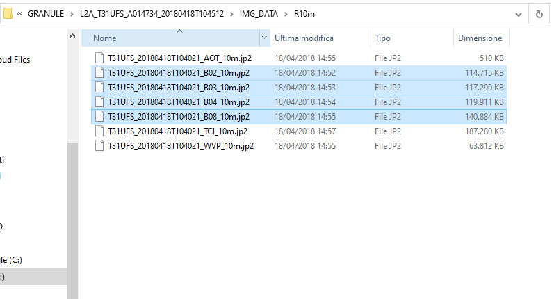
Fig. 3.4.2.3 Sample screenshot.
Import these files in QGIS. In the menu bar open Layer → Data Source Manager (Fig. 3.4.2.4).

Fig. 3.4.2.4 Sample screenshot.
On the left-side menu, select Raster (Fig. 3.4.2.5).
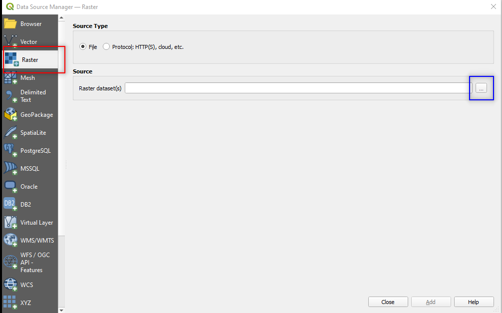
Fig. 3.4.2.5 Sample screenshot.
Select the following parameters:
Source type:selectFile (Default option),Source:- Click on the three dots
[...], browse to the folderS2A_MSIL2A_20180418T104021_N0207_R008_T31UFS_20180418T125356.SAFE→GRANULE→L2A_T31UFS_A014734_20180418T104512→IMG_DATA→R10m, - Select the four images (files “.jp2”),
- Click on
Open(Fig. 3.4.2.6).
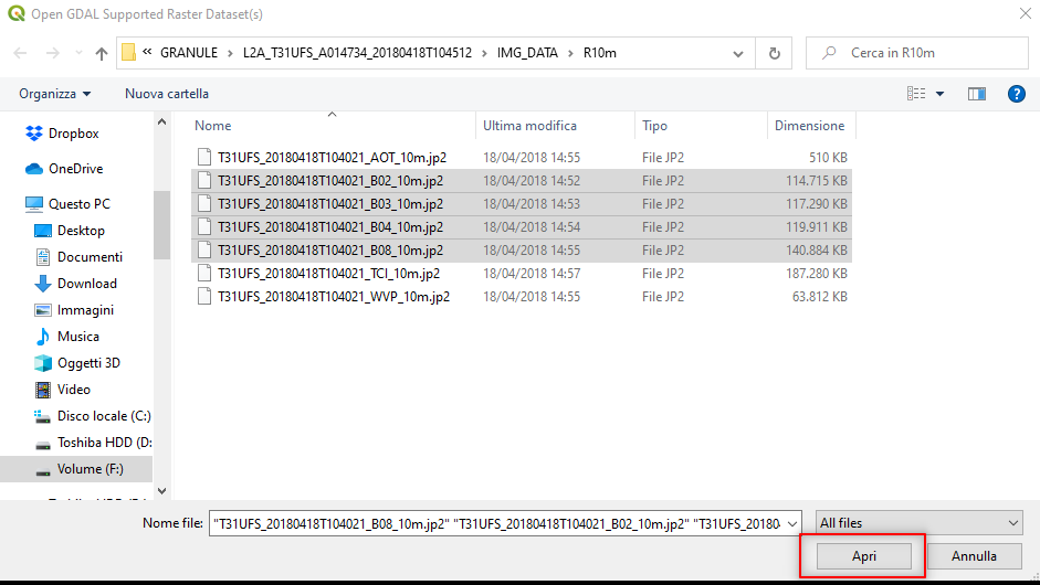
Fig. 3.4.2.6 Sample screenshot.
Click Add (Fig. 3.4.2.7).
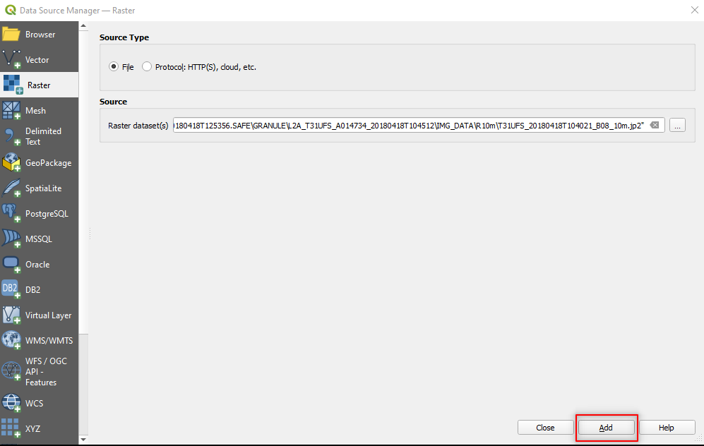
Fig. 3.4.2.7 Sample screenshot.
Now create the multiband file.
In QGIS menu bar open the Raster menu and select Miscellaneous → Merge (Fig. 3.4.2.8).
Fig. 3.4.2.8 Sample screenshot.
In the merge window click on the three dots [...] at the end of the Input layers parameter (Fig. 3.4.2.9).
Fig. 3.4.2.9 Sample screenshot.
Select all the layers and click OK (Fig. 3.4.2.10).
Caution
Be careful to check that files are sorted in the following order: B02, B03, B04 and B08.
If the order is different, the saved image will have the wrong order’s spectral bands, and the image processing will give incorrect results.
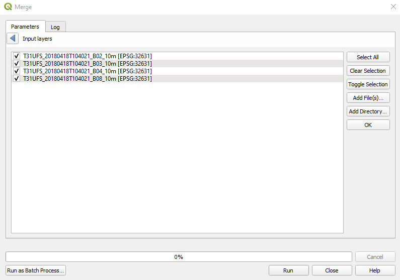
Fig. 3.4.2.10 Sample screenshot.
Select the following parameters in the Merge window:
Grab pseudocolor table from first layer:unselected,Place each input file into a separate band:select,Output data type:Float32,Merged:Click on the three dots[...]:- Save to File
- Select the folder where you want to save the image. Use the following file name
S2_20180418_10m.tif.
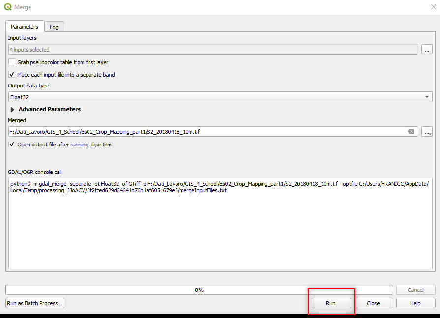
Fig. 3.4.2.11 Sample screenshot.
3.4.2.10. Prepare multiband files for 20-meter satellite images
Repeat the same data processing done for the 10-meter satellite images, and create multiband files for the 20-meter satellite images.
Remove the open layers from QGIS and open the folder S2A_MSIL2A_20180418T104021_N0207_R008_T31UFS_20180418T125356.SAFE → GRANULE → L2A_T31UFS_A014734_20180418T104512 → IMG_DATA → R20m.
Each 20-meter Sentinel-2’s spectral band is stored as a single file. Now select the spectral bands with 20 m spatial resolution, those file names end with (Fig. 3.4.2.12):
- “…B02_20m.jp2”,
- “…B03_20m.jp2”,
- “…B04_20m.jp2”,
- “…B05_20m.jp2”,
- “…B06_20m.jp2”,
- “…B07_20m.jp2”,
- “…B8A_20m.jp2”,
- “…B11_20m.jp2”,
- “…B12_20m.jp2”.
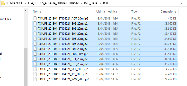
Fig. 3.4.2.12 Sample screenshot.
Now create the multiband file by merging together the spectral bands, as described in Prepare multiband files for 10-meter satellite images.
Caution
Be careful when selecting the input layers. Band B8A is the last entry by default. IT MUST BE MOVED AFTER BAND B07 (Fig. 3.4.2.13).
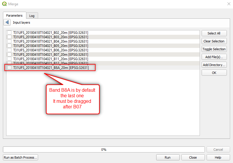
Fig. 3.4.2.13 Sample screenshot.
Once band B8A is moved AFTER band B07, the list will look like Fig. 3.4.2.14).
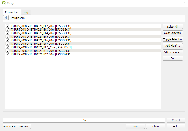
Fig. 3.4.2.14 Sample screenshot.
Select the following parameters in the Merge window:
Grab pseudocolor table from first layer:unselected,Place each input file into a separate band:select,Output data type:Float32,Merged:Click on the three dots[...]:Save to File: `` Save the output file as ``S2_20180418_20m.tifin the same folder used for 10-meters Sentinel-2 images.
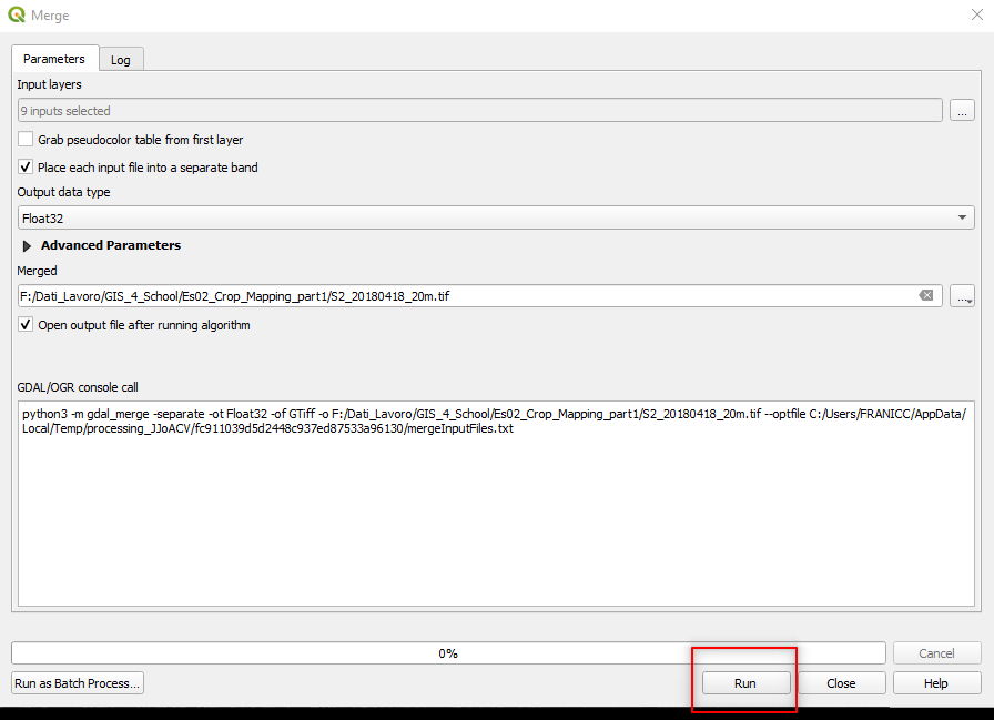
Fig. 3.4.2.15 Sample screenshot.
3.4.2.11. Resize the image
The Sentinel-2 images cover a larger area than our study area. Thus, we can resize them before starting the classification process.
In the menu bar select Layer → Data Source Manager (Fig. 3.4.2.16).
Fig. 3.4.2.16 Sample screenshot.
In the left-side menu select Vector and set the following parameters (Fig. 3.4.2.17):
Source Type:setFile (Default setting),Source:Click on the three dots[...]and browse to the folderStudy_area\. Select the fileWallonia_Study_Area.shp(Fig. 3.4.2.18).
Click the button Add.
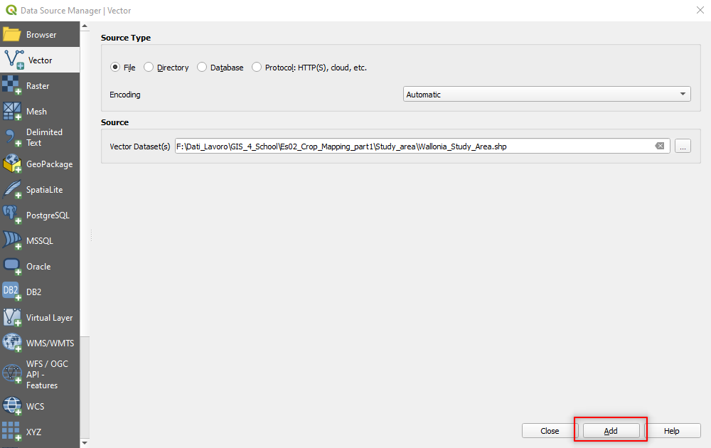
Fig. 3.4.2.17 Sample screenshot.
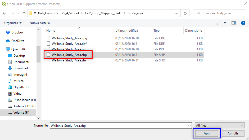
Fig. 3.4.2.18 Sample screenshot.
A rectangle will appear in the bottom left corner of the image (Fig. 3.4.2.19). This is the extent of the study area.
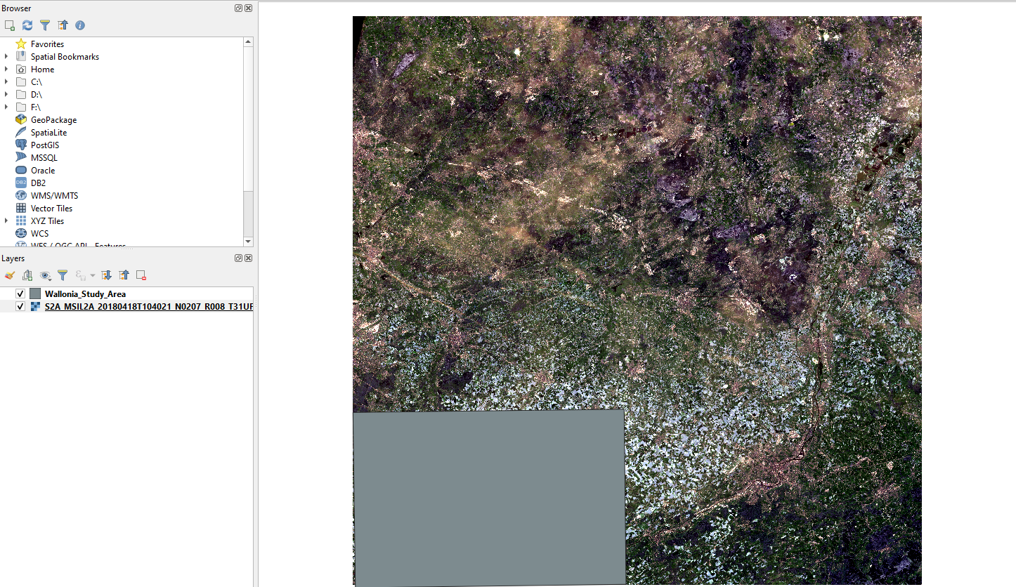
Fig. 3.4.2.19 Sample screenshot.
To resize (i.e. clip) the satellite image, search in the Processing Toolbox panel the command clip and open the tool Clip raster by mask layer in the GDAL package (Fig. 3.4.2.20).
Hint
If the Processing Toolbox panel is not loaded, open the QGIS menu View → Panels and select Processing Toolbox.
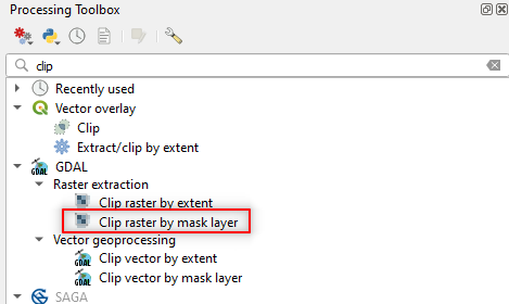
Fig. 3.4.2.20 Sample screenshot.
In the Clip Raster by Mask Layer window, set the following parameters (Fig. 3.4.2.21):
Input layer:setS2_20180418_20m,Mask layer:setWallonia_Study_Area,Source CRS:Not set,Target CRS:Not set,Assign a specified nodata value to output bands:Not set,Create an output alpha band:unselect,Match the extent of the clipped raster to the extent o the mask layer:select,Keep resolution of input raster:select,Set output file resolution: unselect,X Resolution of output bands: Not set,Y Resolution of output bands: Not set,Clipped (mask):Click on the three dots […]. SelectSave to fileand browse to the folder where you saved the merged images. Now save the new resized (clipped) image the file nameS2_20180418_20m_clip.
Click the button RUN.
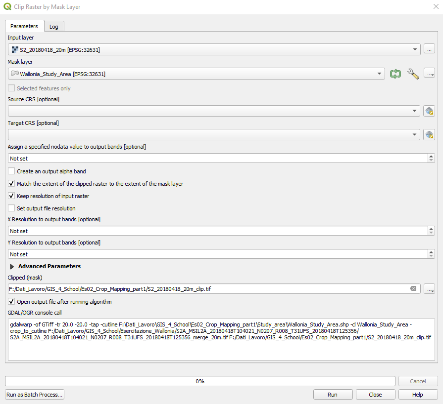
Fig. 3.4.2.21 Sample screenshot.
The new clipped image will appear in QGIS (Fig. 3.4.2.22). Now the image is smaller; thus, the subsequent data processing will be faster.
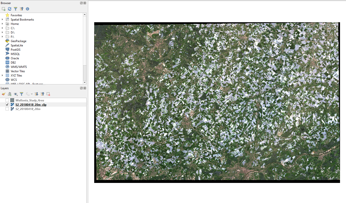
Fig. 3.4.2.22 Sample screenshot.
Remove all the layers from QGIS.
3.4.2.12. Create the training samples for image classification
In our study area, farmlands are much more extensive than 20 m x 20 m. Thus, we use the 20-meters Sentinel-2 image to perform the classification process. On the one hand we do not need greater detail, and on the other hand the 20-meters images have much more spectral bands, thus allowing a better recognition of crop types.
Import in QGIS the Sentinel-2 multiband image of 27 June 2018 from the folder ..\Sentinel-2\20m (Fig. 3.4.2.23). This image is already merged and resized as described in Prepare multiband files for 10-meter satellite images and Resize the image.
Fig. 3.4.2.23 Sample screenshot.
Import in QGIS the shapefile Wallonia_2018_In_Situ_Extracted_v1.shp that describes a field with available information on the cultivated crop type. This information is stored in the attribute table (Fig. 3.4.2.24).
To see the attributes, right-click the layer Wallonia_2018_In_Situ_Extracted_v1.shp and select Open Attribute Table.
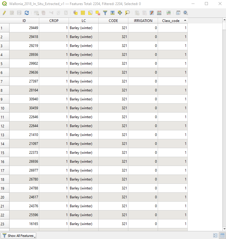
Fig. 3.4.2.24 Sample screenshot.
The attribute LC (i.e. land cover) describes the crop type, and the attribute Class_code assigns a unique numerical code to each land cover class. The database uses the coding scheme of Table 3.4.2.1.
| Land cover | Class code |
|---|---|
| Barley | 1 |
| Chicory | 2 |
| Common wheat | 3 |
| Flax (Linseed) | 4 |
| Grassland | 5 |
| Maize | 6 |
| Not Agriculture | 7 |
| Peas | 8 |
| Potato | 9 |
| Sugar beet | 10 |
Important
We need some a priori information on the land cover for EACH crop type we want to map. This information is used as training samples during the classification process.
Now we have to tell the software which satellite image we want to classify (Fig. 3.4.2.25).
Open the SCP tool window.
Select Band set from the left-side menu.
Set the parameter Multiband image list to the Sentinel-2 multiband image S2_20180627_20m.
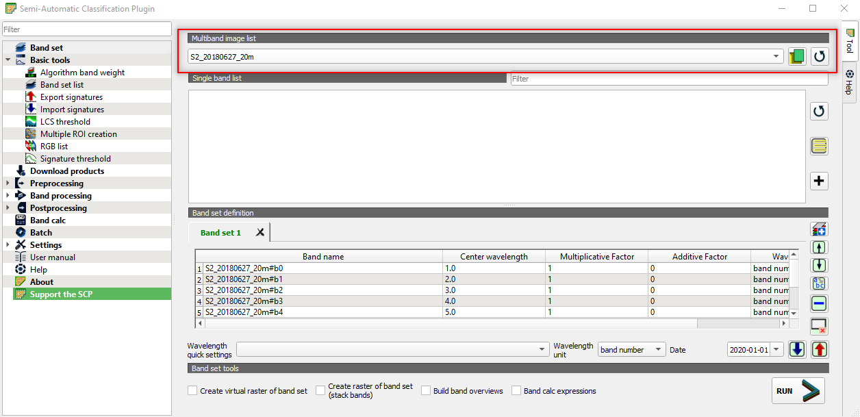
Fig. 3.4.2.25 Sample screenshot.
Then we need to convert the shapefile into ROI (Region of Interest) for the classification process to use these polygons as training samples.
Open the SCP Dock (Fig. 3.4.2.26).
Tip
If you don’t have the SCP Dock window opened in QGIS, select: View → Panels → Activate SCP Dock.
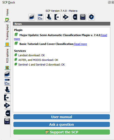
Fig. 3.4.2.26 Sample screenshot.
Open the tab Training input and click on the icon Create a new ROI file (Fig. 3.4.2.27).
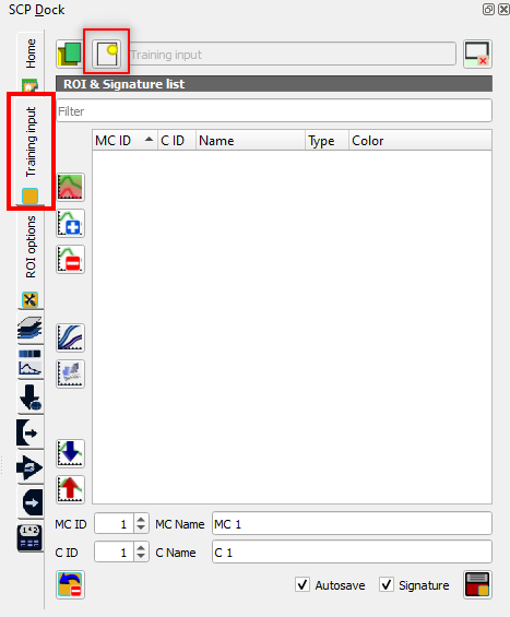
Fig. 3.4.2.27 Sample screenshot.
Select the folder where you want to save the training samples file and name it Training.
Open the main SCP window again and go to the panel Basic Tools panel → Import signatures (Fig. 3.4.2.28).
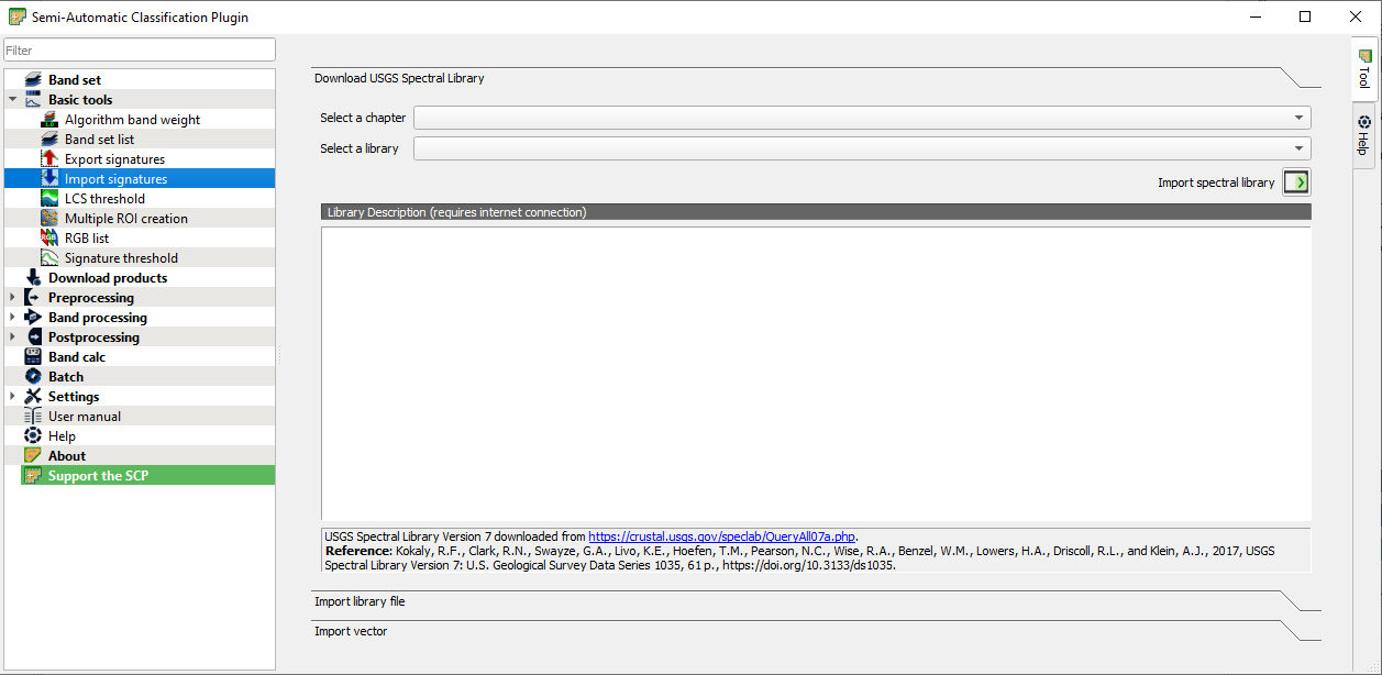
Fig. 3.4.2.28 Sample screenshot.
and click the button Import vector (Fig. 3.4.2.29)
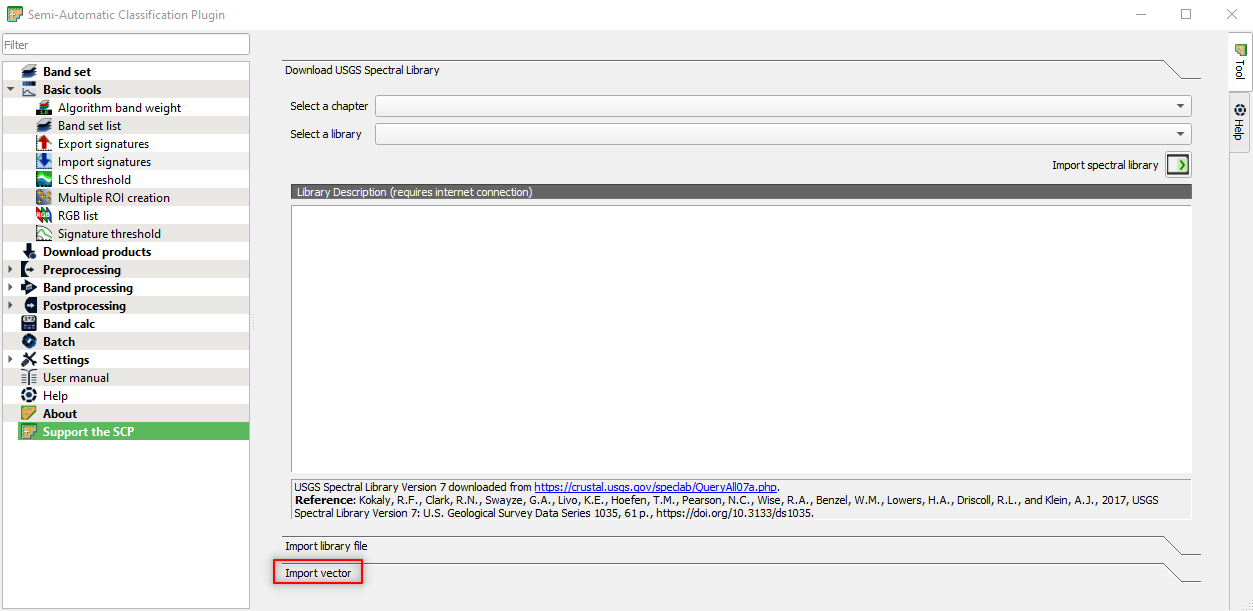
Fig. 3.4.2.29 Sample screenshot.
Now open the shapefile Wallonia_2018_In_Situ_Extracted_v1.shp (Fig. 3.4.2.30).
The software shows the following information:
MC ID field(i.e. Macro Class ID field): this field requires a numerical code to identify the classes we want to classify. QGGIS allows to use an attribute of the shapefile; thus we use the Class_code,MC Name field(i.e. Macro Class Name field): this field requires the class name linked with the MC ID field. The attribute containing the class name is LC,- In this exercise, we will not use the fields
C ID(i.e. Class ID) andC Name(i.e. Class Name). Thus, select the same attributes of the Macro Classes.
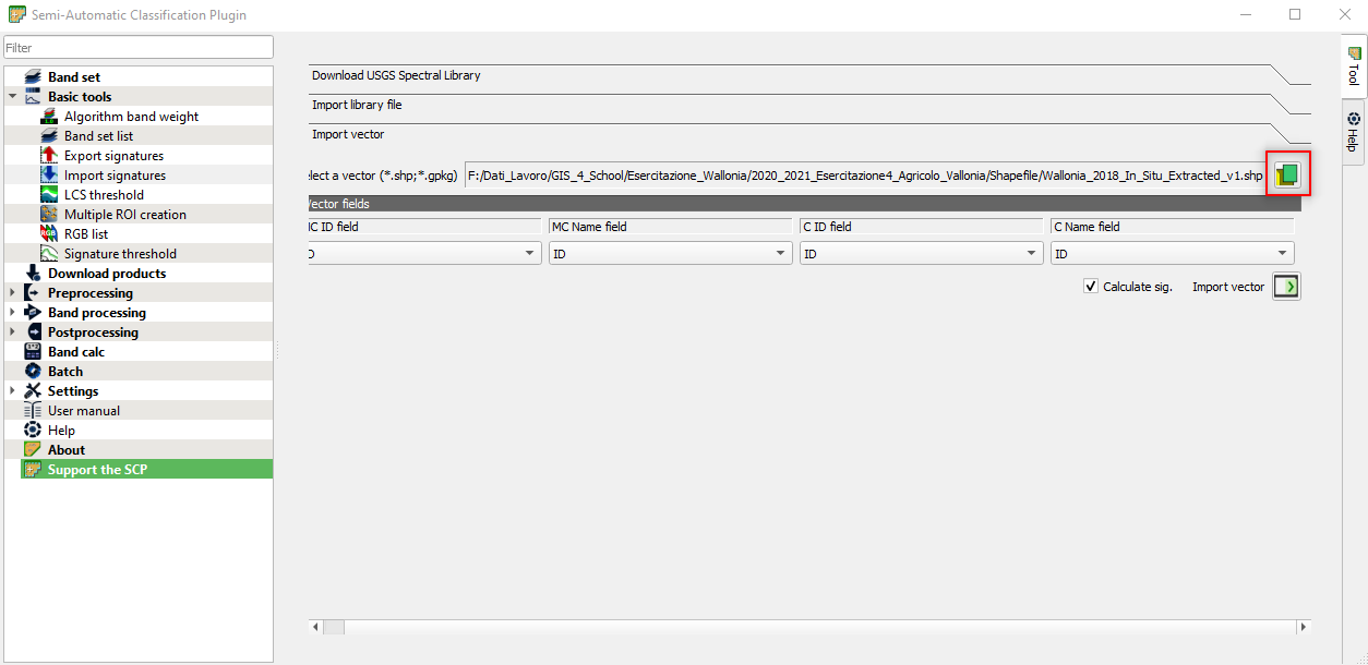
Fig. 3.4.2.30 Sample screenshot.
Click the Import vector icon (Fig. 3.4.2.31).
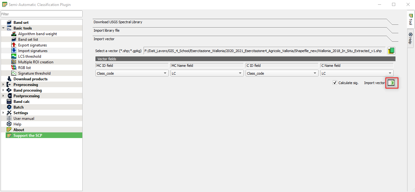
Fig. 3.4.2.31 Sample screenshot.
Important
Wait until the importing is finished!
This process might take some minutes, depending on your PC performances.
3.4.2.13. Automatic mapping of crop types
Let’s start the classification process.
Open the SCP window and go to the Band processing panel. Select Classification and set the parameters as follows (Fig. 3.4.2.32):
Select input band set:set 1. We set earlier the Sentinel-2 multiband imageS2_20180627_20mas the band set 1,Use:flag MC ID. We set earlier the crop type asMC ID,Algorithm:select Minimum Distance. We use the minimum distance classification algorithm,Threshold:set 0. We are telling the algorithm to classify all the image pixels.
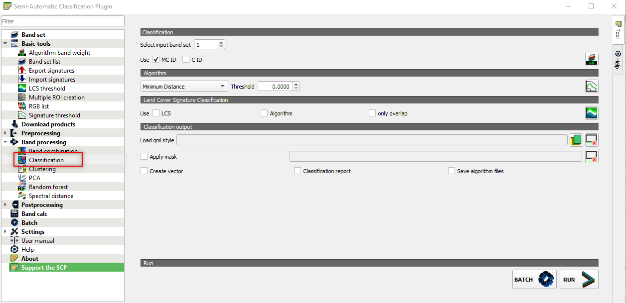
Fig. 3.4.2.32 Sample screenshot.
Click the button RUN and select the folder where you want to save the classification map. Name the file 20180627_Classification (Fig. 3.4.2.33).
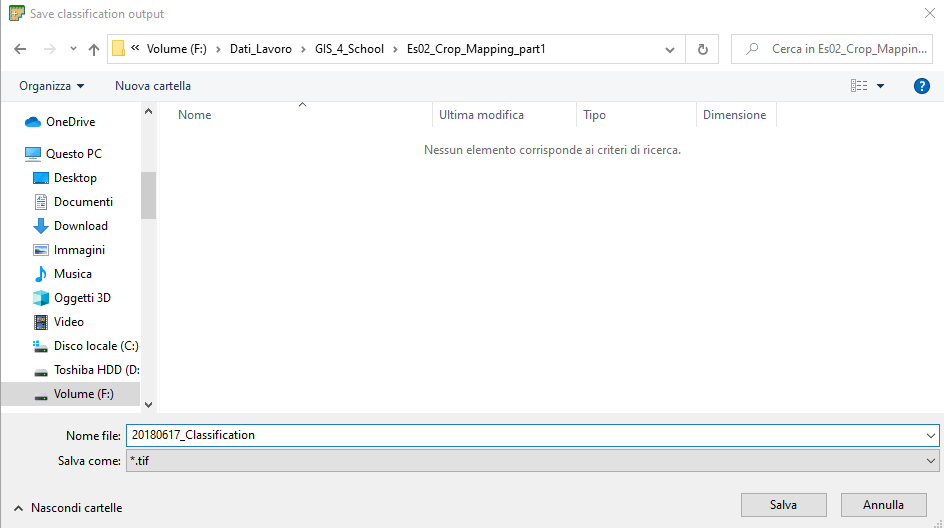
Fig. 3.4.2.33 Sample screenshot.
The data processing transforms the input satellite image into a land cover map of crops types. Each pixel of the map is coded with its Class_code (Table 3.4.2.1). All the image pixels whose land cover is not recognized are assigned the “special” Class_code 0 (unclassified). Fig. 3.4.2.34 shows the result.
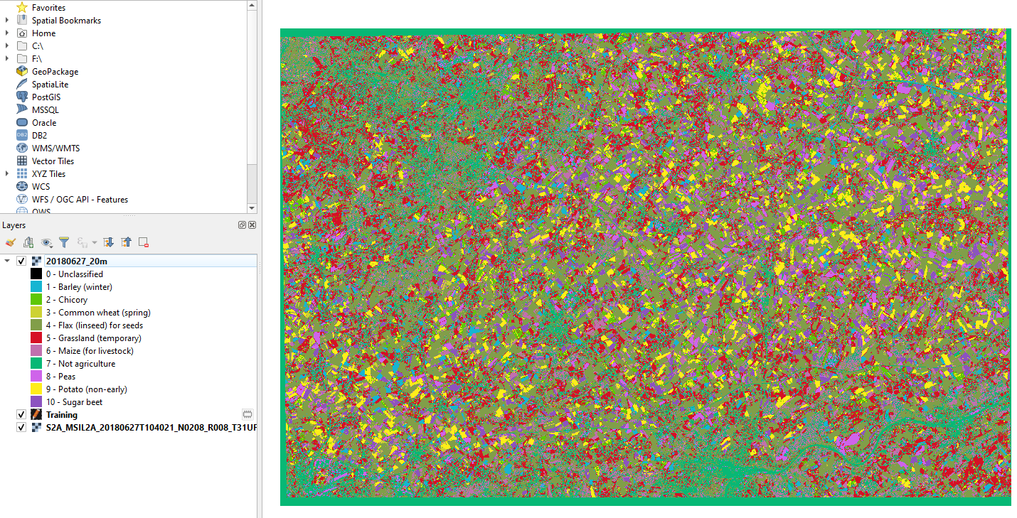
Fig. 3.4.2.34 Sample screenshot.
3.4.2.14. Simple analysis of results
If we want to estimate the most farmed crop, right-click on the classification layer 20180627_Classification and select Properties (Fig. 3.4.2.35).
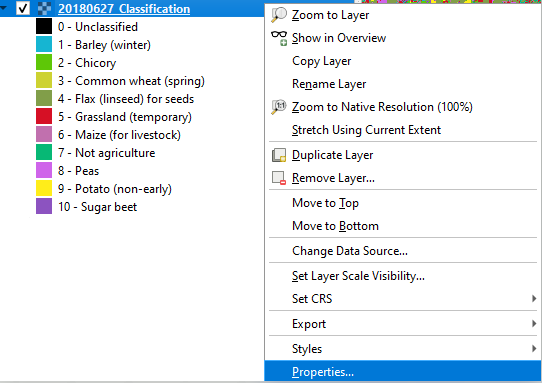
Fig. 3.4.2.35 Sample screenshot.
In the left-side menu select Histogram and then click the button Compute Histogram.
This tool counts the number of pixels for each land cover class, called frequency (Fig. 3.4.2.36).
We see that the crop Flax (Linseed), coded with the class number 4, is the most farmed in the study area.
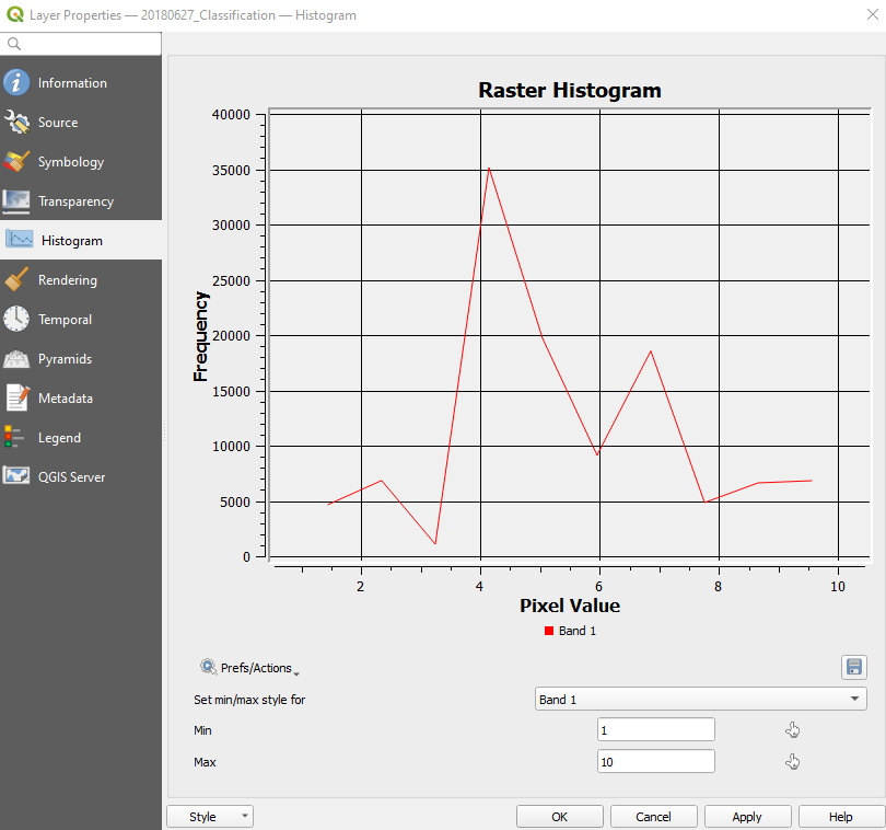
Fig. 3.4.2.36 Sample screenshot.
Hint
If we have some information on the land cover and satellite images for the same location, but in a different period, we can compare how the farming of crop types changes in time.
Hint
If we have some information on the land cover and satellite images for the same period, but in a different location, we can compare how crop types are farmed in other places.
3.4.3. Monitoring crops’ vegetative stage (difficulty: easy)
3.4.3.1. Download the data
Important
DATA FOR THE EXERCISE
Click here to download the data for this exercise (270 MB).
3.4.3.2. The environmental problem
Agricultural productivity is strictly related to environmental factors. For example:
- Rising levels of CO2 reduce protein content and essential minerals in most crops, including Wheat, Soybeans, and Rice, resulting in a loss of food quality,
- Extreme temperature and precipitation can prevent crops from growing,
- Floods and droughts can harm crops and reduce productivity,
- Droughts can cause desertification,
- Many insects and fungi prosper under warmer temperatures, wetter climates, and increased CO2 levels,
- Pollutants reduce agricultural productivity.
Warning
The role of climate change
Climate change is modifying the temperature and the precipitation regimes, intensifying extreme weather, and increasing desertification in many fragile territories. That has an impact on the health of vegetation and crops.
3.4.3.3. Scope of the exercise
This exercise shows satellites’ use to evaluate Barley and Potatoes’ vegetative stage in different periods of the year.
3.4.3.4. Study area
The study area is Wallonia, the southern and most extensive region of Belgium. The climate is temperate, moderately humid, with an annual rainfall of about 780 mm well distributed over the year.
The soil is loamy and moderately well-drained; thus, it does not require irrigation. The main winter crops are Wheat and Barley, while the main Summer crops are Potatoe, Sugar beet and Maize. Field size ranges from 3 ha to 15 ha.
3.4.3.5. Satellite images
The analysis is done using two cloud-free Sentinel-2 images collected in the following dates of Spring-Summer 2018:
- 18 April 2018,
- 27 June 2018.
Warning
The Sentinel-2 images used in this exercise are supplied as atmospherically corrected L2A products. THUS, THEY CAN BE USED WITHOUT ANY FURTHER PRE-PROCESSING.
3.4.3.6. Land cover information
Information on the actual land cover is provided as polygons (shapefiles). Each red polygon in Fig. 3.4.3.1 stands for a crop field with available information on the cultivated crop type.
In the study area are cultivated the following main crops:
- Barley,
- Chicory,
- Wheat,
- Flax (linseed),
- Maize,
- Peas,
- Potato,
- Sugar beet.
Fig. 3.4.3.1 Farmlands in the Wallonia region.
3.4.3.7. Methods
The monitoring of vegetative stage is done using the Normalized Difference Vegetation Index (NDVI) (How spectral indices are designed) described by Equation (3.2.2.2):
3.4.3.8. QGIS set-up
Open QGIS and select New Empty Project in the main window (Fig. 3.4.3.2).
Fig. 3.4.3.2 Sample screenshot.
3.4.3.9. Calculate NDVI
To compute NDVI, we need only the NIR and Red bands. Thus, we use Sentinel-2’s highest spatial resolution images (10-meters).
Open the folder …\Sentinel-2\10m and import in QGIS the image S2_20180418_10m.
Note
Prepare the input multiband satellite images as described in Prepare multiband files for 10-meter satellite images.
Now we do some calculations with images using the Raster Calculator. This tool allows evaluating equations based on the image pixel values.
Open Raster Calculator from the menu Raster → Raster Calculator... (Fig. 3.4.3.3).
Fig. 3.4.3.3 Sample screenshot.
We want to calculate the NDVI for each of the satellite image pixels (for more information refer to How spectral indices are designed):
Before writing the calculation formula for NDVI, we need to know which are the Red and NIR spectral bands.
Remember that Sentinel-2’s 10-meters resolution Red band is band 3 (B3), and its 10-meters resolution NIR band is band 4 (B4). Thus, the NDVI equation written for Sentinel-2 images becomes Equation (3.4.3.1):
Equation (3.4.3.1) can also be written as follows:
where:
B3 are the pixel values in Band 3 (i.e. the Red band),
B4 are the pixel values in Band 4 (i.e. the NIR band).
Now, we have to write Equation (3.4.3.2) using QGIS syntax, so the software can understand it.
With the help of the calculator buttons, write the following expression in Raster Calculator Expression:
(“S2A_20180418_10m@4” - “S2A_20180418_10m@3”)/(“S2A_20180418_10m@4”+”S2A_20180418_10m@3”)
Hint
How to read QGIS equations?
“S2A_20180418_10m@4” means:
“pick each pixel value of image S2A_20180418_10m for band 4 (@4)”.
“S2A_20180418_10m@3” means:
“pick each pixel value of image S2A_20180418_10m for band 3 (@3)”.
Equations are calculated on a pixel basis. Thus the same equation is computed for each image pixel individually. The results are shown in a new image.
In Result Layer click on the three dots [...] next to Output layer and select where you want to save the classification results. Name the folder ..\NDVI and the file 2018_04_18_NDVI (Fig. 3.4.3.4).
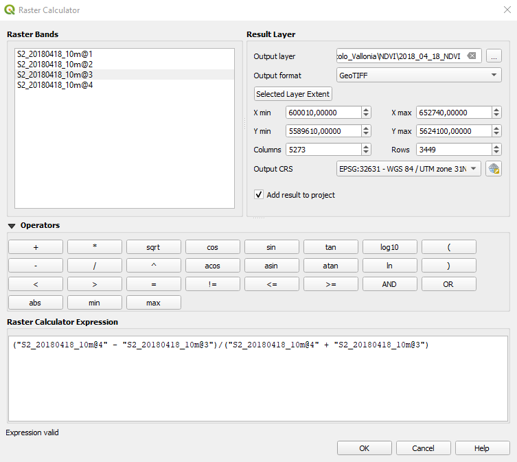
Fig. 3.4.3.4 Sample screenshot.
The output is a grayscale image, where each pixel contains its NDVI value just computed (Fig. 3.4.3.5).
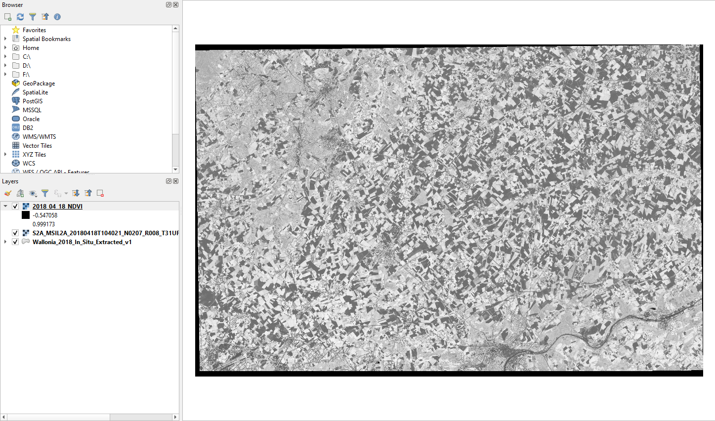
Fig. 3.4.3.5 Sample screenshot.
Now repeat the data processing again for the satellite image collected on 27 June 2018 (multiband file S2_20180627_10m).
Remember to use “S2A_20180627_10m@3” and “S2A_20180627_10m@4” in the expression for calculating NDVI on 27 June 2018. Save results as ..\NDVI\2018_06_27_NDVI.
Tip
To simplify the processing, remove all the layer from QGIS and start from scratch (Calculate NDVI).
3.4.3.10. Select the NDVI information for Barley and Potato
Once computed the NDVI for both the satellite images, we want to compare Barley and Potato’s vegetative stage in April and June.
Open the attribute table of the shapefile Wallonia_2018_In_Situ_Extracted_v1: right-click on Wallonia_2018_In_Situ_Extracted_v1 → Open Attribute Table (Fig. 3.4.3.6).
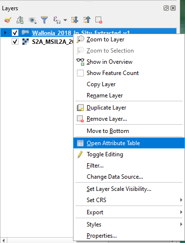
Fig. 3.4.3.6 Sample screenshot.
To filter the attribute table by land cover type (the attribute LC), we need the tool Select feature using an expression. Click the icon showed in (Fig. 3.4.3.7).

Fig. 3.4.3.7 Sample screenshot.
The window Select by Expression opens. Expand the tree Fields and Values and double click on LC (Fig. 3.4.3.8).
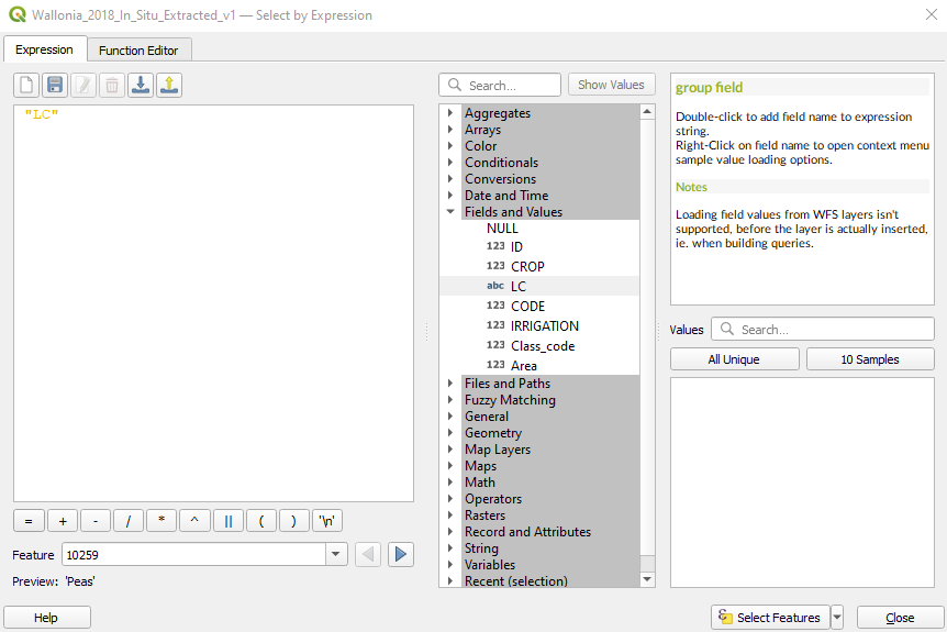
Fig. 3.4.3.8 Sample screenshot.
The main window Expression automatically fills with “LC”.
Click the button = and then click the button All Unique. This command shows, on the right side, the list of all available land cover in the shapefile Wallonia_2018_In_Situ_Extracted_v1.
Double click on Barley (winter). Now the expression in the main window becomes “LC” = ‘Barley (winter)’ (Fig. 3.4.3.9).
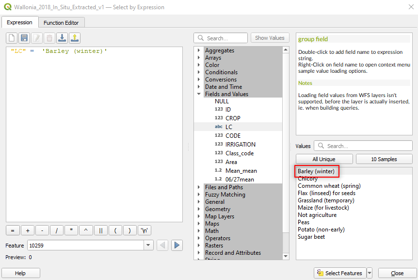
Fig. 3.4.3.9 Sample screenshot.
We are telling the software to select the land cover Barley. But we want to select also Potato.
Expand the tree Operators and double click on the OR operator (Fig. 3.4.3.10).
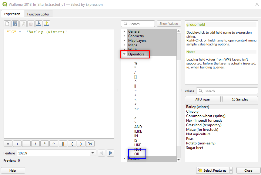
Fig. 3.4.3.10 Sample screenshot.
Expand the tree Fields and Values again, double click LC, click the button = and then click the button All Unique. Now double click on Potato.
The expression in the main window becomes “LC” = ‘Barley (winter)’ OR “LC” = ‘Potato (non-early)’ (Fig. 3.4.3.11). We are now telling the software to select from the attribute table all the polygons whose land cover is Barley or Potato.
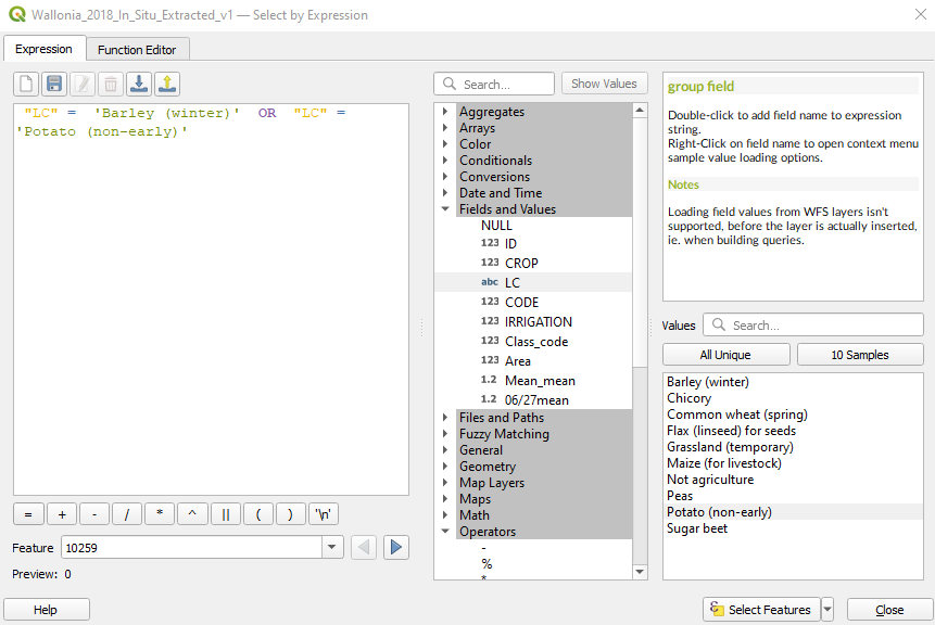
Fig. 3.4.3.11 Sample screenshot.
Click the button Select Features (bottom right of the window) and then Close the window.
As a result, 13 polygons out of 55 are selected. Now export these polygons in a new layer. Right-click on the layer name → Export → Save Selected Features As... (Fig. 3.4.3.12).
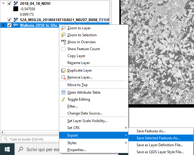
Fig. 3.4.3.12 Sample screenshot.
A window opens. Select the following parameters (Fig. 3.4.3.13):
Format:set toESRI Shapefile,File name:Double-click on the three dots[...]and select the folder where you want to save the file. Name it:Barley_Potato,Layer name:Leave this field empty,CRS:Keep the default value. QGIS automatically takes the Coordinate Reference System (CRS) of the original file.- Keep the default values for the other parameters.
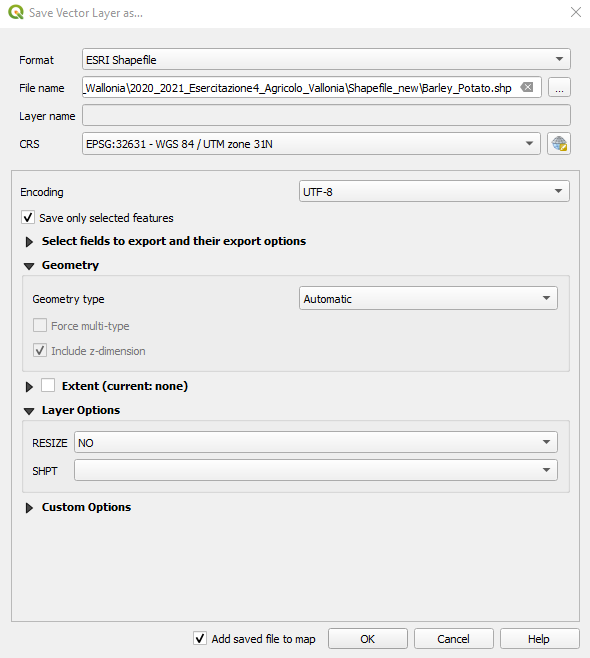
Fig. 3.4.3.13 Sample screenshot.
3.4.3.11. Compare winter crops and summer crops
Now we want to compare the different vegetative stage of Barley and Potato. For this task, we use the Zonal statistics tool.
Unlike the Cell Statistics algorithm that computes per-pixel statistics, the Zonal statistics algorithm calculates per-polygon statistics. That means the output (e.g. minimum, maximum, sum, count, etc.) is calculated only on pixels within the selected polygons.
Search in the Processing Toolbox panel for the Zonal statistics (or write zonal statistics in the Processing Toolbox search bar) and double-click on it (Fig. 3.4.3.14).
Hint
If the Processing Toolbox panel is not loaded, open the QGIS menu View → Panels and select Processing Toolbox.
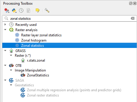
Fig. 3.4.3.14 Sample screenshot.
The Zonal Statistics window opens. Select the following parameters (Fig. 3.4.3.15):
Input layer: set
Barley_Potato,Raster layer: set to
2018_04_18_NDVI,Raster band: set to
Band 1 (Gray),Output column prefix: set to
18_04_,Statistics to calculate:
- Click on the three dots
[...], - Select Mean and unselect all the other statistics,
- Click the blue back arrow, located in the upper-left corner (Fig. 3.4.3.16).
- Click on the three dots
Zonal Statistics:
- Click on the three dots
[...], - Save to file,
- Select the folder where to save the Zonal Statistics file,
- Name the file
Zonal_statistics_18_04.
- Click on the three dots
Click the button RUN to execute the data processing.
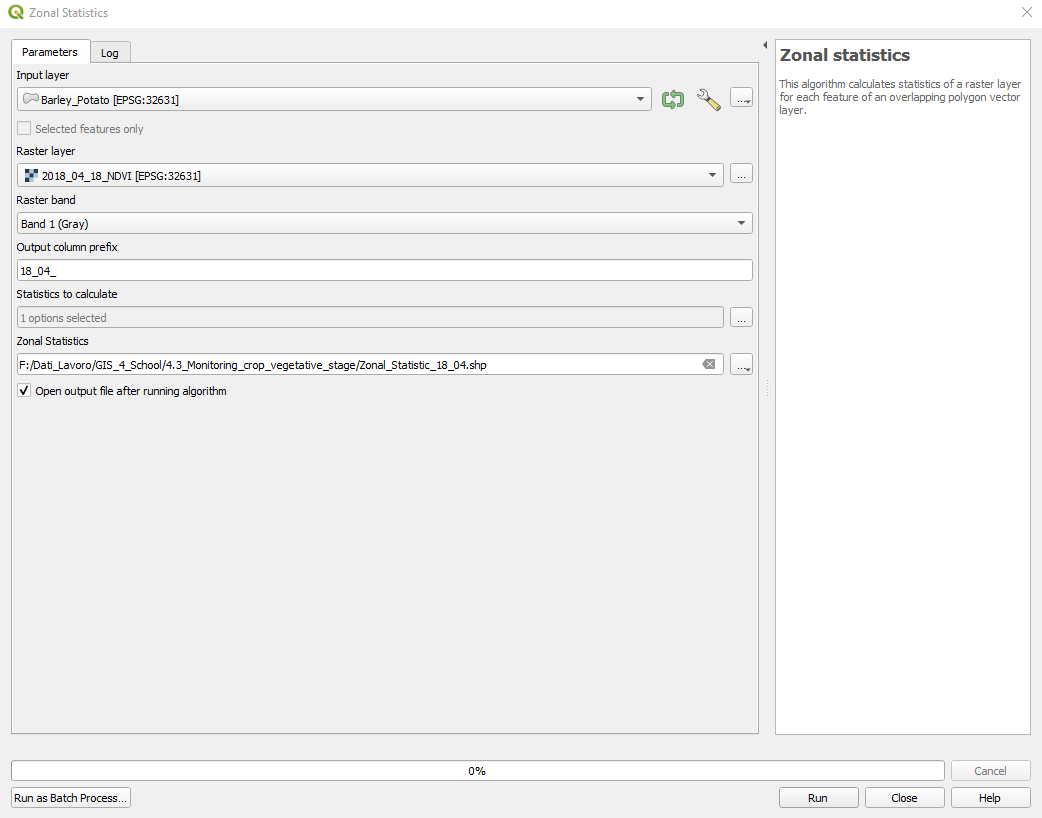
Fig. 3.4.3.15 Sample screenshot.
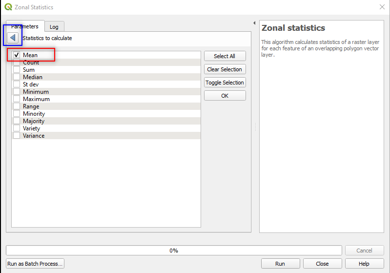
Fig. 3.4.3.16 Sample screenshot.
The data processing adds a new shapefile layer, called b4_b3_mean. This is a copy of the shapefile Sampling_2016 with the new attribute (i.e. column) b4/b3_mean. The new attribute b4/b3_mean contains the mean RVI of each polygon (i.e. rows) (Fig. 3.4.3.17).
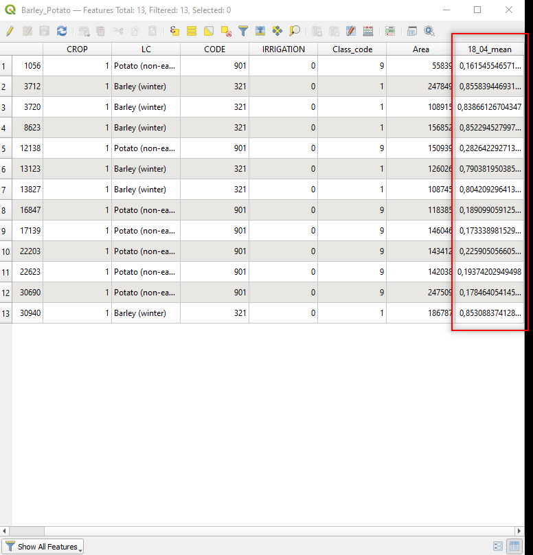
Fig. 3.4.3.17 Sample screenshot.
Now compute the zonal statistics for the satellite image collected on 27 June 2018 (file 2018_06_27_NDVI).
Remember to set the Raster layer to 2018_06_27_NDVI, and Output column prefix: to 27_06_.
Fig. 3.4.3.18 shows the result.
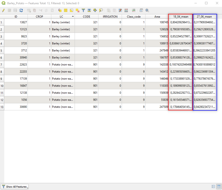
Fig. 3.4.3.18 Sample screenshot.
3.4.3.12. Simple analysis of results
Let’s discuss our findings.
Mid April:
- Barley has high NDVI values, corresponding to a high amount of healthy biomass (just before harvesting),
- Potato has low NDVI values, corresponding to a low biomass amount (because the seedling is not grown yet).
Late June:
- Barley has low NDVI values, corresponding to a low biomass amount (because the crop has been harvested),
- Potato has high NDVI values, corresponding to a high amount of healthy biomass (because the crop grew up).
We thus deduce that Barley is cultivated as a winter crop in the study area.
In contrast, we deduce that Potato is cultivated as a summer crop in the study area.
Note
It is interesting to notice that, unlike one may expect, not all the fields with the same crop have the same NDVI values in the period of full growth. This phenomenon is easily explained because the seedlings’ health and vigour may vary due to non-optimal environmental conditions.
Thus, fields cultivated with Barley in winter, or fields cultivated with Potato in summer, showing abnormal low NDVI values could have productivity issues related to environmental factors, as recalled in The environmental problem.
3.4.4. Additional resources
For additional hands-on, have a look at the following recommended practices by the United Nations Office for Outer Space Affairs using QGIS and open data:
- Flood mapping and damage assessment using Sentinel-2 data (UN-SPIDER).
- Use of digital elevation data for storm surge coastal flood modelling (UN-SPIDER).
- Disaster preparedness using free software extensions (UN-SPIDER).
- Exposure Mapping (UN-SPIDER).
(v.11.03.20-10.15)